One of the buzzwords of modern marketing or design work is “understanding your customers.” Before you jump on board with a trend or design style, it’s good to research how consumers or clients in your industry respond to it. One particular trend that has dominated the web for several years is minimalism.
So, if you’re considering a minimalist redesign, let’s take a look and see if it’s the best strategy for you and your site.
Why Minimalist Design is All the Rage
Modern minimalism has been around for over 80 years. Several decades of lavish design and skeuomorphic hyper-realism supplanted the postwar minimalist movement, but it has once again become a mainstream trend. The most common elements include:
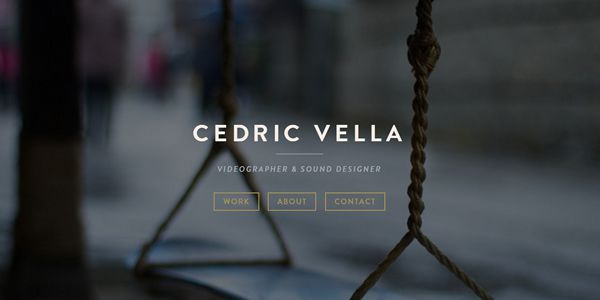
- Letting a handful of visuals convey your larger message (“less is more”). Videographer Cedric Vella does this by featuring just his name and title, three informative links, and a calming background image above the cut of his one-page website.

- Cutting anything that distracts from your main point or purpose — only leave an element in place if your design makes no sense without it.
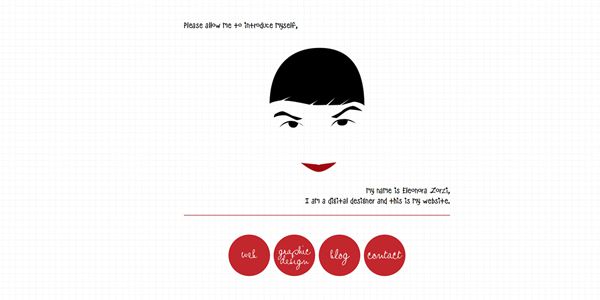
- Making every detail fit your theme in the way it communicates your message. Eleonora Zorzi’s digital design page has very few elements, but they each fit her personal brand — structured and creative at the same time.

- Using sparse, carefully selected colors. Minimalist design usually includes one or two highlight colors, which draws the viewer’s eye.
- Providing as much direction with your white space as with your words. Separate text into sentences or small paragraphs, and spread these out in the order and direction that you want them to be read.
All of these things lead to design that many users appreciate because it’s fundamentally easy to use. Additionally, so many user’s lives are full of clutter that a bare-minimum design aesthetic feels very refreshing.
Pros and Cons of Minimalism
As with any fad, minimalism has some inherent downfalls. It’s not a one-size-fits-all solution; some businesses need more visual content or intricate design because of the nature of their work. A minimalist approach wouldn’t fit sites like Square Circle, the Hard Rock Hotel brand, or SensiSoft, for example.
Trimming all content down to bare bones would downplay the impact of Square Circle’s bold ad work, eliminate the lush details sought by Hard Rock Hotel guests, and fail to
illustrate the adaptability that SensiSoft brings to the advertising world. Minimalism can also make you unsure about whether you still have too much content, or be so austere that your message is unclear to visitors.
There are, however, well-documented advantages to using minimalism for the right endeavor:
- Faster load time — there aren’t multiple photo and video files that take forever to load.
- Ease of navigation — it’s hard to get lost when there aren’t many places to go.
- Lack of ads — highly appreciated by most visitors, especially those in a hurry.
- Less server strain.
- Centrality of content — all distracting elements are eliminated.
- Responsiveness — easier to optimize for mobile browsers.
- Aura of importance — not cluttering up the page lends your site an authoritative mystique.
Determining whether the pros and cons are of more weight depends largely on the kind of business your site represents. Beta testing on a core group of loyal users is one way to gauge how your customers are likely to receive a complete minimalist redesign of your site.
How Using Minimalist Design Can Affect Your Business
If you are in ecommerce, minimalism can definitely be a design asset. The loading and navigation speed of a streamlined site makes the casual shopper more likely to buy, whereas you can lose 4 out of 10 visitors because of a slow-loading page. Consistent design and an understated, professional appearance also make viewers feel better about doing business with you. With simple, intuitive use being important to 76 percent of surveyed web users, minimalism can be a safe default option.

Others argue that since leading companies like Apple have made minimalism the standard for design, many people forget that there are other, equally viable ways to make technology beautiful. Many consumers middle-aged and older find minimal design ugly — they appreciate well-placed details and cozy spaces with more than ‘two pieces of furniture’.
In addition, minimalism’s simple appearance belies the intense design process required to get it right. This makes for many badly designed “minimalist” sites.
Concluding
If you think minimalism will appeal to your target demographic and enhance the aesthetic of your business, go for it, as long as you consider the following:
- Run many tests before you fully commit to your site’s new look.
- Implement changes gradually; this can sometimes make people more comfortable with the updating process. (Include a notice in your blog or newsletter to avoid confusing your visitors.)
- Accept honest feedback. If you realize that your sleek redesign is less of a hit than you hoped, be willing to add back in a few of the older elements that your customers appreciated.
- Don’t use good design — minimal or otherwise — as a substitute for strong marketing and customer service.
How has minimalism figured into your business? Share your stories with us!
Related Topics
Top