As with any medium as widely used as typography, it can fit into many categories. Typography is a part of all of our lives, so let’s analyze it for a minute. Merriam-Webster defines typography at 1) letterpress printing, and 2) the style, arrangement, or appearance of typeset matter. Modern terms may refer to it as a branch of graphic design, however.
Like with most areas of design, there are certainly elements of science, art, philosophy, and craft. When looking to typography as a means to give us something for the human eye to see clearly – something that is coherent – then the science is put to use. For example in the 1929 published journal by D. G. Paterson and M. A. Tinker titled “Studies of Typographical Factors Influencing Speed of Reading: II. Size of Type”, they found that 10-point type yields the fastest reading.
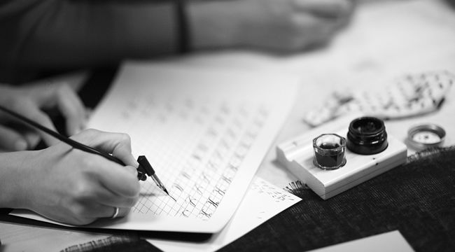
Typography as art has an even wider spectrum, as we can look at everything from calligraphy to graffiti. It can be argued that such examples conjure up individual connotations and feelings, which are unique in their own way. As with art, these emotive attributes are distinctive to each individual who views them.
Graffiti, for example, is traditionally closely linked to hip-hop culture. A majority of those far removed from that lifestyle might hold a negative viewpoint, and compare it to vandalism or even thug culture. Whereas the complete opposite will no doubt argue its value; such as the significance of a ‘tag’ and how that in itself can be just as important as the image.
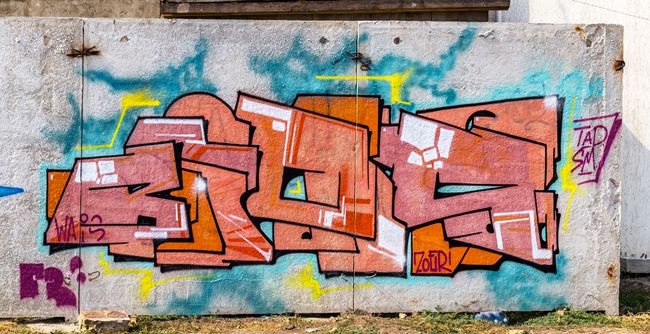
The above example of graffiti art is solely made up of words that have been arranged in a way that makes it appear pictorial.
Additionally, every computer word processing program comes with endless fonts in all colors and sizes. Depending on what the user is producing with such a program, they will use a specific typeface based on their own interpretation of what that typeface means to them.
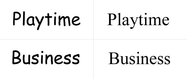
The much disliked Comic Sans font, for example, might be likened to what might be used in a playschool environment, whereas the standard Times New Roman, and other Sans Serif styles, tend to be associated with more professional use.
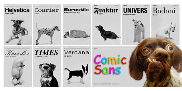
Image Source: Gizmodo.
Then in the graphic or web design industry, professionals in that field create their own typefaces, as well as editing the placement, arrangement and spacing of the letters; all of these factors of which are similar to graffiti or calligraphy. As with all art, there are endless mediums to create typography. Ink on paper, paint on wood, welded steel, wood and nails, you name it.
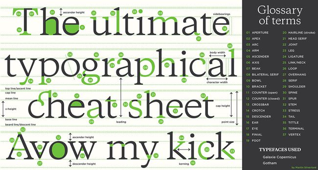
Image Source: Anatomy of Typography.
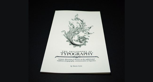
Interested in the philosophy of Typography? Is there such a thing? Check out “The Philosophy of Typography” by Steven Acres. He states that “The title page sets the mood for the rest of the book, thus it should mirror the properties of the text.” There is no denying that certain texts can mean different things. For example, when you see ‘READ THIS NOW‘ it conjures a different feeling compared to ‘read this now.’
More urgency perhaps. Why does it feel like you’re being yelled at when someone emails you in upper case? Also, if that were written in red, its message would appear more alarming, compared to if it were written in pink.
Soft scripted fonts are extremely formal and feminine, while more hand-drawn looking fonts can feel almost comical, like in the Sunday paper funnies.

Furthermore, and as previously mentioned, the difference between how Comic Sans and Times New Roman is used is worlds apart. The roundness of Comic Sans might be associated with amateur design, or a style that is, arguably, childlike and playful. Times New Roman, on the other hand, has a more obvious formality about it.
Decide for yourself:
The creation of typography is an art and a craft in itself. Someone out there had drawn all those fonts we love so much.
Whether it’s like back in the old days when a rubber stamp was carved out for the news printing machine or today when drawings are scanned and processed into the computer. Lucky for us there are folks out there, and maybe you, with an intense passion for typography.
We will continue to watch the popular styles of type change as each decade passes by as well. Just look at advertising typography in the ’60’s verses today. The letters make us feel a different way.
We can study it with science, analyse it with philosophy, enjoy it with art and create it with craft. Don’t you just love type!
Related Topics
Top