To stay afloat during this tough economic period, companies must change with the times; this sometimes includes a new logo or even a whole new brand identity. Although the changes differ among brands and are unique to the challenges of the company, logos and branding are trending toward simplicity.
A number of well-known companies have redesigned their logos recently, and some have even gone so far as to redesign their entire brand identity system.
Below I have outlined a number of corporate logo redesigns with successful results.
Pepsi
The first major name with a long history of brand evolution is Pepsi. They have gone through many packaging iterations since their inception in the early twentieth century. The trend toward simplicity is especially apparent here with the current can flaunting a mostly blue design with the company name and logo as the only ornamentation.
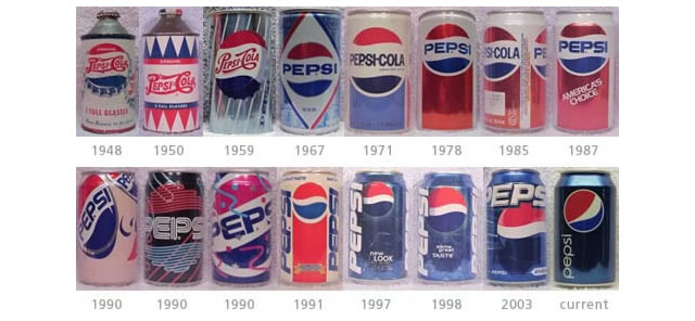
The simple logo only adds to the sparse feeling of the design. The Pepsi logo began as a highly decorative red wordmark and has evolved to a red, white and blue icon with elegant but straightforward lines. The abstract quality of Pepsi’s logo is its best feature – and it is recognizable on its own because of Pepsi’s longstanding status as a household name, in this way similar to Nike.
Apple
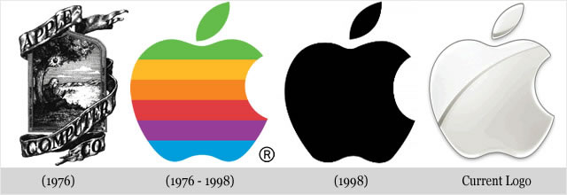
Apple, a relatively new company in comparison to Pepsi, has still gone through a number of identity changes in its short history. The first change was a drastic one, moving from a busy, dark image-based logo to a more appropriate image of an apple. The apple concept progressed throughout the years, evolving to its current sleek silver apple icon. Interestingly, the logo changes seem to mirror the style shifts of Apple’s hardware.
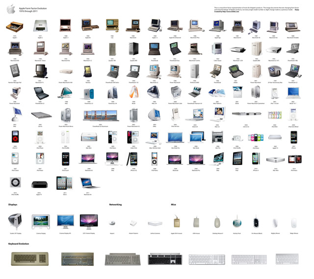
As time went by, the computers and accessories became more streamlined and less clunky. Matte gray and black gave way to metallic silver and shiny black. The physical shapes became smaller and more rounded. Apple’s current logo adheres to both of these trends with its shiny silver look and slightly three-dimensional, rounded appearance.
Comedy Central
Comedy Central also modified its logo drastically a couple of years ago, shifting from a busy, illustration-based logo to an extremely simple one. Using one inverted “C” to encase another smaller “c,” Comedy Central intended the new logo to reference the copyright symbol. Some critics complained that it looked too much like it, but that was the point – to literally turn the copyright symbol upside down to make a humorous statement.
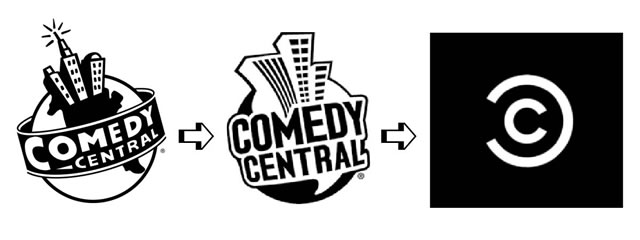
By using the copyright symbol to make a joke, Comedy Central is figuratively saying that they have exclusive rights to humor. Turning the word “Central” upside down further drives home their point, and adds visual interest. The appealing minimalist appearance of the new logo puts Comedy Central on equal footing with other big name competitors.
Animal Planet
Animal Planet also uses the orientation of text to their advantage. In their new logo, the “M” is turned on its side, mimicking the number three. There is much debate over the reasoning behind this decision, and no clear answer; but regardless of the motive, the sideways position and lighter green color makes for an attractive and visually stimulating logo. In my opinion, the negative space on the left of the sideways “M” looks like a bird’s beak – negative space is always more noticeable when a letterform is used in an unexpected way.
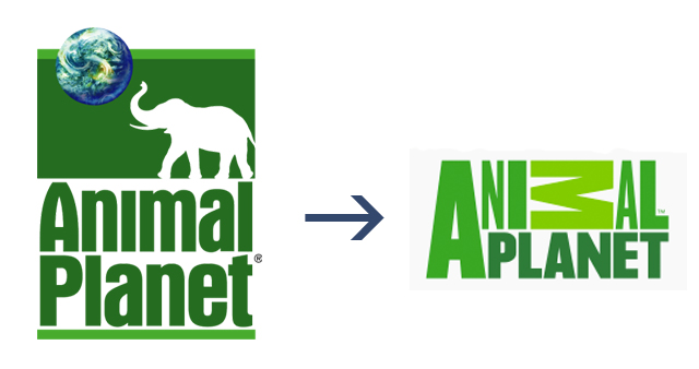
Animal Planet’s old logo focused on imagery, using an elephant and an illustration of the world as its main elements. The text seemed almost like an afterthought, sitting below the images with no real integration. The new identity represents the network appropriately, without using imagery as a crutch.
Seattle’s Best Coffee
Seattle’s Best Coffee exemplifies this trend toward simplicity with a new identity system that highlights the liquid nature of coffee. Their old logo was wordy and complex, with too much information squeezed into a small space. The color combination was outdated, and the shapes were very stylized and three-dimensional. Their new logo eliminates much of the text, leaving only the company’s name, and uses uncomplicated shapes to convey their point.
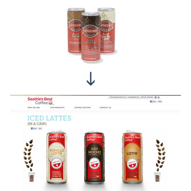
A droplet of coffee placed inside a semi-circle lends a bit of style, while the fresh new color scheme looks modern and unfussy. The company’s packaging also changed a bit with the introduction of the new logo, using the simplicity of the new logo as a model. The overall layout remains similar, but the Seattle skyline drawing has been removed from the background and the typefaces and colors have been updated to complement the new logo.
Conclusion
As design trends shift over the years, companies must keep up with these changes. Some make the decision to redesign their logos, while others go so far as to revamp their entire brand identity. Many of these businesses are trending toward more simple, straightforward designs and away from the complicated, multi-colored illustrations popular in decades past. Regardless of the industry or sector, it is clear that the future of logo design is headed toward easy, concise symbolic representations.
Have you noticed this tendency toward simplicity? What are your favorite corporate redesigns?
Related Topics
Top