You’ve spent countless hours tweaking your CSS, testing your responsive breakpoints, and checking site speed. You know the site like the back of your hand. Your eCommerce site is beautifully designed, but is it user-friendly?
There’s a lot more to creating an ecommerce site that sells than a fast loading, mobile-responsive design. When it comes to converting traffic into money, UX matters. While there are hundreds of potential best practices to follow, there are also common UX mistakes that kill customer confidence.
Navigation is a central aspect of user experience. Moving people through category, product and checkout pages requires a well thought out information architecture and clear click path.
The goal with menus is to help people find what they are looking for, not show off your creative design skills. Some common mistakes with navigation are:
- Going overboard with icons
- Pushing promotional products in mega menus
- Not including bread crumbs
- Too many top level items
How to get it right: keep it simple. When it comes to navigation, I am a bit old school. Hamburger menus shouldn’t be the default menu on large desktop screens. Make sure that your category hierarchy makes sense and that products are tagged with multiple categories. Someone looking for “snow boots”, might look under “shoes” or “winter apparel.” Use a multi-column drop down if you have a large number of subcategories.
2. Shotty Site Search
Depending on who you ask, 30% – 83% of ecommerce site visitors use site search as their primary way to navigate. Either way, you want to make it easy for visitors to use your search function, some studies show that site search users are twice as likely to convert.
Despite all this, eCommerce site search are plagued with problems. Functions like filtering are helpful, but not always necessary if you don’t have a large inventory. What is critical though is support for fuzzy and exact product search. 34% do not support users’ searches by product name.
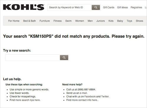
If someone knows the exact product name or model number, buyer intent is high. If someone knows exactly what they want to buy, chances are they will use site search to find it. If your site search is broken, you’ll crush buyer confidence.
How to get it right: a high converting site search starts with design. Basic principles like contrast and proportion can go a long way here. Check out how Walmart’s search function has evolved in size and contrast.

Walmart’s Header 2012

Walmart’s Header 2014

Walmart’s Header 2016
According to Ecommerce Illustrated, when Alinc Technologies tested a bolder border to its search box (right), it increased site search use by 13.2%.
Once you get the design right, make sure fuzzy, misspelled and exact searches for product names or model numbers give relevant results.
3. Cluttered Hero Design
One of the most common mistakes I see with ecommerce sites is the use of a slider on the home page. What a waste of premium real-estate! Pretty much every template I see for sale boasts sliders as a premium feature. I don’t know if the designers are pushing it or if they are just meeting customer demand. Either way, test after test reveal how problematic sliders can be.
Usability guru, Jakob Nielsen calls them “deadly.” Here’s why:
- Auto-advancing sliders increase cognitive load and disrupts the thought process
- Users see them as ads and them don’t click on them
- Content is rarely relevant or focused
- Sliders are rarely implemented well on mobile
- They can cause SEO issues
How to get it right: sliders are often a byproduct of indecisiveness. Stakeholders want to promote too many things and display different messaging. Focus on creating a static hero image with a value proposition that speaks to your ideal customer. Use a call to action that entices them to click one more time.
4. Overly Complex Forms
On average, it takes 4.5 interactions before a user converts. Someone discovering your site and brand for the first time is probably not going to whip out their credit card. If you want visitors to return, capturing their email address or creating a new account is a surefire tactic. The problem, though, is poorly designed, overly complicated forms.
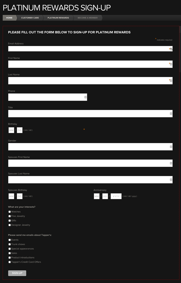
Yikes!
How to get it right: simple forms, with fewer fields tend to work better. Highlighting the active form field helps orient users. Form buttons are super important. Make sure the color stands out against the background. Avoid generic button call to actions like “Submit.” Button copy should clearly state the benefits of completing the form “Send Me My $10 Coupon.” A simple change of button copy can have a dramatic effect on conversions.
5. Mishandling Out-Of-Stock Products
Don’t let your out-of-stock products run-a-muck on your UX. Remember, the goal is to build user confidence with each click. Seeing a product that they like only to find out that it’s not available is a confidence killer. If you’re planning on getting more stock, you can have a back in stock notification app on your product page.
How to get it right: apologize and let them know when it will be back in stock. You can incentivize them to come back by offering a promo code or free shipping. You should also consider removing out-of-stock products from your category pages or labeling them “More on the way soon.”
6. Hidden Money Button
Speaking of buttons, I’m not sure why any eCommerce site would want to hide their “Add To Cart” button. Many WooCommerce themes even hide the button for the default setting. Can someone explain why?
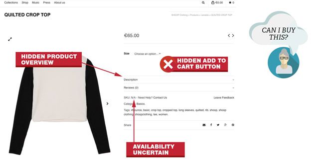
Someone may end up on your page, not see the button and assume its out of stock or not available. Yes, I understand that you might have to select a size first, but there are better ways to handle this. How would you feel if you were all excited about buying a product online, but wasn’t sure if was in stock.
Uncertainty = lost confidence.
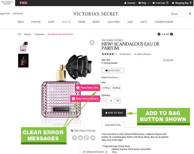
How to get it right: don’t hide the first button you need people to click on to make money. If users need to select a variation first, you can:
- Grey out the Add To Cart Button and add bold colored copy near the button that states “Please Select an Option”
- Have a button state that says “Please Select an Option” with an arrow on the option that needs to be selected. When the option is selected, change the button state to say “Add To Cart”
7. Skimpy Product Photos
When it comes to UX on ecommerce product pages, product photos are right up there. People cant’ touch your products, so photos are main way they can experience them. Large, clear photos can increase conversion rates.
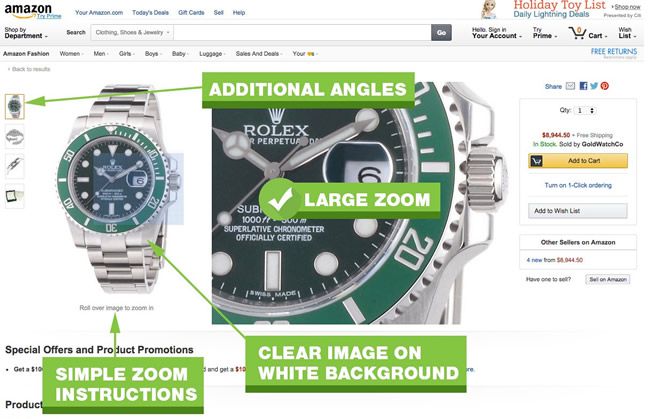
How to get it right: Use large, clear photos on white backgrounds. Show your product in multiple angles and include a zoom feature.
8. Tiny Tap Targets
Tiny tap targets are a prime example of a desktop-first mobile responsive design. Just because something is easy to click with a mouse, doesn’t mean it will be easy to tap on mobile.
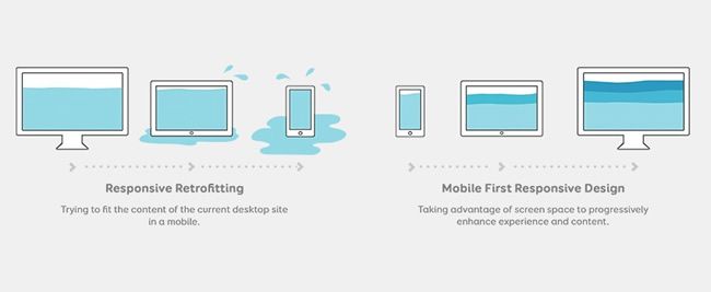
This graphic sums it up [Illustration by Stéphanie Walter, licensed under a CC BY-SA 4.0]
How to get it right: with more and more sales coming from mobile designs, you better make sure your tap targets are finger friendly. Google recommends that tap targets/mobile buttons are at least 48px tall/wide.
9. Invisible Customer Service
When it comes to eCommerce, customer service and UX make up the entire customer experience (CX). An eCommerce site without clear links to customer service policies, a phone number or live chat is like walking into a retail store with no employees.
How to get it right: have clear links to customer service policies (like shipping and returns). Understand that CX and UX can work together to give you a competitive advantage. In fact, most customers (85%) have said that they would pay up to 25% more for a superior experience. If your selling to millennials, consider adding live chat. Over 60% of millennials prefer live chat over other contact methods when wanting to ask a question.
What other ecommerce UX mistakes drive you nuts?
Related Topics
Top