Once our Yelp research was complete, it was time to analyze the findings and determine the major pain points users experienced with Yelp’s current site. We began by watching our UserTesting videos and making note of interesting moments. (UserTesting’s platform allows you to annotate videos and create video clips directly from your dashboard.)
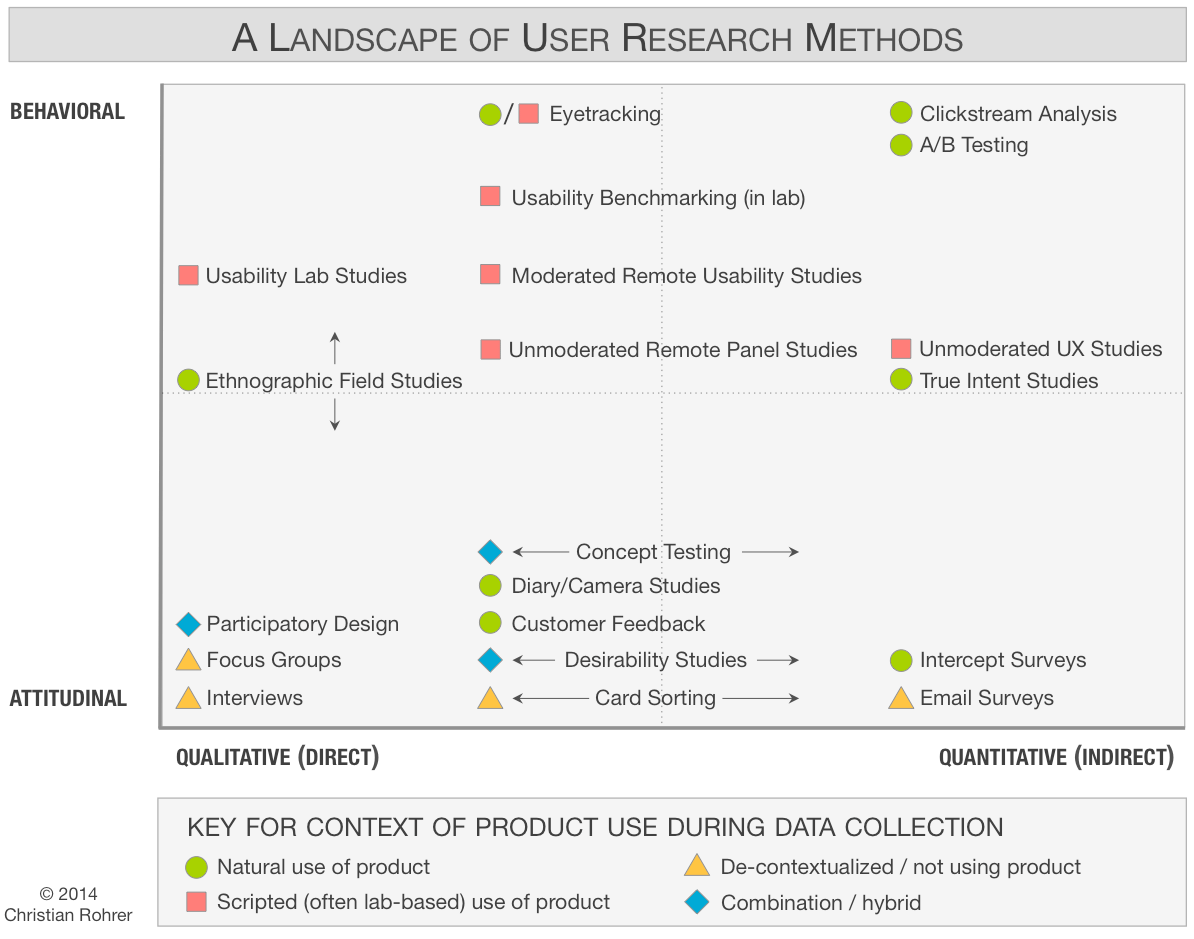
Image Source: Which UX Methods.
As discussed in The Guide to Usability Testing, there are a wide range of user research options ranging from resource-intensive usability lab studies to simple email surveys. Our screen-recorded user tests provided us both attitudinal and behavioral insights since we could hear what users thought (attitudinal) as well as see what they did on screen (behavioral). We’ll explain why qualitative research matters, explain our takeaways, and show how we wove them into the new design.
- The Right Approach to Qualitative Analysis
-
Analyzing Qualitative Results
- 1. The Search function was the primary starting point for any task
- 2. Events were not very noticeable
- 3. Bookmarking was frustrating, and no one used Lists
- 4. Searching for a specific venue was extremely fast and easy
- 5. Users relied on photos to determine the ambiance of a restaurant
- 6. Users relied on filters, but they could be improved
- 7. The price categories weren’t clear
- Design Based on Usability Testing
- Watch, Listen, Learn
The Right Approach to Qualitative Analysis
When it comes to qualitative analysis, it’s not enough to just ask users to recount their experiences. As Jakob Nielsen, Partner at the Nielsen Norman Group, points out, the first rule of usability is to never listen only to what users say. The wrong approach would be to create a few designs and then ask users which one they like the most — users haven’t tried the design, so they can only comment on surface features.
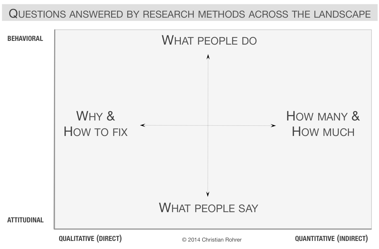
The right approach to qualitative analysis, and the one that we are champions of, is to examine user behavior and then ask them the Single Ease Question. This process helps to eliminate cognitive biases and gets to the bottom line of UX analysis: how did the users accomplish their tasks, and how easy or difficult was it? Our screen recording also captured audio (and we encouraged people to think out loud), because otherwise it’s easy to miss why certain behavior occurred. The “why”, after all, is the most important part of user analysis.
Analyzing Qualitative Results
Distinct patterns emerged in our observations of user interactions with Yelp (we explain these patterns in greater detail in User Testing & Design). Overall, we learned that the Search bar was one of the most essential features, and it was easy to use if the users knew exactly what they were looking for (if they knew the name of a business, for example). Other features weren’t as intuitive, though, as you’ll see in our discussion below.
1. The Search function was the primary starting point for any task
All five test participants relied heavily on the Search bar, even for tasks that could easily be completed by browsing through the Categories instead (such as finding an interesting restaurant or bar without being given any specific parameters).
In fact, four out of the five participants went straight to the search bar to find a restaurant. Only one user started browsing through the categories, and she quickly found them “overwhelming” and ended up resorting to the Search bar instead.

The Search bar was the most intuitive feature for users.
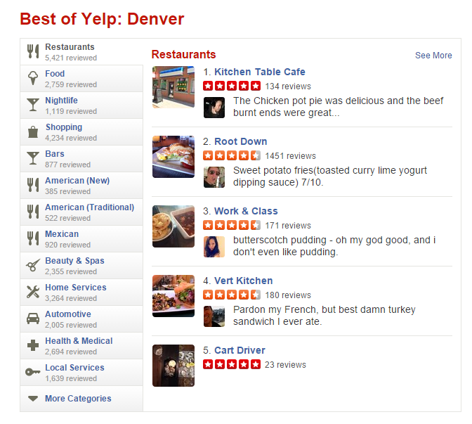
Yelp’s categories were “overwhelming” and less helpful than the Search bar.
Note: in our test instructions, we asked users to “find” a restaurant, not to “search for” a restaurant, because we wanted to observe how they would naturally go about this task without biasing them toward a specific function.
Interestingly, when the users were given specific parameters (like the budget, ambiance, and type of restaurant, or the name of an individual business) they almost universally ignored everything on the homepage except for the Search bar. Knowing this, we realized it would be very important to make the Search bar the most prominent feature on the redesigned site.
2. Events were not very noticeable
In one task, we asked the two users without Yelp accounts to find an interesting event in their area this weekend. We wanted to learn whether they would use the Events tab at the top of the page.

The Events tab is easy to miss.
Surprisingly enough, nobody used the Events tab. When asked to find an interesting event in their area this weekend, one test participant used the Search bar while the other navigated through the Arts & Entertainment category in the Best of Yelp section.
We learned that if we wanted users to actually interact with the Events feature on Yelp, we would need to make it easier to find.
3. Bookmarking was frustrating, and no one used Lists
We were curious to see how users would choose to save locations for later reference. In Yelp, there are two ways to do this: users with existing accounts can either bookmark a location or create a list. We simply asked Group 1 (three users with Yelp accounts) to “save” a number of locations to look into later so that our wording wouldn’t mention any features that could bias their actions.
Of the three users who were given this task:
- One saved the businesses using Bookmarks but complained that the process took a long time.
- One started to save businesses using Bookmarks but gave up because it took too long.
- One was not able to figure out how to save businesses and gave up on the task.
The two users who used Bookmarks both remarked that it would be nice to be able to bookmark a business from the search results page, rather than having to go to each business’s page separately, as you can see in the video below.
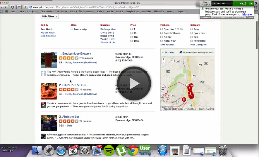
Click the “Play” button to hear user thoughts on the Bookmarks feature.
It would be nice to allow users to have an easier and more intuitive method of saving businesses to return to later, so we prioritized bookmarking in our redesign.
4. Searching for a specific venue was extremely fast and easy
All five users were given a task to find a specific business to find out if it was open at a certain time. They all successfully completed this task, and rated the task as “Very easy”. As mentioned previously, all five used the search bar to accomplish this task.
Since searching for a specific business is working so well, we decided not to change anything about the way Yelp has designed this functionality.
5. Users relied on photos to determine the ambiance of a restaurant
When asked to find a restaurant with a certain ambiance, none of the five users attempted to use the search bar. Instead, three users looked through photos of the restaurant on Yelp, one visited the restaurant’s website, and the last stated that the price symbols ($,$$,$$$,$$$$) was enough to indicate if the restaurant had the right ambiance.
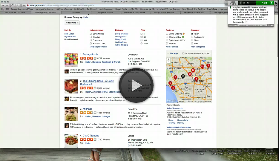
Click the “Play” button to hear user thoughts on determining restaurant ambiance.
This brought up two insights:
- Photos are an essential part of the Yelp experience, and they are critical for users to choose a business.
- Ambiance doesn’t play much of a role in Yelp’s search or filtering functions. We decided that, in the redesign, we could either include a filter for types of ambiances, or we could make it more expressly clear that using the Search bar will search for keywords in reviews as well as the name and type of business, so Search could be used to identify ambiance, menu items, and more.
6. Users relied on filters, but they could be improved
In the task where five users were asked to find a restaurant for a group of 15, three of the five participants used the “good for groups” filter, while one used the “make a reservation” feature and scrolled down until she found a restaurant that could seat the group.
At another point, one user attempted to select two categories to filter his results, but one of his choices disappeared when he clicked the other. (See the video below.)
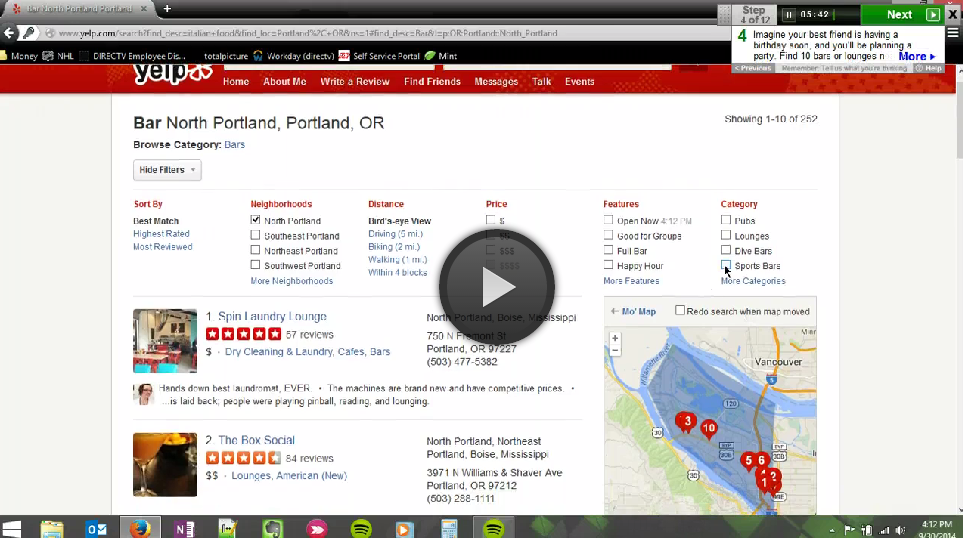
Click the “Play” button to hear user thoughts on using Filters.
While filters are important, we learned that they could be greatly improved. This finding inspired us to run a card sort on all of Yelp’s current filter options to determine which ones are actually useful to users.
7. The price categories weren’t clear
When users were searching for the restaurant with specific parameters, one of the requirements was to find a restaurant within a $20/person budget. Two of the five users were confused by whether their $20 restaurant budget would fall into the $, $$, or $$$ category. One user stated that she didn’t know what the symbols meant, and another clicked the wrong category. The other three correctly chose the $$ category.
The definition of the symbols does not display when users select filters; it only displays when the user navigates to a particular restaurant’s page. Since price expectations are highly subjective, it was unclear to users which category they should choose.
With this insight, we decided that in our redesign, we would need to be more explicit about what each dollar symbol indicated.
Design Based on Usability Testing
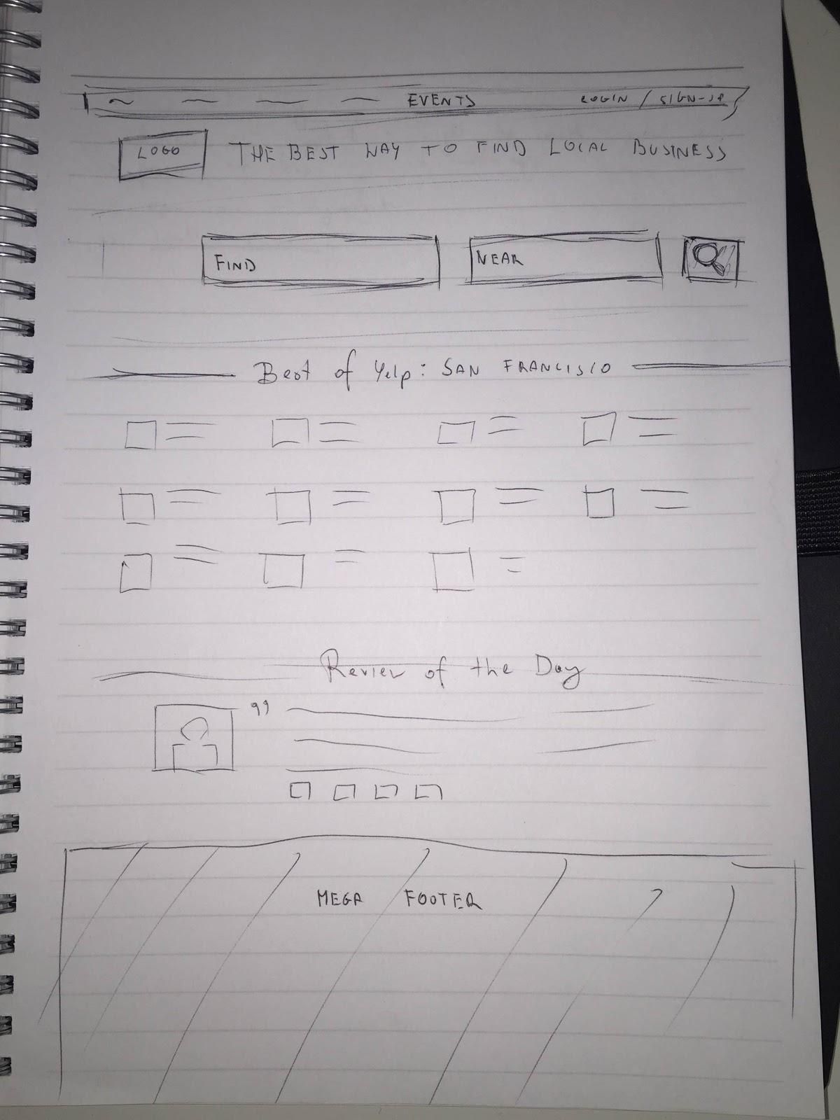
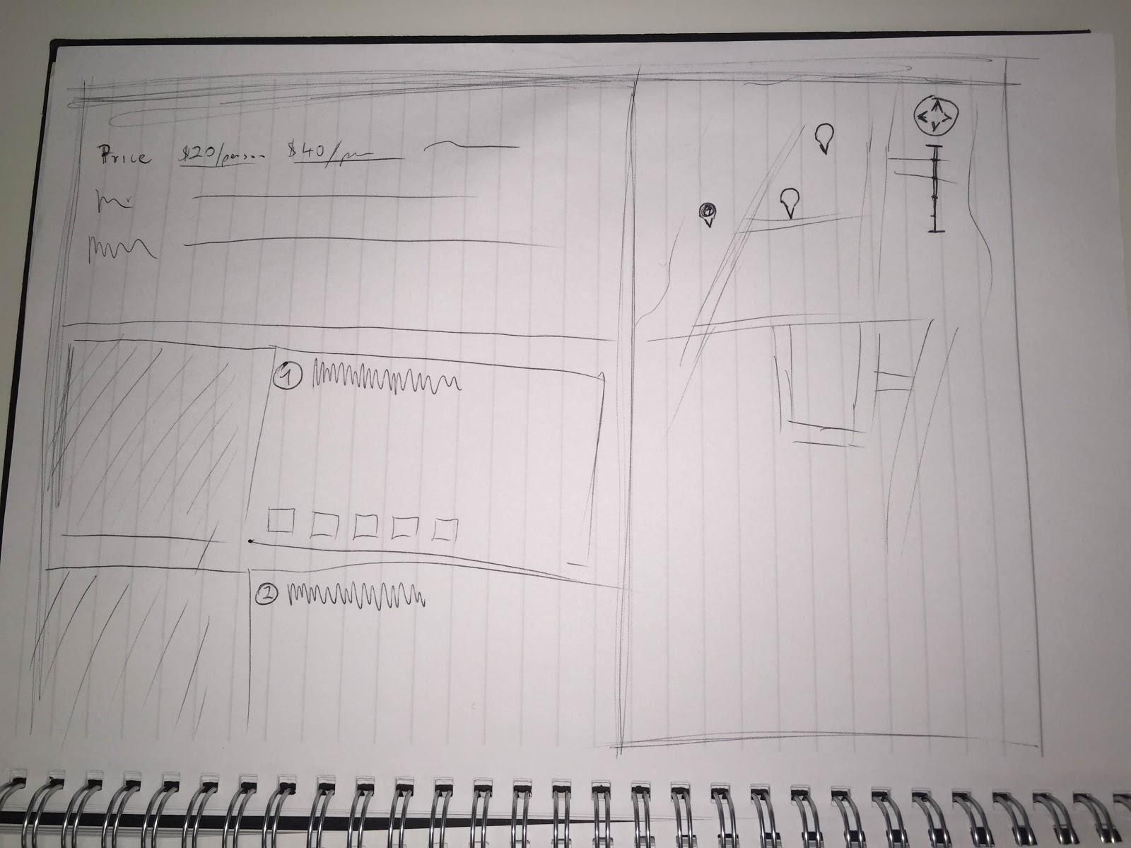
Once it was time to design, we followed an approach based on the last few steps of the Google Ventures design process. UXPin CEO Marcin Treder first started with many informal sketches before a team decision helped cull it down to the top 2-3 sketches. To prevent design by committee, Marcin had the final say regarding which sketches would progress into wireframing and prototyping with UXPin.
After moving into UXPin, we created a wireframe to incorporate most of the design changes, then added some interactions and animations to turn it into a low-fidelity prototype. Once the animations were smoothed out, we added detail in UXPin for a high-fidelity prototype. Screenshots from the process are shown below.
1. Sketches
Homepage:
Search Results:
2. Low Fidelity Wireframes
Homepage:
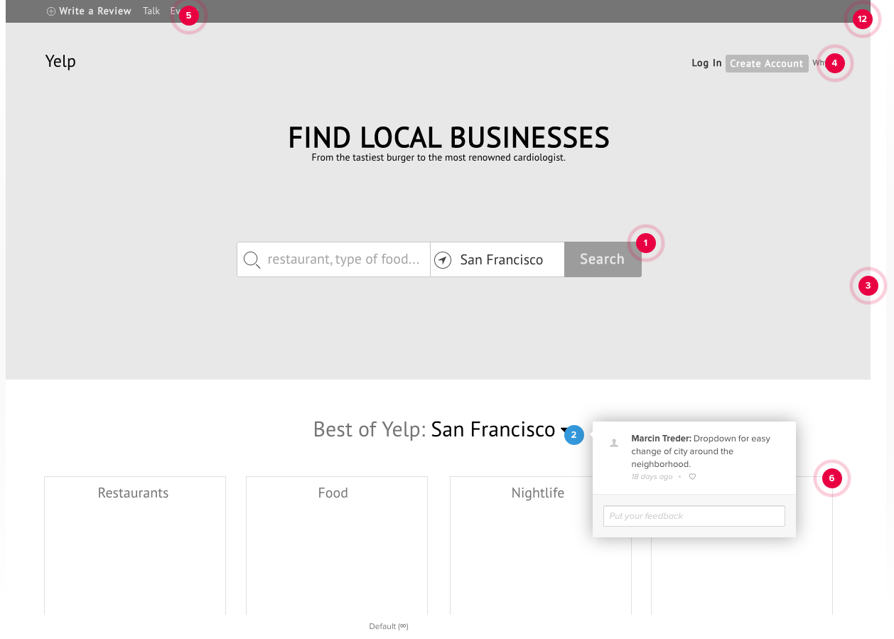
Image Source: Yelp Redesign.
Search Results:
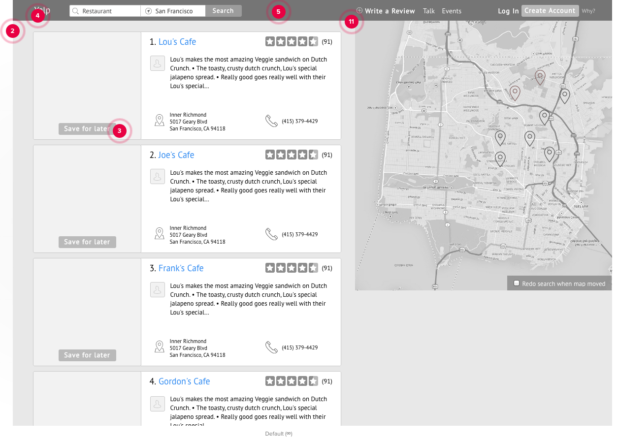
Image Source: Yelp Redesign.
3. Low Fidelity Prototype (click to interact)
To click through a few interactions and browse the entire design, you can play around with this in the Live Preview.
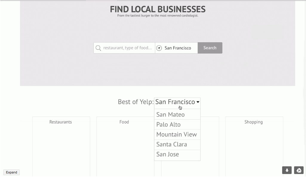
Image Source: Low Fidelity Yelp Prototype.
4. High Fidelity Prototype
To click through a few interactions and browse the entire design, you can play around with the high fidelity prototype in the Live Preview.
Homepage (click to interact):
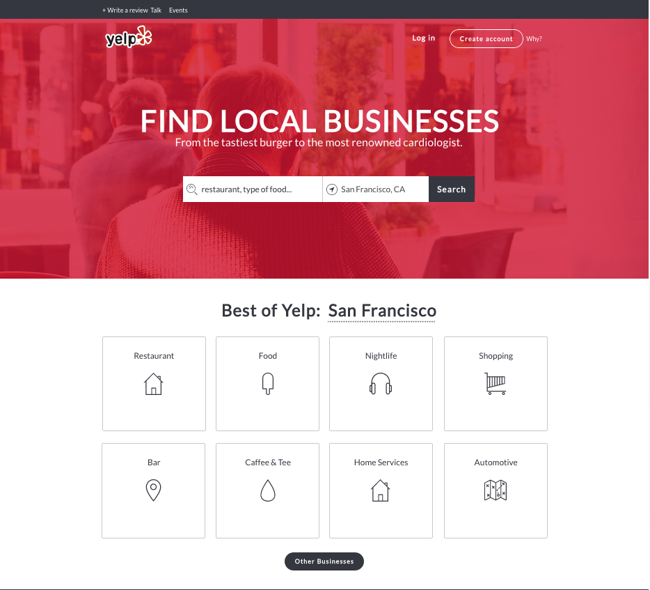
Image Source: High-Fidelity Prototype.
Search Results (click to interact):
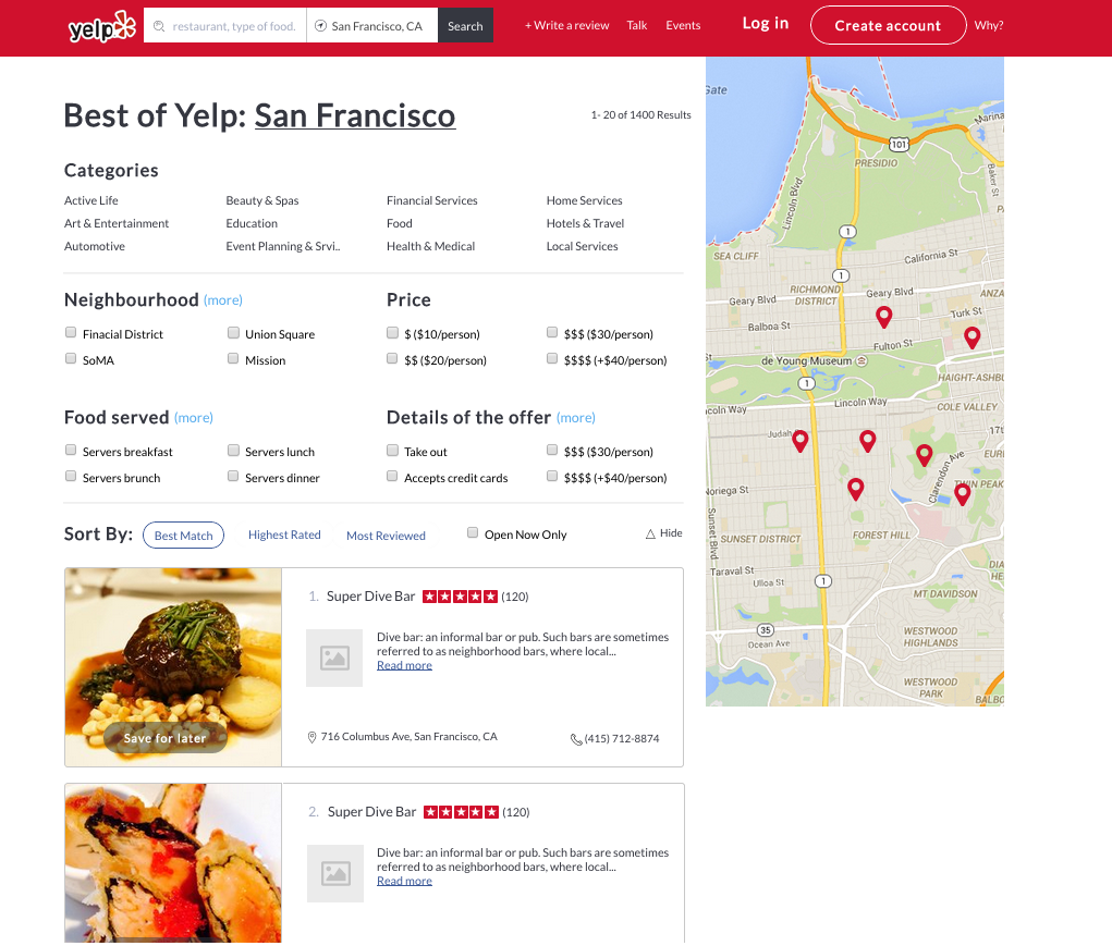
Image Source: High-Fidelity Prototype.
Watch, Listen, Learn
What users say and what users do should serve as checks and balances during user testing. While you don’t need to necessarily be present during the test, an audiovisual recording is mandatory, otherwise you might miss out on the context of actions. When you combine qualitative analysis with quantitative analysis , you’ll get an even clearer idea of why and how to fix a problem, as well as how many usability problems your design needs to solve.
To learn more about how to incorporate cost-efficient usability testing into your designs, check out the free e-book User Testing & Design. You’ll find 109 pages of screenshots and tips, using the Yelp redesign exercise as an example.
Top