All creatures have a distinct way of perceiving the world around them. Dogs have an impressive sense of smell. Eagles have the uncanny ability to see their prey from a distance. Humans, on the other hand, are hardwired to look for patterns.
In order for us to figure out what we are looking at, our minds tend to look for repeating qualities. The human brain would then, based on learned behavior, try to form conclusions as to why these patterns occur.
Pattern recognition is a cognitive process that is largely unconscious. A baby can recognize the inflections of his parents’ tones and tell if they’re happy or upset, clouds can form recognizable shapes, while some even see the image of a deity on toasted bread.
It is this piece of human psychology that encourages designers to apply tried-and-tested UX patterns when designing websites.
And while a designer would feel the need to be creative – to build something that is uniquely theirs – breaking the mold often results in visitor confusion and ultimately works to the detriment of a website.
UX Design Patterns: Significance and Importance
For over two decades that the internet has been around, designers have gained a wide understanding of user problems and their respective solutions.
These are called UX Design Patterns – the repeatable design solution to recurring visitor problems.
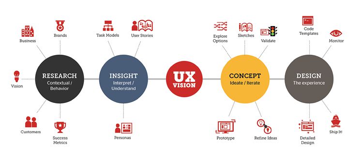
In those 20 years of internet history, designers have relied on proven interface elements. After being exposed to the same designs, users started to trust what is familiar.
For example, when a visitor goes to a travel website, they come with certain expectations of what they need to see before fully engaging. This process usually happens in just a span of a few seconds.
Upon searching for a hotel, for instance, clicking on photos is expected to generate a broader description of the hotel’s amenities. They have come to expect this, because of all the other websites they’ve previously visited that follow this design.
Breaking that pattern would disrupt a user’s expectations, resulting in confusion and eventually leaving the website.
Users are unconscious of the fact that they have learned such behaviors or that they have come to expect certain patterns. Still, they look for it. That is how they behave, and consequently, judge a website.
The key then to a UX-optimized design is to make sure that a website feels natural and intuitive for the users.
Provide users with design that feels complete, thereby engaging on an unconscious level. When they encounter this kind of design, they would have no problems interacting with the website.
In short, designs should be easy, engaging, and visually inviting.
Reinventing the wheel is generally not advisable, especially when there are patterns already in place – patterns that have been tested time and again for usability across browsers and devices.
Are UX patterns and UI patterns similar?
If we are going to the nitty-gritty of their definition, UX refers to the process of optimizing a website for effective use, while UI refers to the presentation of the website itself.
But in the context of patterns used in designing, these terms are interchangeable.
UX and UI can often be seen when it comes to pattern libraries available to designers.

Pattern libraries collate resources and examples of designs based on usability tests, personal experience, company standards, and recent trends. Some of the best pattern libraries out there include MailChimp, UI Patterns, Little Big Details, and Design Details.
The Importance of UX Patterns
UX patterns go back to the core of why designers do their work: to give users the best experience.
Being a designer requires an eye for what is visually appealing. It is understandable then that creativity and artistic drive would come into play when optimizing the UX of a website.
Adapting available UX patterns do not necessarily mean a boring, cookie-cutter design that will not stand out from all the existing websites out there. Rather, think of it as giving your users more impetus to engage with a website.
The bottom line is that designers design for users. Keeping them engaged and eventually converting them is the priority. And patterns would help achieve that.
Below are a couple of benefits websites will gain from UX patterns:
1. Reduces users’ thinking time
One of the many pain points of users online is that they do not have the time nor the patience to figure out how a website works.
They will always look for the easiest way to accomplish a certain action on a website, be it signing up to newsletters, searching for specific pages, or making an actual purchase.
Using patterns allows websites to make human psychology work to its benefit. Faced with familiar elements, people will have less time think and more reason to move to doing another task within the website.
This is not to say that a designer cannot modify an existing pattern. Changes can be applied, but they have to be justified by solid user data.
2. Designers will not need to constantly reinvent the wheel
Google itself said that users actually prefer simple and familiar designs. Complicated layouts would only drive away site visitors.
Designers can use this to their advantage.
Rewriting a design from scratch would take a lot more time as opposed to copy-pasting existing code. These are not just any code; these are codes backed with usability testing over the years.
With the time you save, you can devote that to the more enjoyable part of designing – creating and tweaking codes.
Case Study: Quantitative Analysis of Using UX Patterns
To further drive home this point, Shay Ben-Barak conducted a case study with one goal in mind: to demonstrate the decrease in user performance when using a non-conventional design.
Here are his findings:
A. Goal of the Experiment:
Ben-Barak wanted to prove his hypothesis by having the test subjects use the standard keypad and the disruptive keypad:
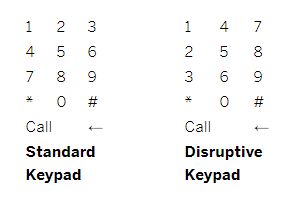
The goal is to measure their performance based on the difference in reaction times, as well as the number of mistakes committed when using the two keypads.
B. The Experiment:
Using a keypad app, the participants were asked to dial a 10-digit phone number they have memorized by heart.
They were to dial the number twice – once on the conventional keypad, and once on the disruptive keypad.
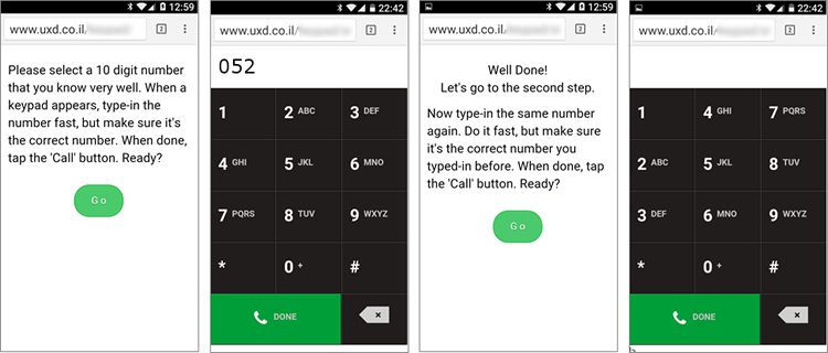
Performance is measured based on the time it took to dial the number on each of the keypads, as well as the number of taps on the backspace button.
C. Findings and Conclusion:
Out of 150 test subjects, 130 were deemed valid pairs after eliminating subjects due to various factors like easy-to-type numbers (12345…) and technical issues.
The results are as follows:
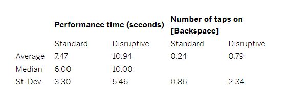
Based on the table, using the disruptive keypad took users a longer time, specifically 46% more, to type a ten-digit number.
Half of the test subjects (50%) using the disruptive keypad took more than 10 seconds to dial on average, as opposed to only 15% of subjects that took 10 seconds to dial on the standard keypad.
Interestingly, 22% of the number pairs didn’t match, implying that the disruptive keypad became too confusing that participants weren’t able to dial the right number at all.
Lastly, there is also a direct correlation between the use of disruptive keypad and the number of taps on the backspace button (correlation value: 0.77).
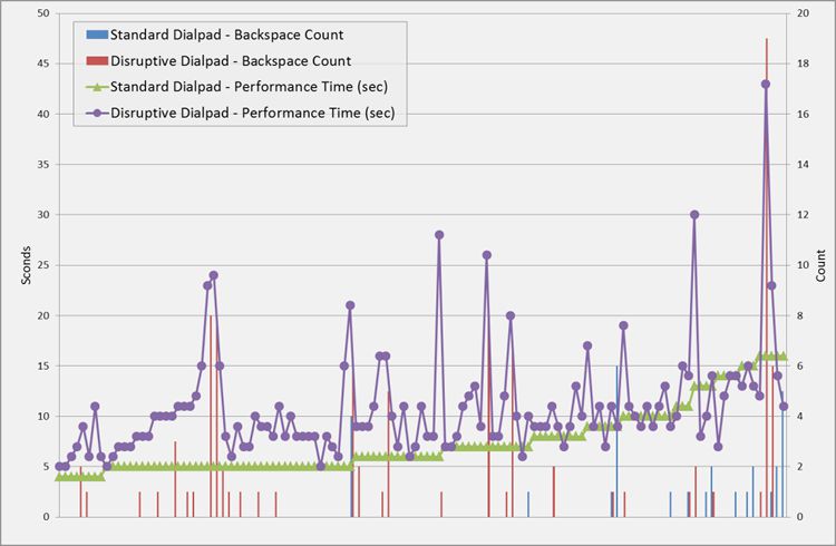
The non-conventional keypad increased performance time by 30-50%, as well as increased the probability of mistakes committed by users. These findings can prove to be costly to site owners, as changes from what is conventional can affect user behavior negatively.
This experiment further proves the point that UX patterns are needed when designing a website.
Related Topics
Top