Although many people are designing mobile products that are social in nature, few understand what that really means, how it works, or why it’s important.
While social features are becoming increasingly important for many reasons, they require careful thinking about the identities and respective communities impacted by them, and how the nature of the product changes with this kind of user interaction. For example, every social network you could possibly link to (i.e. for sharing purposes) is different and serves a different purpose for the users involved. And some information may be really sensitive (i.e. bank information, personally identifiable information, or users may want privacy so they can’t be viewed or contacted by certain people or anyone. These are just some considerations, but the list is virtually endless as mobile applications incorporate more designs around who we are as unique and social people.
In this article, we dive deep into 10 different UI patterns for social design. We’ve also previously delved into the importance of navigation design patterns, you should check that out as well.
An Overview of The Patterns
Here’s an overview of the design patterns we’ve detailed in this article:
- Achievements & Badges.
- Auto-Sharing.
- Activity Feeds.
- Friend Lists.
- Follow.
- Vote to Promote.
- Pay To Promote.
- Direct Messaging.
- Like.
- Find & Invite Friends.
1. Achievements & Badges

Example: Codecademy, Stackoverflow
Problem: The user wants incremental encouragement and a general sense of progress
Solution: Build gamification into the user’s interactions with the website. Apart from the regular user interactions like listening to a song or posting an update on a social network, many sites also want to encourage users to complete their profile information or interact more frequently with the app. In these cases it makes sense to provide some incentive to the user so that this extra step appeals to them.
Gamification is one of the most popular ways of doing this as it can be a great way of increasing user engagement. Gamification applies the mechanics that hook gamers in order to make the users more engaged on the site. A gamified app is characterized by rewards the user receives as they move through different stages of the “game”. For example users of Codecademy receive points and badges as they complete different tutorials. Stackoverflow and Quora implement the same and provide users with points that can be used to unlock additional features like asking targeted questions or contributing to protected questions.
2. Auto-Sharing
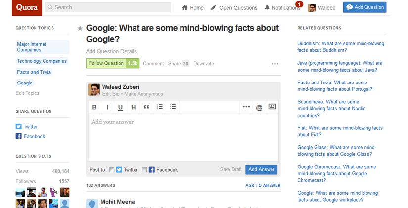
Example: Quora, Vimeo
Problem: The user wants to easily share their activity with their social networks.
Solution: Build an option that lets users automatically share particular interactions with their social networks. A lot of web apps like Tumblr, Spotify and Vimeo are building granular sharing settings which allow users to automatically post updates to their networks based on their activity. These updates can be posted within the app or even shared with external social channels like Facebook or Twitter.
Not only does this help the user engage with their friends and family in everyday activities like listening to a song or reading an article on an external website, its also a great way to build awareness and engagement with the app itself. For interactions like uploading a photo to Carousel or a video to Vimeo, this pattern makes it even easier for users by eliminating an extra step in the process which they are most likely going to take regardless.
3. Activity Feeds
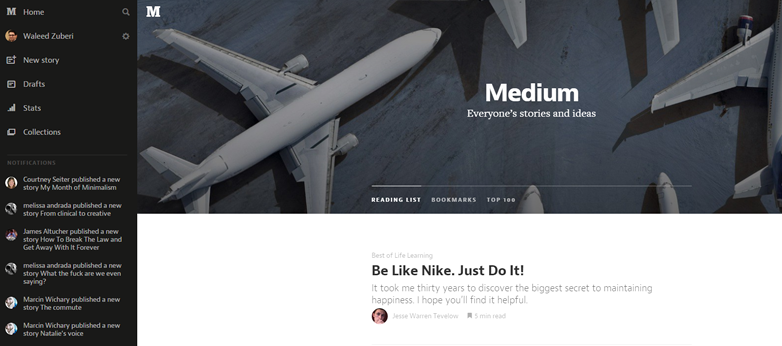
Example: Medium, Vimeo
Problem: The user wants to keep up with what’s happening around them and get quick updates on recent activity.
Solution: Show recent activity that’s relevant to the user within the app. Aside from the obvious Facebook or Twitter news feeds, other web apps that contain an element of social interaction, like Quora or Medium have implemented activity feeds that provide users with an overview of recent activity from their friends or people they follow.
The activity stream can be used to aggregate recent actions by an individual user, commonly used on profile pages; more commonly however, activity feeds are used to aggregate multiple users from the perspective of one user. These feeds are extremely useful in demonstrating different features of the UI by showing how other users are interacting with it, and this also plays a great word-of-mouth role.
4. Friend Lists
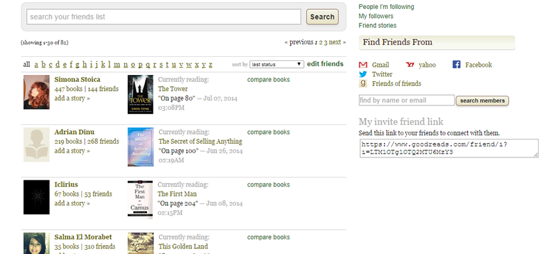
Example: Goodreads
Problem: The user wants to keep track of and engage a subset of their friends on the site.
Solution: Show all the user’s connections or friends in a list. Spotify and Airbnb are part of the growing number of web apps that give you friend lists which can be used to help users engage with the app in a better way by keeping up with how people they know are using the app. Combined with the Follow pattern, which we discuss next, a friend list gives users an easy way to keep track of this information, which comes in handy to give some social proof to content that the users are interacting with.
Friend lists also come in handy when the users want to control who they share with. Whether it’s one-on-one communication or keeping track of someone’s tastes and preferences, the way users explore their blossoming friend groups will become increasingly contextual, requiring friends to become a more integral part of the content-consumption experience.
5. Follow
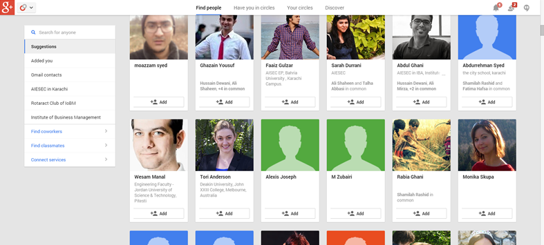
Example: Google+, Pinterest
Problem: The user wants to track and keep up to date with activity on topics or themes, not just people.
Solution: Let users select items that they want to stay up to date with. Aside from the purely social web apps like Twitter, Pinterest and Spotify, they let you select friends, channels or artists that you want to keep track of, and updates are shown in the user’s newsfeed. Whether you have friends or not, there’s endless user-generated content to keep you busy.
Users can gain access to a lot of varied content by “following” the activities and recommendations of other users and this pattern allows them to do so without having to worry about how many of their actual friends are using the app. Content shared with followers on sites like Google+ and Pinterest makes the content curation community possible and users can choose to follow topics, events, themes or even people to get fresh content built by and around the channel being followed. For the same reason friend lists will become an increasingly important UI design pattern, so will following.
6. Vote to Promote

Example: Medium, Reddit
Problem: The user wants to endorse and share content they like.
Solution: Let users participate in content curation by designing a voting system, where content they like can be promoted. The idea of crowd-sourced content curation was popularized by the likes of Digg and Reddit, and today we see almost every app that has user generated content integrate this pattern to bring up the best from the rest. On Reddit, Stackoverflow and Quora, users can vote on content created by other users. Not only does this create a history of what the user has upvoted or downvoted, it also gives users a way of popularizing content and publicly associate themselves with something they enjoyed.
7. Pay To Promote
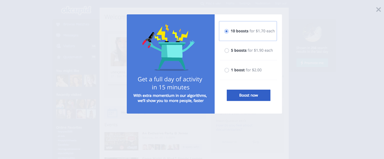
Example: Quora, OKCupid
Problem: The user wants to highlight certain content above the regular content feed.
Solution: Let users pay to to promote their content. On sites like Quora and Facebook, users can give their posts a boost by paying a certain amount that gives them greater visibility in the content feed above the regular non-paid content. OKCupid allows users to give their profile a boost in views and LinkedIn does the same albeit as part of the paid membership plan rather than by individual content like in Facebook. As discussed in the e-book Web UI Design Patterns 2014, this form of native advertising can be a great way of allowing users to gain traction and greater visibility while maintaining the user’s experience in the platform.
8. Direct Messaging
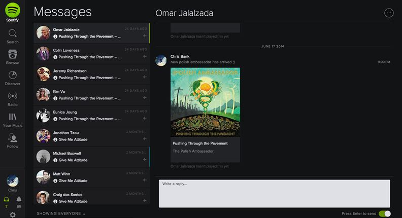
Example: Spotify, Twitter
Problem: The user wants to send private messages to their friends from within the system.
Solution: Allow users to interact with each other in private messages alongside their other interactions. Instagram and many other web apps offer chat or direct messaging as an integral part of their experience. Private chat UI design patterns will continue to blossom across many web apps, not just traditional “social networks” now that users are finally comfortable sharing more private things online and they have substantial breadth in the content they’re generating online.
9. Like
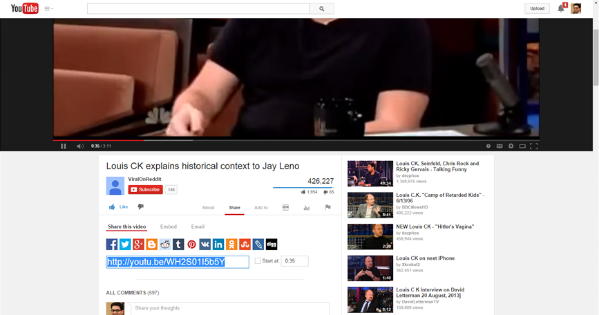
Example: YouTube, Pinterest
Problem: The user wants to rate content in a simple way without having to worry about the degrees to which they like it.
Solution: Simplify rating controls by making them binary choices – the user either likes it or dislikes it. Eliminating the fine-grain of stars and rating scores, this makes rating things easier for users as well as interpreting them. If I liked a video, should I rate it 4 stars or go all the way with 5 stars? YouTube and almost every application lets you like (or even dislike) everything in a binary way instead. A lot of web apps provide a way of showing appreciation by simply “liking” or “hearting” content.
10. Find & Invite Friends
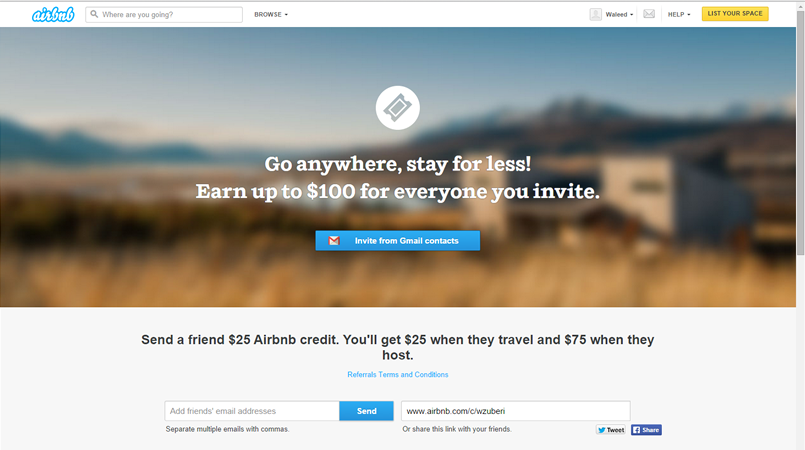
Example: Pinterest, Airbnb
Problem: The user wants to experience the application with their friends.
Solution: Make the invitation process simple and easy to complete. Since word-of-mouth and referrals are a huge driver of growth especially in consumer applications, you’ll see this UI design pattern proliferate and evolve even more. Providing users with a way of connecting with and sharing the app with friends also gives them a better, more immersive experience even if just in terms of more content. The invite feature can be built into the onboarding pattern or even as the empty state design, both of which we’ve covered earlier.
Let The User Socialize
Keep track of where your users might want or need to socialize, whether they ever view those features, how often they use them, where they’re coming from and going to in the application (i.e. the user flow) and so on. Keep rearranging, re-sequencing, re-sizing, and tweaking those controls until you get more of the desired actions. And, of course, think deeply about how the user is actually using your mobile application when they’re trying to socialize – make sure you’re not missing something obvious.
For a deeper look at how some of the hottest companies are implementing new and existing social design patterns as well as 50+ other patterns, feel free to check out the e-book Web UI Design Patterns 2014. Use what you need and scrap the rest – but make sure to tailor them to solve your own problems and, most importantly, those of your users.
Related Topics
Top