Using a quality responsive CSS framework can give you a nice head start on any web design project. Some, like Bootstrap, are a bit bloated with excess code, while others require a fairly steep learning curve.
Ideally, you want to work with a package that gives you just enough features to help you hit the ground running while not weighing you down with a bunch of options you don’t need.
You might also like these Material Design Web Frameworks or these Open-Source WordPress Development Frameworks.
With that goal in mind, here are 20 CSS frameworks that provide the basics – without all the bulk.
FICTOAN
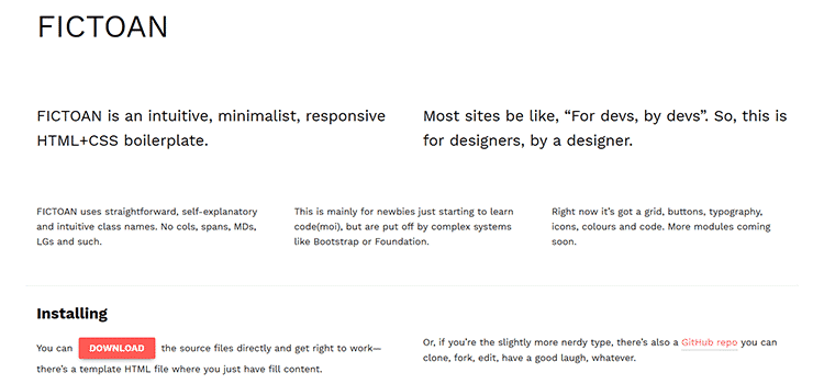
FICTOAN aims to be a great choice for those who aren’t fans of larger, more complex frameworks. It features a vivid color scheme, custom icons and lots of lightly-styled design elements.
avalanche
avalanche is a framework that you can customize to meet your needs. There are available packages to enable specific features like a fluid grid system, offset classes, containers, vertical spacing and more.
Beauter
At less than 5k compressed, Beauter certainly takes the challenge of being seriously lightweight. That doesn’t mean there aren’t features, however. You get the basics like a responsive grid, but also some extras like parallax scrolling, modals, tooltips and some nice containers.

Vanilla Framework
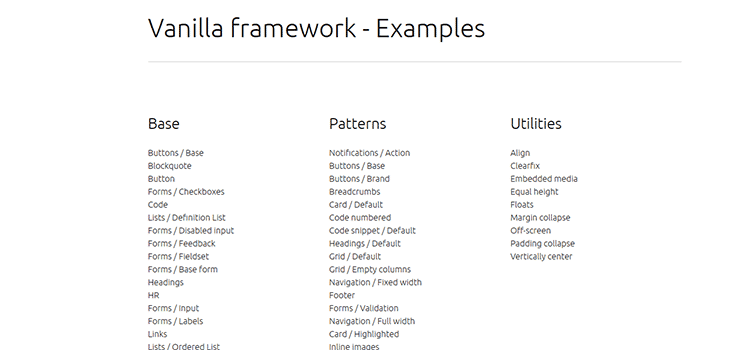
Vanilla Framework is simple by design to give you a great starting point for your project. Many containers and design elements look great on their own but are also easily customized to match your desired look.
Cirrus.CSS
Cirrus.CSS is a component and utility centric SCSS framework designed for rapid prototyping.

Halfmoon
Halfmoon is a front-end framework with a built-in dark mode and full customizability using CSS variables.

new.css
new.css is a lightweight (~4.5kb) and classless CSS framework for building HTML-only websites.

Bulma
Based on CSS Flexbox, Bulma is a fully responsive and modular framework that lets you use just the stuff you need. You get all the advantages of Flexbox, including columns and tiles that automatically resize themselves based on their number and viewport.
Milligram
Milligram weighs nearly as little as its namesake – just 2k when compressed. It includes all the basics you’d expect and is designed to minimize the number of styles you’ll have to reset.
InvisCss
InvisCss was built as an alternative to more complicated frameworks. The package features simple CSS selector names and a minimal, yet attractive UI.
Look
The result of a personal project, Look was released to the public as a minimalistic CSS framework to serve as a basic starting point for site development. Design elements are simple and can be customized to your liking.
unlimitedGrid
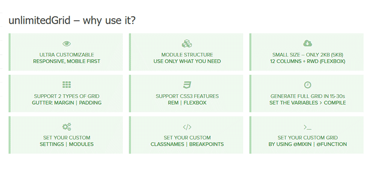
Based on Sass, unlimitedGrid is a flexible, mobile-first grid framework. It’s modular, so you only have to use the features you need. Flexbox support is included and there are multiple grid variations to choose from.
Vital
Billed as the “reverse approach” to larger frameworks, Vital is both lightweight and scalable. Built using Sass, you’ll find an efficient grid layout, custom buttons and loaders. Several useful layout styles are also included for things like photo collages, card containers and forms.
PowerToCSS
Based on the principles of SMACSS and DRY, PowerToCSS is a lightweight CSS framework that offers a rock-solid foundation to get you started quickly on your next web project.
Kouto Swiss
Kouto Swiss is a complete CSS framework for Stylus that gives you lots of mixins, functions and utilities to code faster, and also includes the power of the Caniuse website to make your stylesheets fit your compatibility needs.
Furtive CSS
Furtive is mobile-first framework with a very small footprint. This framework doesn’t worry about older browser versions, meaning that it can use ‘cutting edge tech’ like flexbox, SVGs, and limited vendor prefixing. It’s also available in SCSS, CSS, and comes with a Gulp file for customizing the build.
Webplate
The Webplate framework includes everything from a robust responsive layout engine, to global button elements, customizable forms and support for IcoMoon icon fonts. It also comes with jQuery, Modernizr and Typeplate by default.

Fluidity
Fluidity is perhaps the most lightweight fully-responsive CSS framework ever! The HTML is almost 100% responsive straight out of the box, and the 115 bytes CSS file fixes the ‘almost’ part. Can’t get lighter than that.
Schema
Built on LESS, Schema is a responsive frontend UI framework that comes with an all-inclusive collection of CSS components (buttons, drop-downs, forms…) to help get you started quickly.
Emerald
Emerald is a pragmatic responsive grid system in LESS. It is block-element based (as opposite to floats) and is written with OOCSS methodology using BEM syntax.
Bijou
Bijou is a lightweight (<2 kb) responsive 10 column grid framework. It comes packaged with buttons, alerts, tables, navbar, and of course the grid.
Spark
Spark is a lightweight framework based on the mobile-first approach to responsive design. The framework comes pre-built with several color themes that are interchangeable, in both shiny and flat styles. Currently, the base colors are silver (default), blue, green, orange, red, purple, lime and dragonfruit.
Typebase
typebase.css is a minimal and customizable CSS typography boilerplate. The most important thing that typebase.css gives you is an enforced vertical rythm across most device screens, thus ensuring that the text across columns and long copy doesn’t become uneven. Both Less and Sass versions are available.
Hoisin
Built with Sass, Hoisin is a simple responsive front-end mini framework that has been created as an alternative to more complex and bloated front-end frameworks. It purposely does not include any components, instead focussing on giving you an organised base from which you can create your own library.
Cute Grids
Cute Grids is a mobile-first, 12 column responsive grid system that was born out of the frustration of today’s large overbuilt frameworks that can be overkill for most projects and restrict the creativity of the designer.
Light but Mighty
The whole point of using a framework of any kind is to make your job easier. So going in and having to restyle a slew of CSS or loading a bunch of scripts you’re not even going to use seems to go against all logic.
Using one of the more basic frameworks above can get you off to a fast start without all of the headaches. And, being that some of them use a modular approach, you can pick and choose just the items you need for a particular project. That’s more like it!
Related Topics
Top