Let’s admit it: typography is awesome, isn’t it? If you really are serious about making the internet (or anything with written words for that matter) better and more beautiful place, you cannot disregard the importance of amazing typography.
And when it comes to typography, what’s the key element? In other words, how does good typography start? Obviously, it all begins with the selection of the ideal font! Your font choice goes a long way in defining how good (or bad) the typography actually is!
One such font, so well-loved by designers all over the world, is Helvetica. Like it or not, Helvetica is one of the most popular fonts out there.
Wait, we were talking about typography and you were getting ready to praise (or trash) me in the comments for having called Helvetica a popular font. Where did superheroes come in?
Yes, I just combined superheroes with a super-font. Actually, I didn’t. Someone else did.
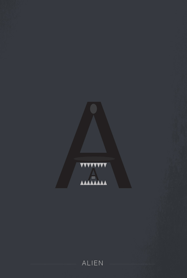
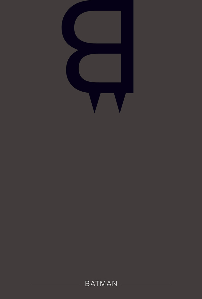
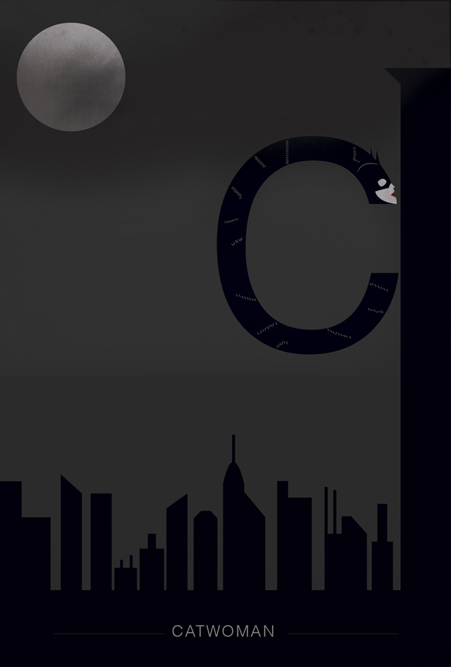
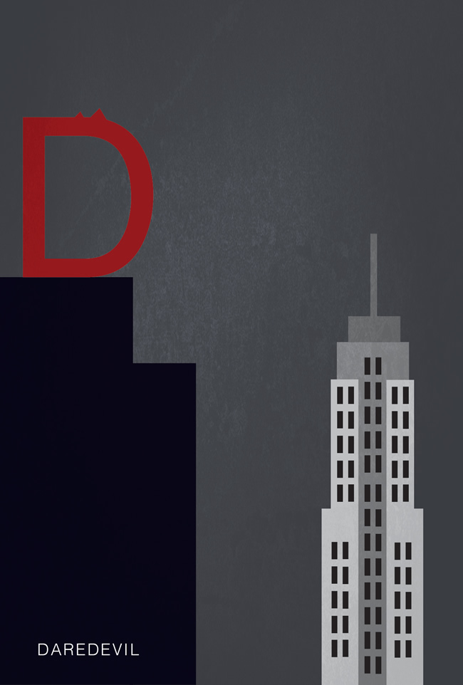
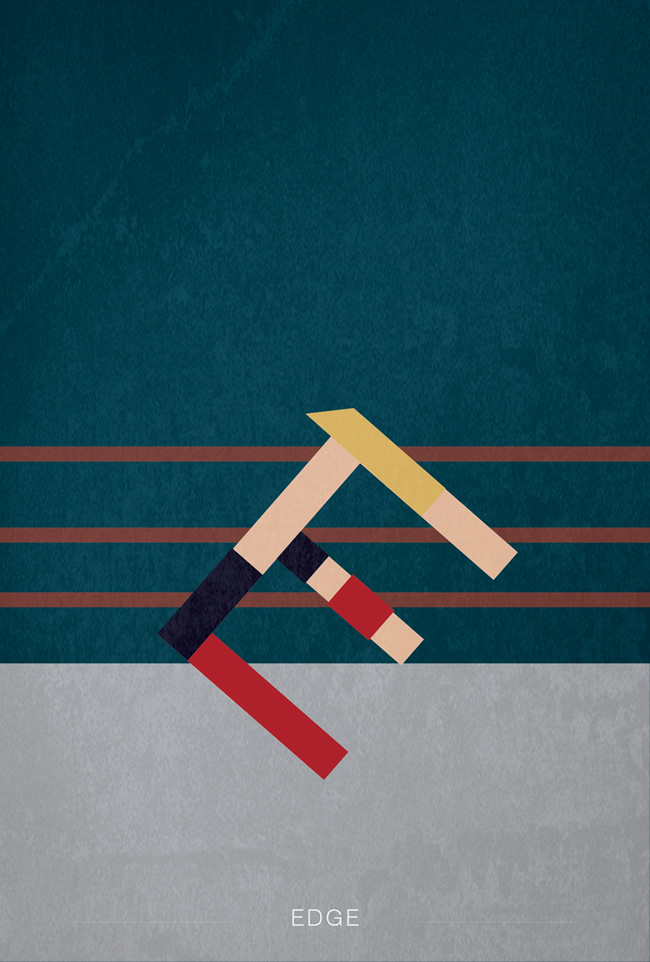
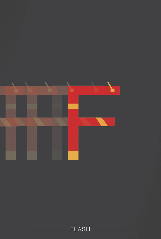
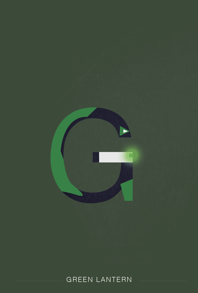
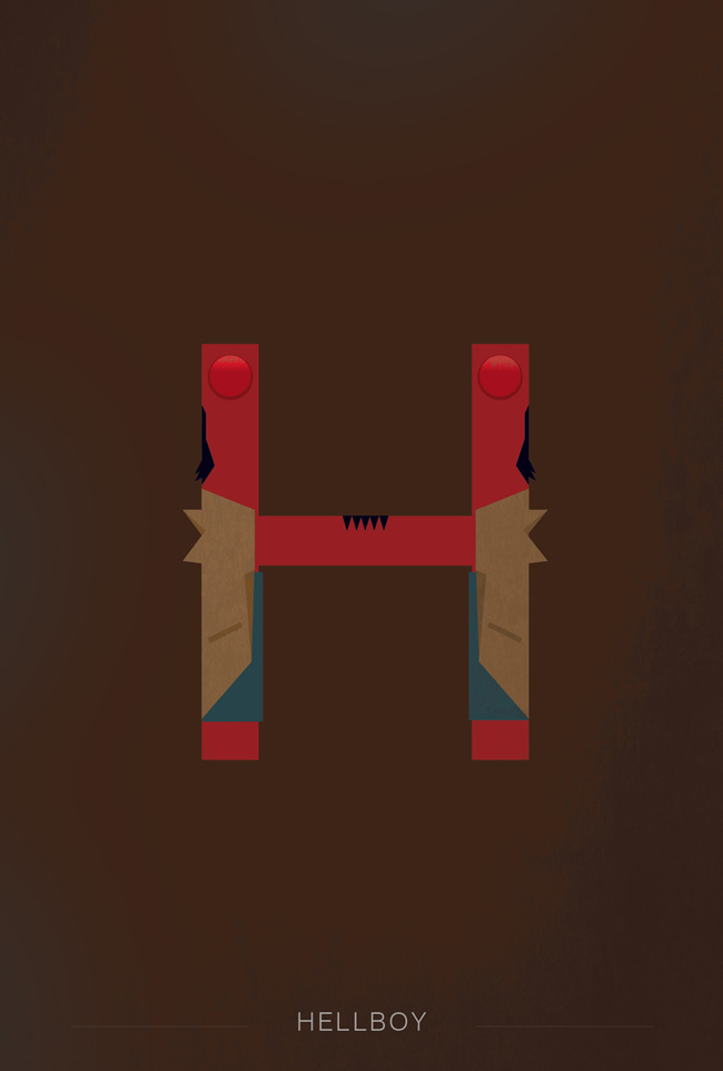
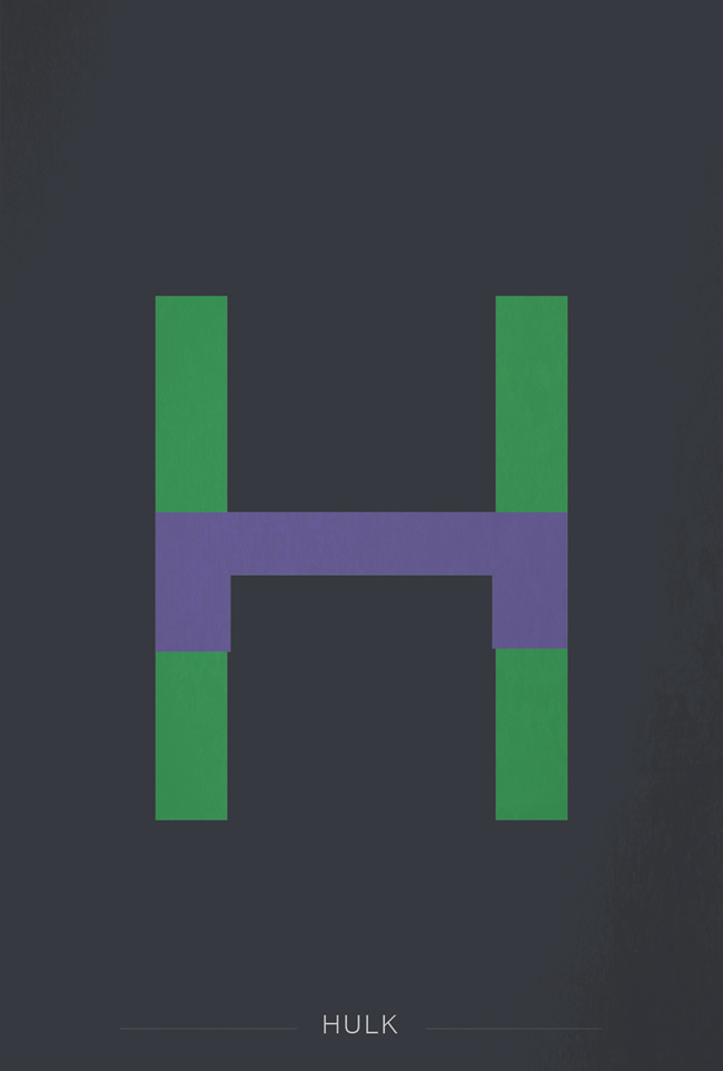
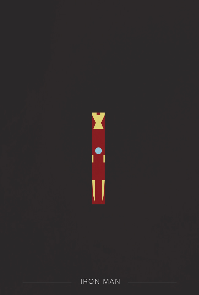
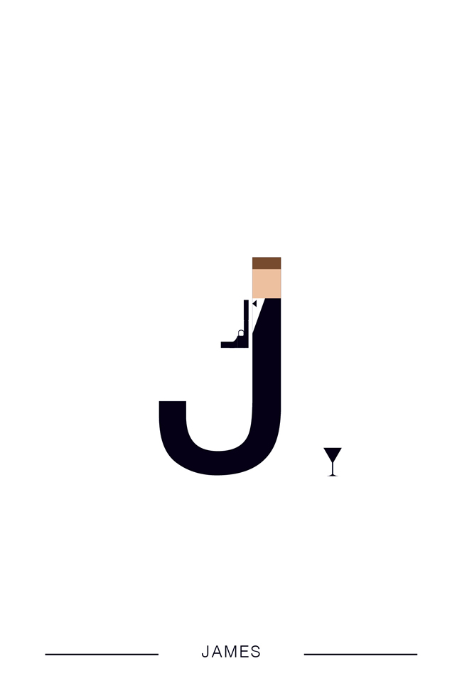
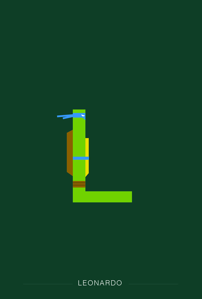
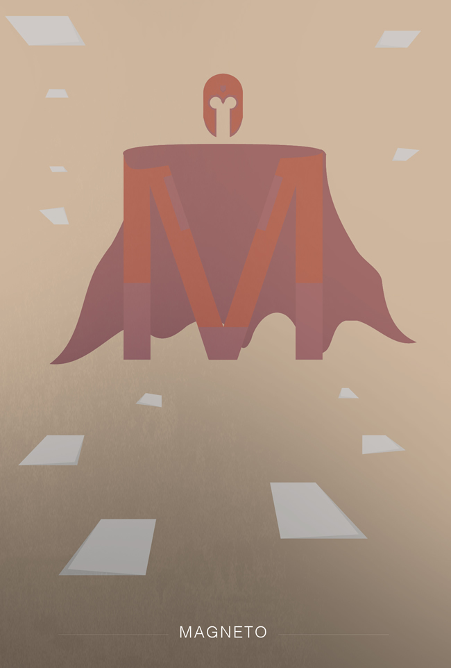
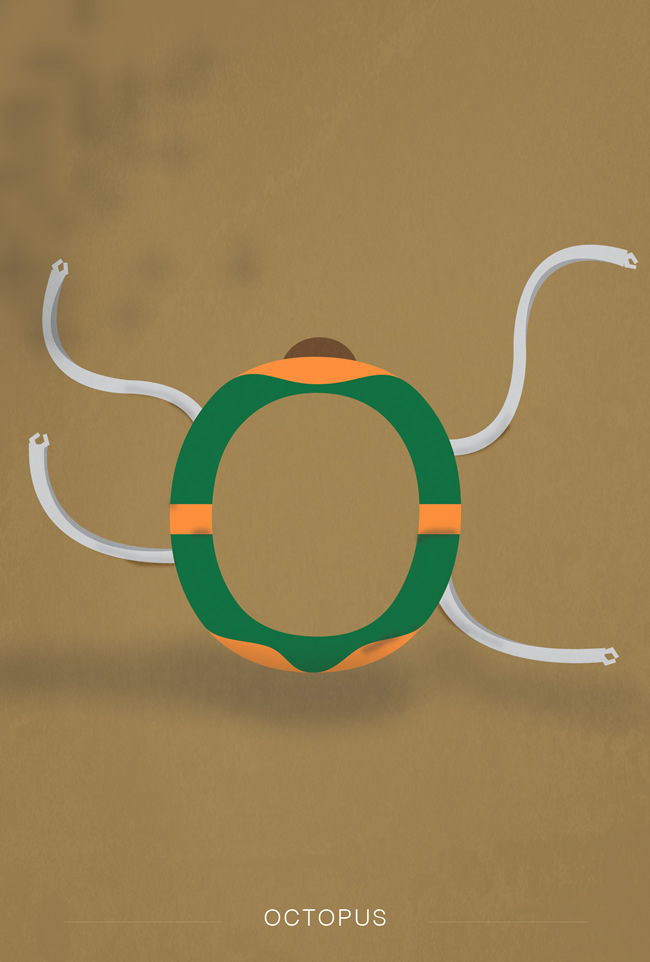
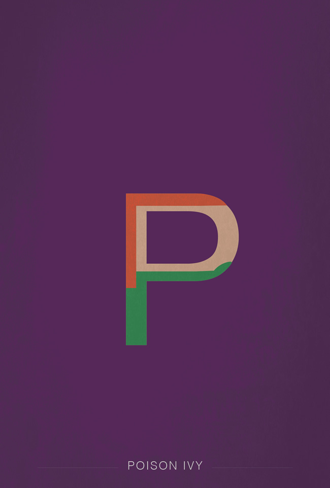
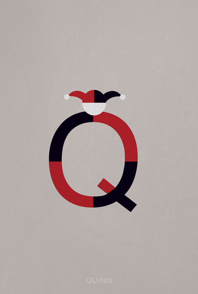
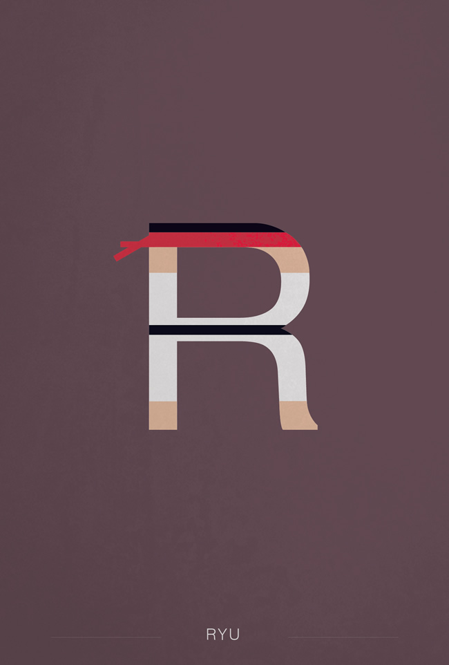
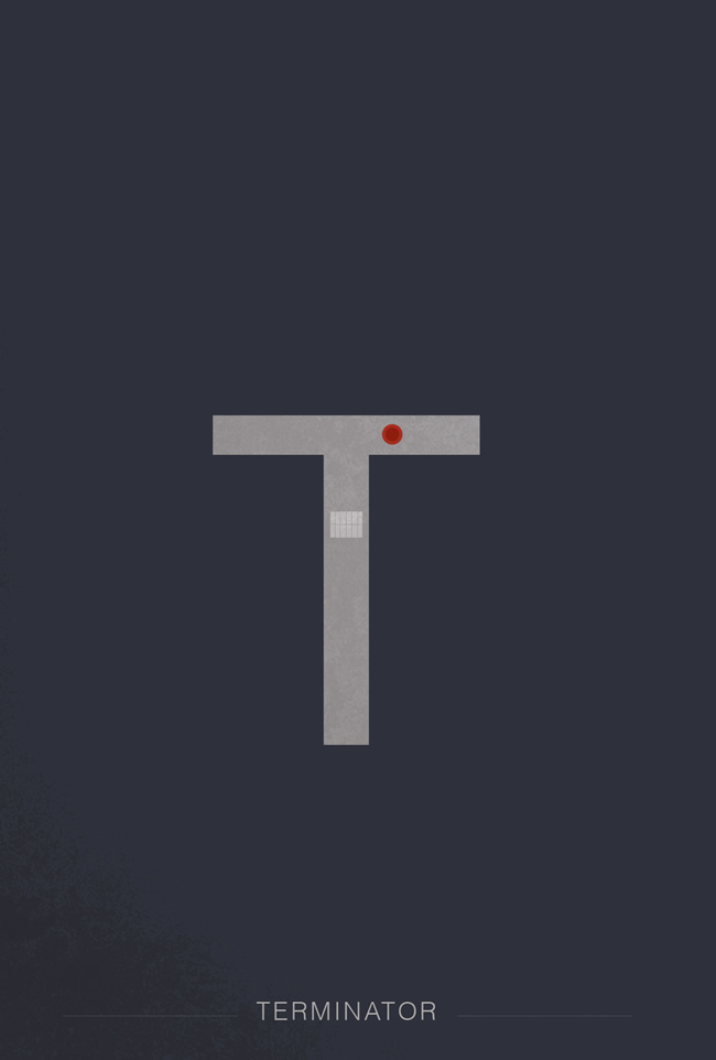
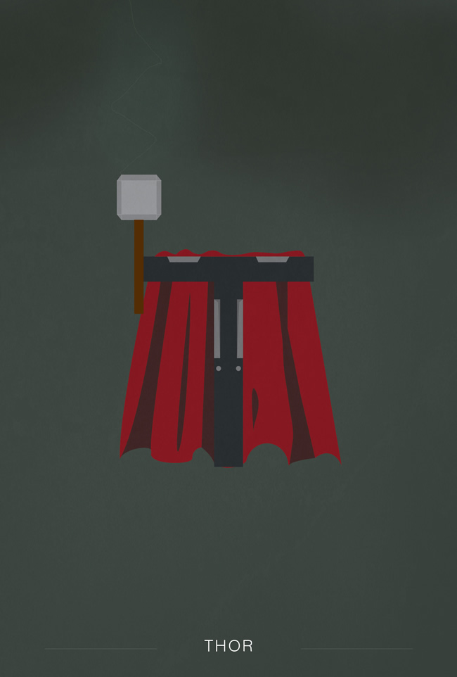
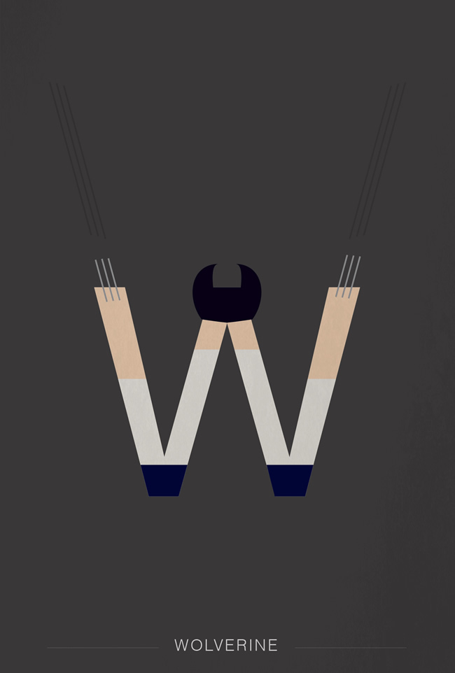
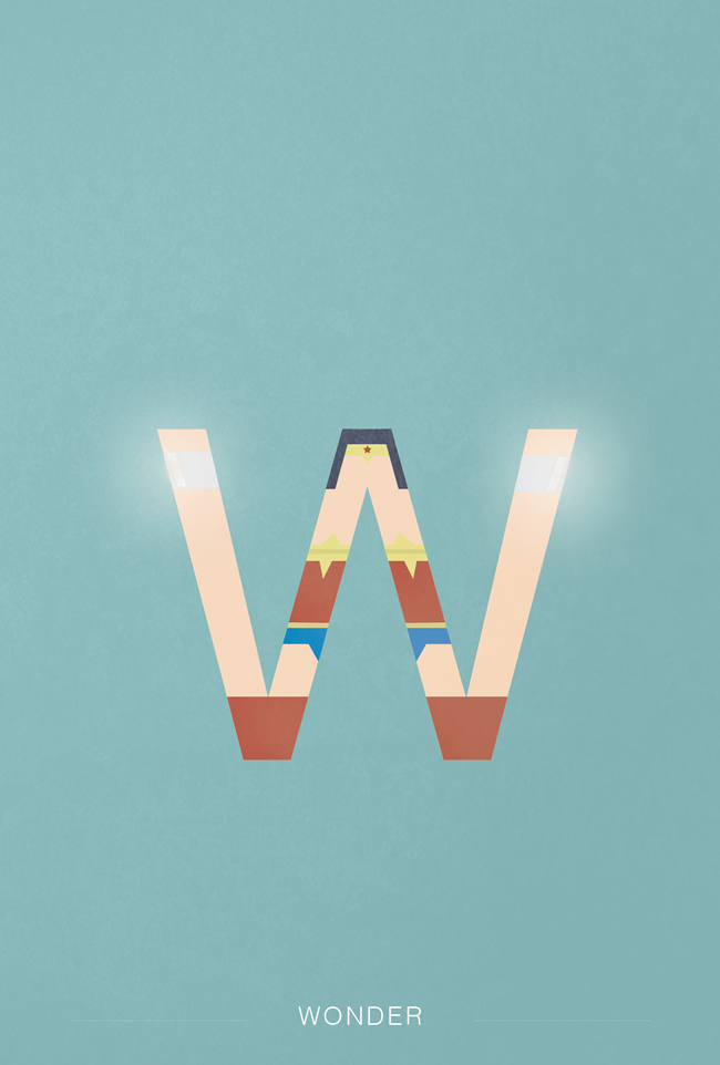
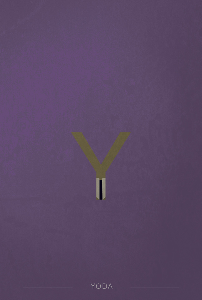
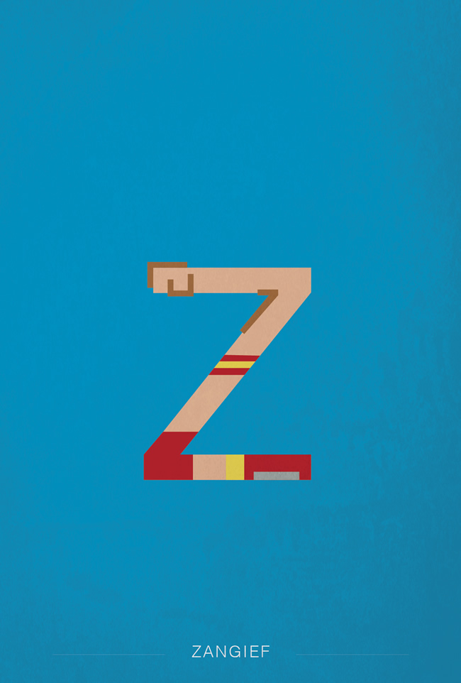
Rene Mambembe, a graphic design student from Nantes (France), has designed a humorous, minimal and impressive alphabet set of superheroes and famous characters using Helvetica, aptly entitled helvetica Superheroes Basically, in this design set, each alphabet represents a superhero or character (for instance, B stands for Batman and S for Spiderman; T for Thor and W for Wolverine; and so on).
Sounds interesting? Yes, if you are a fan of, you are in for a special treat! Furthermore, there are also some WWE superstars thrown in the mix — E for Edge, for instance. Mambembe describes this project as “a tribute to Helvetica and the superheroes”.
Here they are:
Helvetica Supreheroes
