Content is king, but typography is the crown and design is the throne. Typography and design both help content maximize its potential and withstand the test of time.
Typography enhances the readability of information on a web page, yet — quite ironically — it also helps users avoid reading. This is the true and "most humane purpose" of design. Mind blown?
Applying the principles of typography, designers break up text into blocks and offer visual shortcuts that let users sift through masses of information — making it easier to scan for information. It’s more convenient for users to decide where to begin reading if content is organized efficiently. The more information a user gets from one glance, the quicker he achieves his goals on a web page and the less time he spends staring at the screen.
A Brief Introduction to Typography
Typography is a tool with which we, designers, can create things. We use it to shape content, give language a physical body and enable the flow of understanding. From analyzing the basic pixels that make up a well-designed comma to organizing blocks of text along a baseline grid, the study of typography can help us create solid structures of information.
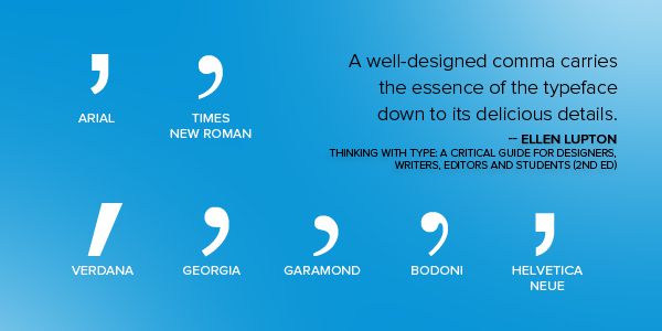
Typography isn’t just about fiddling with fonts and tinkering with typefaces. Typefaces are to designers as glass, steel and stone are to architects. Typography is about assembling those resources into something sensible and robust—like an architect utilizing industrial materials to build a skyscraper that can withstand the test of weather and time.
Typeface versus Font
Let’s clear this up, shall we?
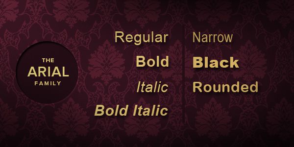
In both print and digital design, a typeface refers to the visual design of letterforms; a font is simply how those designs are delivered. During Johann Gutenberg’s time, these designs were used to create molds from which metal type casts are made. A set of metal casts is called a font. These days, however, a font refers to the software that allows us to install and display the design on-screen. Each typeface can consist of different fonts—often representing a single weight or style. In other words, a typeface refers to a family of fonts (such as Arial) while a font refers to a single member of that family (such as Arial Narrow or Arial Black).
Many designers choose to use these terms interchangeably. Now you know better.
Classifications of Typefaces
Among the various principles of typography, font choice is something we designers must master. Typefaces speak in behalf of a brand or a webpage and should reflect its personality. By understanding the different classifications of typefaces, you will be able to combine them effectively. Nowadays, there are many different kinds of typefaces to choose from. The three most popular ones are: serif, sans serif and monospace.

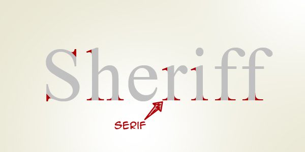
Serif typefaces are characterized by tiny lines (serifs) trailing from the edges of the strokes and stems. Also called "roman" typefaces, they are often used for headlines and narratives. Examples of serif typefaces include Georgia, Times New Roman, Palatino Linotype, Adobe Garamond Pro and Cambria.
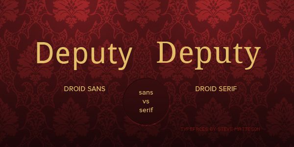
Sans serif typefaces, on the other hand, lack these tiny lines. The French word sans means "without"—hence the name. While serif typefaces are considered serious and elegant, sans serif typefaces are regarded as modern and dynamic. Due to their simplicity, they are easier to read on a computer screen, even at very small sizes—perfect for body text in web pages. Examples of sans serif typefaces include Arial, Helvetica, Verdana and Tahoma.
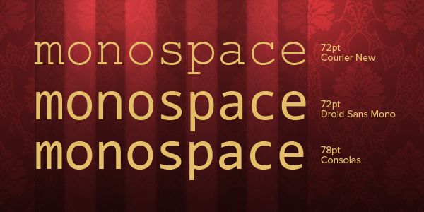
Often used to display code and plain text on webpages to enhance their readability, monospace typefaces are so called because each character shares the same width. Among the most popular monospace fonts are Courier, Consolas and Andale Mono.
Alignment and Proximity
Alignment can both refer to how text is displayed (left to right, in most cases) and how each text block lines up with others. To align typographical elements more effectively, many designers rely on grid systems such as The 960 Grid System and the Golden Grid System. Simply put, a grid system is a set of vertical and horizontal lines that a designer can use as a guide to strengthen the structure of a web page.
Proximity is also important. Keep related elements closer together with enough white space to make each of them distinct. For example, adding distinct vertical white space between paragraphs enhances readability and is often employed by news websites.
Measure
Measure refers to the width of a line in a paragraph or column. It should never be too wide or too narrow. Too wide, the blocks of text will be harder to read—eye movements tend to be jittery when forced to continuously follow a horizontal path. Very narrow lines of text, on the other hand, allow for more pauses in thought, making it easier to lose track of context and meaning.
Leading
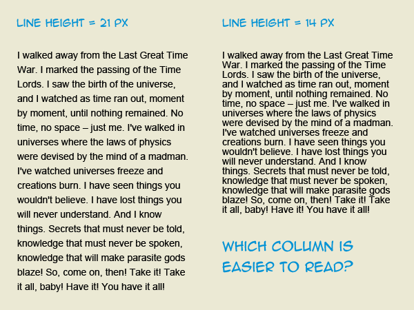
Leading, also called line height, refers to the amount of space between lines in a block of text. Striking a balance between font size and line height can drastically improve readability and "scannability." White space, if set right, should guide the reader’s eyes along the flow of content, not distract them from it.
A very small line height value makes text seem congested; a very large value makes it difficult to distinguish each paragraph.
Weight
Weight refers to the "thickness" of a font compared to its base typeface. We think of weight in terms of "bold," "light," "normal," etc. Many typefaces, however, are already either heavy or light to begin with. When combining typefaces for a design and creating balanced typographical contrast, consider weight first. It’s also a good idea to choose a typeface with distinct weights.
Don’t Stop Learning
This is just the beginning. Typography is about bringing these basic elements together to form a coherent, robust design. It may take a while for you to develop your skills in typography, but with patient practice and constant vigilance, you’ll master it in no time.
Related Topics
Top