Responsive web design has become a large topic of study over just a couple of years. Web developers are looking to keep up with trends and support the most common Internet-accessible devices. This used to mean only desktops and laptops, but now we have tablets and dozens of various smartphones all running wi-fi.
This advancement only means that developers will have to work with new trends which can adapt naturally to various screens. And this is the importance of responsive design, supporting nearly all your users regardless of device platform. In this article I would like to specifically look into handling images for the mobile web.
When creating images for responsive layouts you don’t need to spend a whole lot of time coding. There are just a couple of techniques which, if followed properly, will allow you to scale your website very quickly. And I think the best record for responsive development comes from the designers who have already been on the curve and seen the improvements.
Difference Between Mobile and Responsive
I want to first clarify a couple of adjectives in the post title which are not necessarily related. A mobile website is a layout which is catered specifically to mobile devices. You understand the screen width/height will be limited so there are often chunks of minor content removed for clarity.
However responsive designs are built for all browsers, and they are built to respond properly to any resizing. These resize dimensions could be down to an iPhone screen, or even an iPad or larger. Responsive design is like one-layout-fits-all which often includes mobile platforms. Minor content isn’t removed but often hidden on the page when there is no available space.
But interestingly responsive images and mobile images can be optimized in similar ways. When you’re building a native application the codes are different compared with an HTML/CSS webapp. Throughout the design process keep in mind that responsive images are built to respond well in any environment, and not just mobile screens.
Image Positions and Styles
Another interesting idea is to style your images with CSS3 attributes. These will help your rich media stand out on the page amongst all other responsive content. And if your images are adaptable then you can have them resizing along with the page layout.
But when I mention positioning I mean you should consider where your other content falls on the page. As users are resizing the browser window you should think about how your images will stack up. The position of your HTML elements will determine how they fall when your layout gets smaller. If you have the time setup unique properties for your img tags. These could be box-shadows or even a simple padded background.
Providing Retina Images
One aspect of responsive media is also dealing with mobile retina devices. Your regular images will appear blurry on devices with a more dense pixel ratio. So how can you go about fixing this?
Well the best solution is to prepare your images at a larger size first, preferably double the normal size you would need. So if your logo would normally be 200×150 you should create the image at 400×300 first, and then size down. This way visitors who are using a retina screen will not miss any advanced styles.
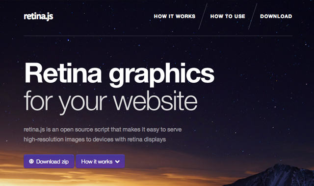
Possibly my favorite JavaScript library for @2x images would be retina.js. You can quickly download a compressed copy of the script and include this into your document header. Then when the page loads Retina.js will check if the current device supports a pixel density larger than 1x. If so all <img> src attributes will be replaced with the typical Apple-style @2x syntax(ie. pear.png becomes [email protected]).
Natural CSS Image Resizing
Aside from getting images to look pretty they should also be adaptive to your layout boundaries. By default if you leave images without a width or height setup they will fold over your page content. But responsive images do not always work well using a defined width/height.
There is a responsive method where you can define a width and height for all your images while still having them resize properly. The first typical bit of code is to add a max-width property onto all img elements with this line of code in your stylesheet:
img { display: block; border: 0; max-width: 100%; }
But the problem is that when we have fixed width/height attributes the width is flexible, yet our height will remain static. So your images will stretch and shrink horizontally but not vertically. You can fix this by adding height: auto; into your CSS properties.
Notice how this method does not require any JavaScript or external 3rd party resources. If you need any code snippet to keep handy, save this one under responsive images. I have this running on most of my responsive web projects and have not seen any bugs in Firefox, Chrome, or Internet Explorer.
Open Source Alternatives
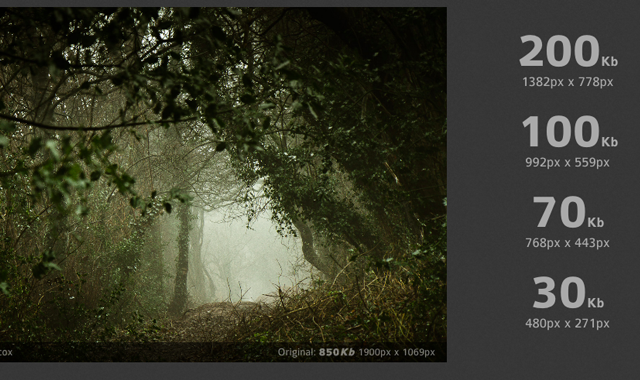
There is an interesting solution I found recently called Adaptive Images which is based on HTML and CSS codes. You add a small line of JavaScript which is tied into a PHP backend. This will generate dynamic cached versions of your images which are sized perfectly for your visitor’s browser window.
The most immediate issue I would see is hogging up server resources. It would be much easier to present one larger image resized than to have a script auto-resizing for each visitor. However the caching system does make it easier so you’re not running a new operation every page request. All you need to do is fill out a couple of PHP variables inside the Adaptive-Images file and you’re done. Just check the website for more information about installing the script.
Another alternative is a small jQuery plugin HiSRC which is hosted directly on Github. You can simply download the source code and add this script right into your document header, along with a recent copy of the jQuery library. The code not only supports responsive image techniques, but you can also supply a dual-resolution @2x copy which will be replaced on devices with larger retina screens.
Helpful Urls
There are similar articles to be found all around the web which detail points about responsive images. Gloss over a couple headlines in this list and see if you can pick up any other gems of knowledge in this area.
- Responsive Images With WordPress’ Featured Images
- Which responsive images solution should you use?
- Adaptive images: solving the responsive image problem
- Adaptive Images in Responsive Web Design
- Responsive Images Without JavaScript
- Adaptive Images for Responsive Designs
- Adaptive Images for Responsive Designs… Again
Final Thoughts
I know there isn’t a lot of ground-breaking information coming out with responsive images, but all of these ideas together bring about a new framework on the web. This isn’t a real framework, but more of a frontend code system geared towards handling responsive media and webpage content.
Definitely go through a few references I’ve posted and test out some ideas in your own projects. The quickest way to advance your knowledge in a subject is to dive in headfirst. Don’t be afraid of failure or screw-ups as these are only speed bumps throughout the learning process. If you have similar ideas or suggestions feel free to share with us in the discussion area below.
Related Topics
Top


