Fluent animated transitions for sliding web page elements such as a menu or an image gallery, have always traditionally been implemented with JavaScript. But using the CSS3 pseudo-class :target and the negation pseudo-class :not() properties, together with the CSS3 Transition Module you can achieve the same effect, but without JavaScript! This means that the very popular “accordion or toggle” effects can be easily implemented using only CSS!
In the following CSS workshop we will build an accordion image gallery to show you how all it all works!
This is what we will build…
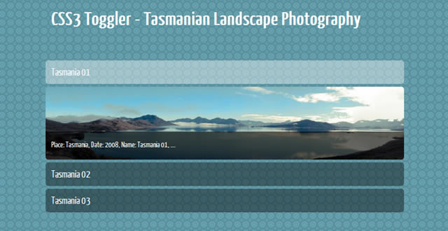
…and you can also have a quick look at the Demo before we start.
Lets get started…
The HTML structure
Getting started, the basic HTML structure of the image gallery has three left menu items, consisting of an header element h2, a paragraph p and a span element. Here they are:
<ul class="imageMenu">
	<li id="tasmania01">
      	    <h2><a href="#tasmania01">Tasmania 01</a></h2>
                  <p><span>Place: Tasmania, Date: 2008, Name: Tasmania 01, ...</span></p>
               </li>
               <li id="tasmania02">
                  <h2><a href="#tasmania02">Tasmania 02</a></h2>
                  <p><span>Place: Tasmania, Date: 2008, Name: Tasmania 02, ...</span></p>
               </li>
               <li id="tasmania03">
                  <h2><a href="#tasmania03">Tasmania 03</a></h2>
	    <p><span>Place: Tasmania, Date: 2008, Name: Tasmania 03, ...</span></p>
               </li>
</ul>
These Elements include the description of the menu item, which will, when clicked, be visible. The HTML above does look pretty poor without any CSS. Here is how it looks at the moment:
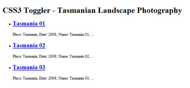
Image Gallery Toggler without CSS
Now it’s time for the CSS.
We will hide the content of the menu items by using the selector :not(: target). The linked h2 element will also need CSS, so this background-color is for all unselected (inactive) menu items.
.imageMenu:not(:target) h2 a {
    background: rgb(54,86,94);/* Fallback */
    background: rgba(0,0,0,.3);
}
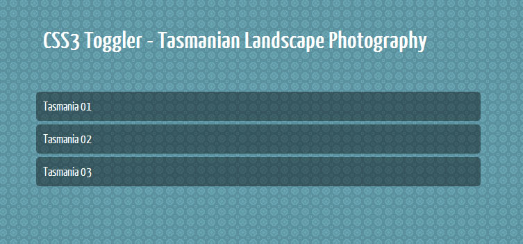
Image Gallery Toggler with closed (inactive) items
The h2 elements will be styled with a white alpha transparent background color and for better usability we will also display the element as a block.
.imageMenu h2 a {
    display: block;
    font-size: 18px;
    font-weight: normal;
    color:#FFF;
    text-decoration:none;
    margin:0;
    padding:10px;
    background:rgb(54,86,94);
    background:rgba(255,255,255,.3);
}
The pseudo-class :target in conjunction with the pseudo-class :not() allows you to offer fantastic webdesign element effects for the likes of image galleries. With this approach, you don’t need classes like “active” or “inactive” and does offer much cleaner HTML.
The pseudo-classes :not(:target) is the “inactive item” and without this pseudo-class you will have an “active item”. The inactive items are already defined, therefore we will continue with the “active items” (for example on mouse over):
. imageMenu h2 a:hover,
.imageMenu h2 a:active,
.imageMenu h2 a:focus {
    background:rgb(154,186,194);/* Fallback */
    background:rgba(255,255,255,.3);
}
The three possible states :hover, :active and :focus are given a bright transparent background color.
Here is what we have so far:
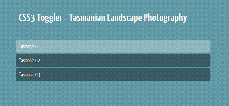
Image Gallery Toggler with closed items and a focused menu item (“Tasmania 01”)
Show me the images!
The pseudo-classes :target and :not() will need some start properties, meaning the closed state of all menu items.
Therefore we will have to define the height of the paragraph which includes the images as background-image. To get no height for the inactive state, you have to define a height of zero pixels (see line 4):
.imageMenu:not(:target) p {
    padding:0;
    margin:0;
    height:0;
    overflow: hidden;
}
The images of the gallery are shown using the background property. I know it’s not semantic to call the images “tasmania01”, “tasmania02” and “tasmani03”, but it makes it far easier to understand.
.imageMenu #tasmania01 p,
.imageMenu #tasmania02 p,
.imageMenu #tasmania03 p {
    background: url(.../images/tasmania01.jpg) top left no-repeat;
    position:relative;
}
.imageMenu #tasmania02 p {
    background-image: url(.../images/tasmania02.jpg);
}
.imageMenu #tasmania03 p {
    background-image: url(.../images/tasmania03.jpg);
}
The photographs we used for this tutorial were taken by the photographer Martin Neuhof from Leipzig, Germany.

Now it’s time to define the “active state” of the menu items of this image gallery. The inactive item has no height, the active state needs a height – a real height. Therefore you have to define a height so that you can view the galleries background images. The images are 130px in height therefore we will need the same height for the paragraph.
.imageMenu p {
    height:130px;
}
The result will be an opened menu item.
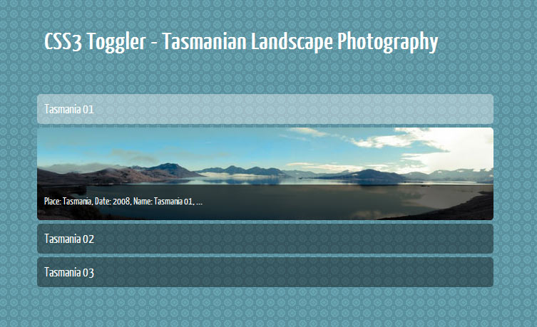
Image Gallery Toggler with opened menu item (“Tasmania 01”)
Preparing the toggle effect
Now it’s time to toggle! The CSS3 Transition Module allows for the kind of flowing animated transition we need to create the toggle. The duration is set on 1.5 seconds.
. imageMenu:not(:target) p {
    -moz-transition: height 1.5s ease-in;
    -webkit-transition: height 1.5s ease-in;
    -o-transition: height 1.5s ease-in;
    transition: height 1.5s ease-in;
}
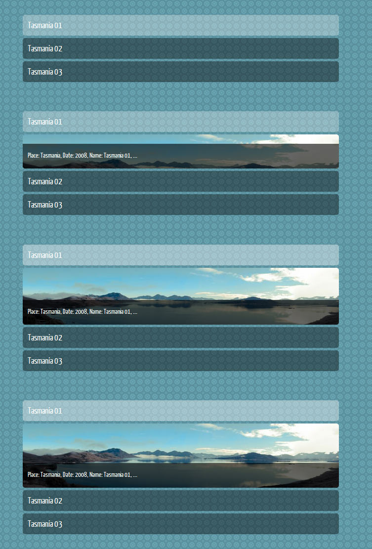
Image Gallery Toggler with opend menu item (“Tasmania 01”)
The open- and close-effect will work in IE9, but not the toggle-effect. All older versions of IE will ignore the pseudo-classes :target and :not() calls. Therefore, the the users of these older browser will see the gallery in the unfolded state.

Image Gallery Toggler as seen by older versions of IE.
If you try this CSS3 Workshop without the pseudo-classes :target and :not() the menu items will be closed!
Finished!
Here is the finished gallery:

View the Demo
Top