The design techniques for admin dashboards are not as openly shared as website layouts. This is because you do not always find examples of admin designs open on the web. To gain access you would need a user/password combo, so designers are often left building with trends found in other examples. But the dashboard interface has grown very quickly as a popular layout style for administrators.
In this article I want to look into various styles and ideas for creating administration dashboard pages. These are typical website layouts built using HTML5/CSS3/JS. Except users will not ever see these designs because the admin CP is only needed for website settings, templates, or updating posts/pages. But there are still lots of exceptional designs for admin dashboards and I hope to showcase a number of trends in this article.
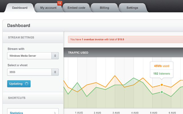
Utilizing tab buttons for page navigation has been a common trend for years. The reason it works so well in dashboard pages is because you often need to organize a lot of similar tools under the same umbrella. Using both horizontal and vertical tab menus can offer related sub-menu positions for including tons of links.
Any form of tabbed link design can work for a navbar. You do not need to handle the typical rounded corners and button interface design. More often it helps to make very simple tabs which behave as links, also using background images for icon artwork. This helps users to determine which links go to which section of the administration panel. Tabbed designs also offer a very flashy interface, using big text and bold letters will help the links stand out among other text.
I can’t make the claim that every control panel navigation should be using tabs. If we look at WordPress’ dashboard it certainly looks more like blocks of list items compared to a tabbed navbar. And WordPress is an extremely popular CMS which goes to show any navigation can work. A good strategy is to plan out a sitemap of links and then follow those ideas to a core group of link items.
Toolbar Icons
I had briefly mentioned icons earlier but I think this design trend is important even outside of navigation. Icons are a picture symbolising the content of a link or some page information. Text requires more time for the brain to read and process what it all means, but pictures are clear and concise. I think icons should be included as interface elements on buttons, tables, headers, input fields, and really any potentially confusing areas on the page.
Modern designers have a much easier time building these interfaces because of the many freebie icon releases to be found online. There are so many collections built using various themes, techniques, and design styles, that you should have no problem locating a set for your admin interface. You can determine good icon placements by scanning the page for content which seems overbearing and might benefit from visual graphics.
Popover Hover Menus
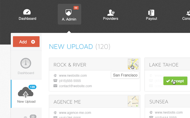
There will not always be enough space on the page to include all the inputs and details you need. Sometimes a good way of handling this problem is to initially hide some features, and then display them later using a popup menu. This could be triggered on hover or by clicking a button/link on the page.
You may also include popover menus for hidden input fields related to some data on the page. Administrators are often busy editing pages or adding new content into the website. This requires a lot of work and patience to put everything together. Obviously a popup block may contain a lot of data – even including modal windows using a lightbox or shadowbox effect.
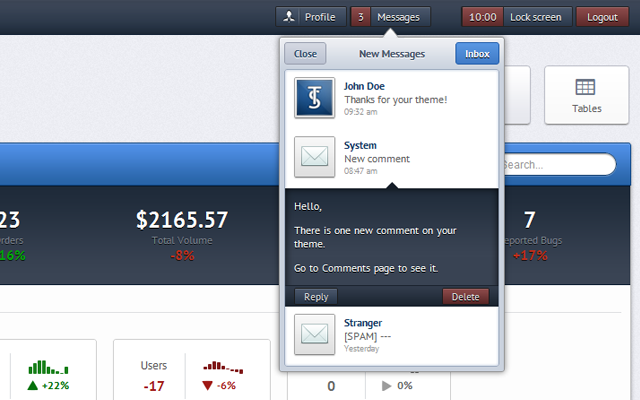
I really like the example above labeled Mango Admin. You can hover the messages link block and it’ll display some of the messages within the inbox. This trend could be expanded for new posts, drafts, user comments, and tons of other queue systems. Any typical CMS generally requires some content management to keep everything running smoothly. By reorganizing some of this content to appear hidden on the page, it can alleviate room for a more relaxed interface.
Content Display Styles
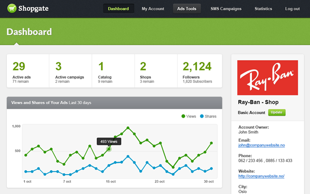
All the various administration panels do share one thing in common – their purpose is to display information. We may also use the word “content” which can include tables, lists, buttons, graphs, really anything. The entire layout is generally focused to encapsulate this content where is it easy to read and easy to edit.
I like the small icons you can see in the table which would appear to be quick access buttons. You may quickly add, edit, or delete content from within a row of the table. And the icons are colored so you will be able to tell from a distance what they do. Of course, this is just one simple example but trends like these are hard to find. Always keep thinking of new ideas or techniques which would make your administration powers easier and simplified.
It is notable that not all administration interfaces will have graphs and charts and statistics. Sometimes you will just be dealing with straight information. And even though this may seem boring, you have to think about how you will be interacting with all this data. Then you will be looking at the challenge from a user’s perception. No matter how many ideas you try out they are all worth it, because nobody has the perfect design UI and there are always new trends on the horizon.
Showcase Gallery
All of the trends listed in this article provide a nice starting point for designers. But I think you can learn a lot by studying other common examples for admin dashboards. There is a small collection of beautifully design admin dashboard designs here. You will notice some of the trends I have noted, plus you will probably discover some fresh ideas to use in your own designs.
