The question of what a website’s style should embody is a frustrating one for many designers, because, of course, everyone wants to capture the essence of the company/product in the clearest and most appealing manner possible.
But with so many tools, resources, and style inspirations available online, designers often suffer from an excess of options. So, how should you begin narrowing them down? Start by diving into this discussion comparing two prominent design styles: abstract or realistic.
Photography vs. Illustration as Graphic Elements
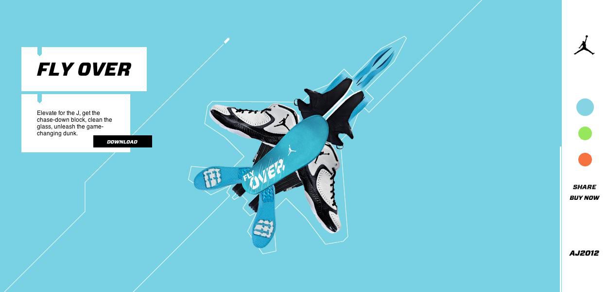
When it comes to the question of photography or illustration, there are points to be made for each, from both marketing and artistic perspectives. In fact, the equally compelling nature of both art forms has led to a rise in photo-illustration, such as in this Nike campaign. The style combines both elements, and therefore provides a sense of complexity and novelty—but that doesn’t mean that either of the distinct styles don’t have plenty to offer still.
Photography

Photography has an essentially compelling feature: that the eye is always drawn to it. And this innate attraction increases the more realistic a photo gets. For example, it’s almost impossible not to be grabbed by a website that displays a full-page photographic background of another person, like DealPult. This is because the image appears almost life-sized, and therefore extraordinarily real.
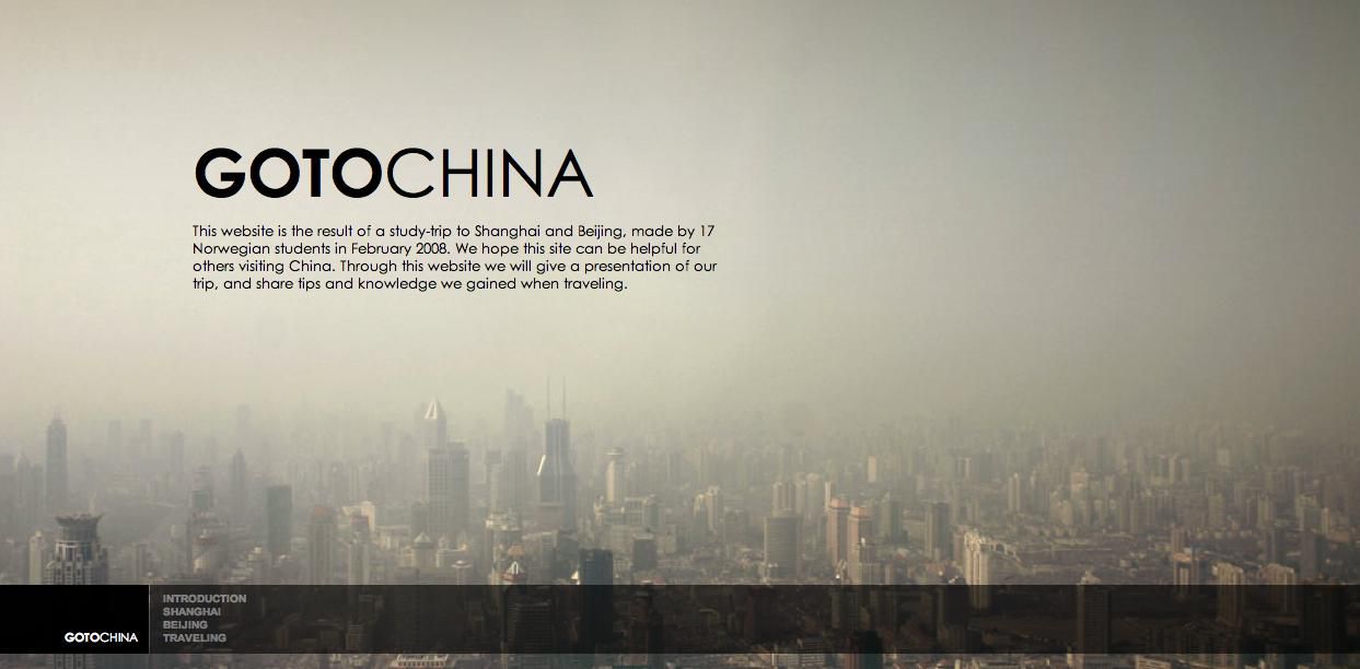
But sometimes attention-seeking imagery isn’t the objective of the design; in these cases, the text needs to take precedence. Softer photographic images like the background on GoToChina’s site can be used to accomplish this.
Illustration
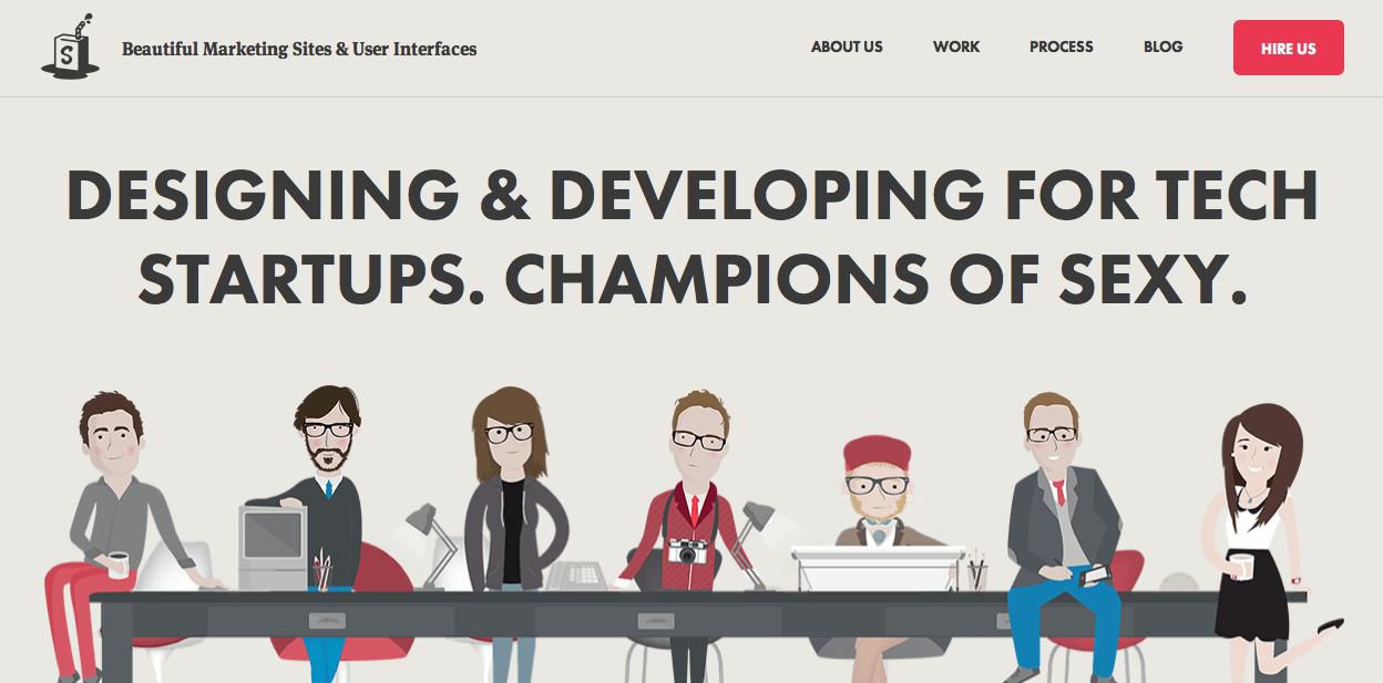
On the other hand, illustration has the advantage of being able to defy reality in ways that even the most processed photography cannot do. And, you can manipulate and create an illustration to fit specific specifications, which might not be realistically attained through photography. Illustration can convey certain concepts more clearly than photography: Simple as Milk shows how a whimsical and approachable look is effortlessly achieved through its vector representations, while complicated diagrams can also be conveniently simplified.
On the other hand, illustrations don’t give that immediate sense of depth and purpose that a good photograph accomplishes so effortlessly. More specific applications for each can be explored in this guide to comparing photos and illustrations.
Technical vs. Voice-Filled Content
There are many strong opinions whether a concise and clear or fun and witty style of writing is most appealing to a broad reader base. Of course, niche sites position themselves firmly in one category or the other, but which is the most successful across a larger demographic?
Technical Writing
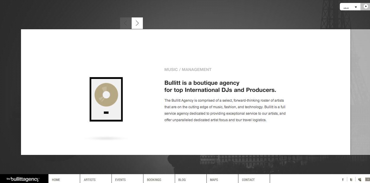
Sites like Bullitt choose to use a measured and professional tone in their copy to inspire a sense of a trustworthiness and reputability. It might be assumed that sites with a sophisticated writing style like this are aiming to appeal to an older audience. However, on looking at comparable sites, it seems that the subject is more important than the audience: a topic that seems as if it should be handled seriously works well no matter who the audience is.
Writing with a Voice

At the opposite end of the spectrum, KickPoint employs a cheeky, down-to-earth writing style. The statement it makes in its ‘About’ page is certainly more attention-grabbing than its counterpoint example, but there’s also the possibility that it’s too boldly individualistic to appeal to a majority of their audience. A writing style with lots of personality takes a bigger risk, but it also might reap bigger rewards.
Flat and Minimal Style vs Textured, Skeuomorphic Style
For this assessment in particular, it’s important to take a step back and evaluate trends for what they are; fleeting and fickle, and only fully evaluated and solidified with time. Because flat style is so on-trend at the moment, it’s tempting to say it’s the better style. But skeuomorphism has its strong points too, and both should be evaluated with their long-term benefits in mind.
Flat Style
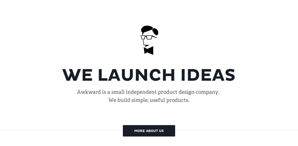
There’s a lot to be said for the dynamism and unexpectedness of a truly flat and minimalist design. Awkward’s homepage is the epitome of the look; its utterly monochromatic simplicity is striking because it is so sparing; with only four elements centered on a white page, each piece carries a sense of importance. At least for now, flat designs like this are a good choice for the types of sites that can afford to use it, because the style is so dramatically different from the majority.
Skeuomorphic Style

Although hyper-realistic site designs have experienced quite a backlash lately (leading directly to the flat style that is currently in vogue) East African Bakery shows us that there is still an undeniable place for skeuomorphism in web design. For something tactile and elemental, like baking, the layering of natural textures is a fitting choice that in no way interferes with an understanding of the functionality of the site. However, it’s equally true that a more esoteric service like the previous example is better served by its rigorous simplicity.
After looking at all these examples, it seems that even a simple question like this, unfortunately, doesn’t have as simple of an answer. But it can be distilled down to a fairly basic observation: the topic and objective of the site are the determining factors for whether an abstract or realistic approach is the most fitting. There are equally convincing arguments for both sides of the equation, and decisions should be made according to which style most fits with your overall objectives.
Related Topics
Top