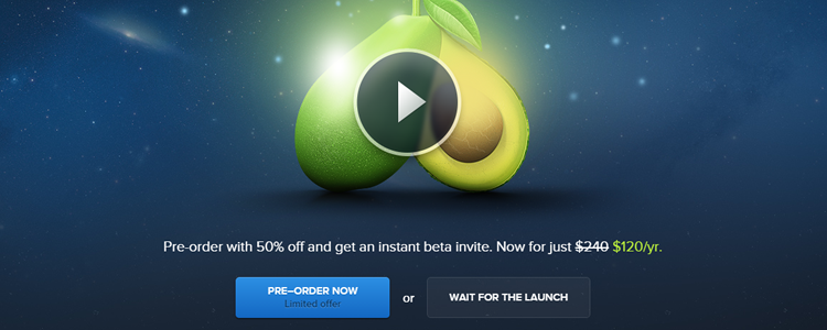
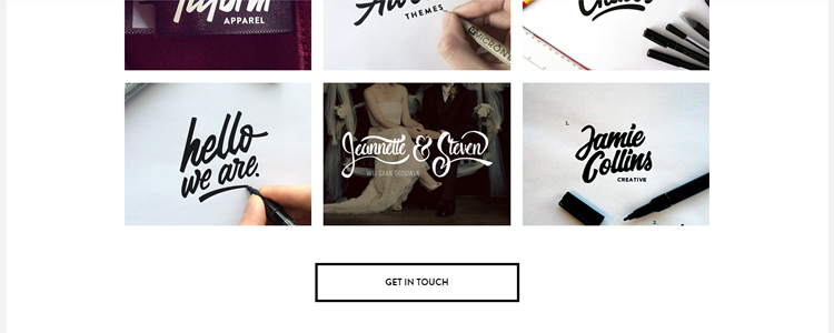
Every year various design trends fade in and out of the community. In 2014, one of the dominant design trends to pass through the web design world has been the Ghost Button. To understand the Ghost Button, we must firstly go over the Ghost Button itself, where this trend originated from, what are some of the pros and cons, and also view some examples.
Let’s get crackin’.
The Ghost Button
The Ghost Button is very easy to identify and have been increasingly cropping up in the last 10 months or so. In all occasions, the Ghost Button is transparent and empty. They seldom have color other than white and typically placed on a picture background or hero image. They most often appear as Call to Action (CTA) buttons and offer a clean look. They are often paired with a cleanly designed website and compliment the overall clean aesthetic of the layout. Some other design elements of a Ghost Button are:
- Surrounded by an outline
- White or black text and border color (minimal color)
- Larger than traditional buttons
- Prominence on the page
- Stands alone – or if in a group, related to another group of buttons
- Transparent with background showing through
You often see ghost buttons used well when they have a distinct contrast to their background and are clearly readable. This can definitely help with a website’s CTA since it provides an obvious element on the page — at least when placed against a background image. You also often notice them in the startup industry as a core design element, as well as see them in flat HTML and CSS frameworks such as Bootstrap and Startup Framework.
At the end of the day, it seems that there is a correlation between flat design and ghost buttons.
Ghost Button’s origins and Flat Design
Design trends are sometimes difficult to track down and Ghost Buttons are no exceptions. The first website that coined the term Ghost Buttons came from the Tumblr blog Websites with Ghost Buttons. The ghost button seemed to evolve from Apple when they redesigned iOS 7. Many, if not all of the buttons on iOS 7’s UI are what we would call a ghost button.
Notice safari’s bookmark section…

…and the update screen in the app store…

…all great examples of Ghost Buttons.
Amit Tripathi of Crispy Coding agrees that the introduction of flat design through iOS7 has helped increase the popularity of the Ghost Button: “Since iOS7 promoted the use of flat UI, ghost buttons have also seen a huge surge in popularity“.
So at the end of the day, the origin of the Ghost Button came from the flat design revolution. Though not created by Apple themselves, Apple helped increase the popularity of not just flat design but also the ghost button.
What are some of the Pros and Cons
With every design trend, it is important to understand the pros and cons of the specific trend.
Some of the advantages of Ghost Buttons are:
- Clean, simple and modern design
- Obvious CTA (when used correctly)
- Unobtrusive CTA (when used correctly)
- Not distracting — background image viewable
- Easy design and implementation
- Sophisticated look
Some of the disadvantages of Ghost Buttons are:
- Can be confusing for non-technical users
- Background image could drown out button
- Button could overpower background image
- Could be dated in a few years — think long term
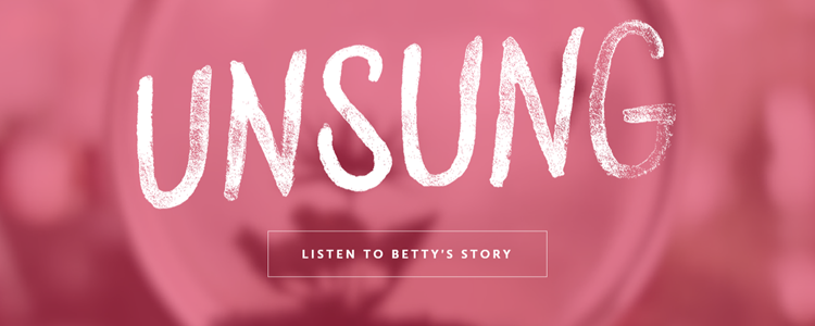
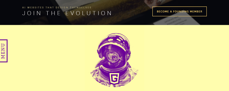
Examples



Wrap Up
After reviewing ghost buttons, it’s origins, pros and cons, and some examples, it seems that ghost buttons used in the correct way can be good for design and for sales (effective CTA). It doesn’t seem that flat design isn’t going away anytime soon, so I definitely would recommend using this design element.
What’s your take on ghost buttons? Let me know in the comments below!
Related Topics
Top
