It seems almost crazy. I began my journey as a web designer in 1996, working for my local newspaper. If my math is right, then I’m just about to enter my twentieth year. More than half of my life has been spent working on the web.
As such, I thought it might be interesting to take a look back at how the web worked (or didn’t) back then and compare it to some of the challenges we face today. The question I have is, does history repeat itself on the web?
Tools of the Trade
In 1996, web design was in its infancy, at least in a commercial sense. Back then I coded (and that’s putting it kindly) HTML by hand in Windows 95‘s Notepad.
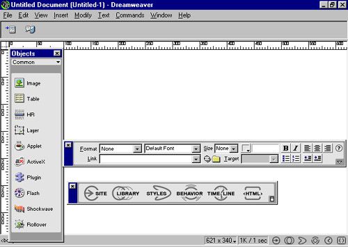
Some rudimentary web editors, such as Coffee Cup, existed. But WYSIWYG was not even close to reality. Most often I found that any HTML editors out there wrote sloppy code (much like I did). That didn’t start to improve until 1997, when Macromedia released the first version of Dreamweaver (later bought out by Adobe).

Macromedia released Dreamweaver in 1997
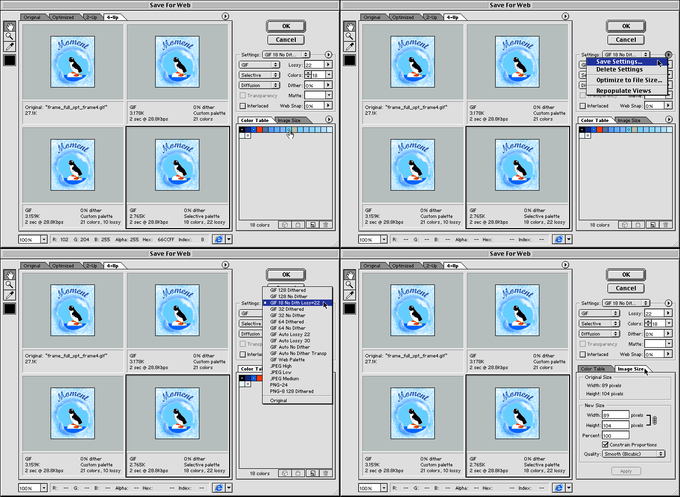
Speaking of Adobe, its venerable Photoshop was not at all the web-design-friendly app that it is today. Why, looking over its version history, it’s amazing to think the ever-present "Save for Web…" option didn’t come to Photoshop until version 5.5, released in 1999.

Photoshop 5.5’s Save for Web Dialog. (Image Source)
Before the days of all the CSS3 goodness we now enjoy, Photoshop was pretty much your only option for shadows, rounded corners and gradients. Compressing images for web use wasn’t even a thought in Adobe’s mind back then.
Beyond graphic and code editing, the main tool of choice for a designer was a good old FTP client. Web-based file uploads over 56k modems weren’t an option.
Does History Repeat Itself?
Certainly not. Dreamweaver and Photoshop are still quite popular and work well. Not to mention hundreds, if not thousands, of other tools to make design and development much easier. Whatever your tastes and requirements, there’s most likely a tool out there to suit you perfectly.
Browsers
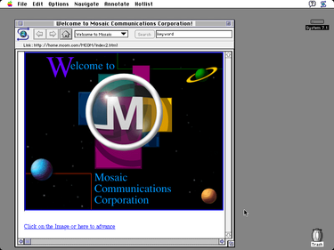
Anyone remember NCSA Mosaic? Co-developed by Marc Andreessen, who later went on to develop Netscape, Mosaic was bundled with a lot of internet service provider (ISP) starter kits. Both Netscape 2.0 and Internet Explorer 3.0 were released in 1996.

The Mosaic 1.0 web browser
The browsers were buggy and unstable. It was not uncommon for a specific website (especially one running Shockwave/Flash) to repeatedly crash your browser session – meaning you never would get to actually check out the site.
One of the worst trends of this time period were sites that featured proprietary code, which would only work in Internet Explorer (thanks, Microsoft). This also led to mostly unusable sites while using non-IE browsers.
Does History Repeat Itself?
Thankfully, no. While we still have to deal with some older disasters, I mean versions of IE, things now are clearly better than they were in the 90’s. While the Mosaic and Netscape brands have long turned to dust, IE gone as well and replaced by Edge. Chrome, Firefox, Safari, and Opera are all solid options. Browser-based quirks are still around, but not nearly as prevalent as they used to be.
Design Methods and Limitations
The mid 90’s were undoubtedly the "wild west" for design. The motto back then was "Just get it to work". As mentioned above, web browsers were pretty much terrible. Sometimes it seemed like you had to trick them into cooperating with whatever look or feature you wanted to create.
You do it with Tables, of course:
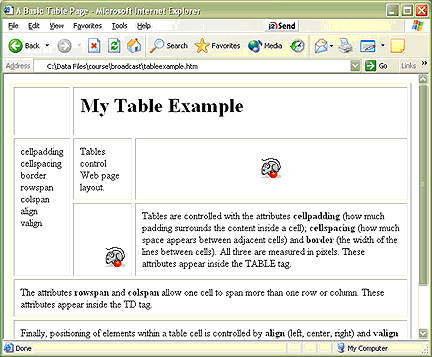
Almost every major site used a table-based layout, as CSS1 was just being prepared for release. If you’ve never built a table-based layout, you’ve missed out on some fun.

A web page made up of tables. (Image Source)
While it was easy enough to create a layout that had multiple columns, other layouts required a great level of creativity. Often, the solution was simply nesting one table inside of another, again and again. The code was extremely bloated and taxed slow connections.
Snail Races:
Connection speeds were one of the biggest hindrances in creating a site. 56k modems were slow, but my goodness, they seemed like broadband when compared with 14.4 and 28.8 models. Generally, you wanted your homepage (code and images) to total less than 50kb of space.
Of course, now we see sites with full-width sliders that are over 1MB themselves. Slow internet connections provided a difficult challenge that you constantly had to be aware of.
Resolutions/Devices:
You know that smartphone in your hand? Well, it most likely has a higher resolution than most desktop computers from 1996. My crash-prone Packard Bell ran a tantalizing 640×480 screen. See, we were mobile first!
But seriously, that was a tiny screen. Some users were running at 800×600 or even the occasional 1024×768 (if you were running a really high-end system), but it was hard to gain access to larger resolutions if you weren’t already running on one. That led to a lot of sites being designed for small screens – only to break on larger displays.
Mobile devices that could browse the web were pretty much a pipe dream in those days. And, even though I never felt like it at the time, things actually were more simple in terms of what types of screens you were designing for. Now, we have responsive layouts that will work on virtually every screen.
Site Management:
So yeah, there wasn’t anything like WordPress back in the day. If you wanted to edit the content of your site, or worse yet add a new navigation section, you were pretty much hacking away at potentially the hundreds of files in a static HTML site.
While server-side includes were used by some savvy folks (not me), others (me) were relegated to changing every single file in the site. Global search and replace was a big help.
Any content management systems from the mid-to-late 90’s were usually custom built for a corporation and cost quite a large sum of money. Still, they didn’t work so well. Browser and scripting limitations would render these systems a big waste of money in many cases. It’s also one reason why IE 6 stuck around well beyond its useful life.
Does History Repeat Itself?
I’d say the only thing that has repeated (and multiplied) itself are screen resolutions and the sheer number of devices we must design for. The advent of responsive design has certainly made that challenge much easier to tackle, though.
As I mentioned earlier, those "classic" browsers often took the same code and rendered it in very different ways. While that problem will still pop up from time to time, it’s not nearly the design disaster that it once was. This is another huge step in allowing us to create designs that work on all screens.
Here and Now
Like electronics and automobiles, web design has come a long way in a relatively short amount of time. It’s amazing to see what talented designers and developers are creating, never having dreamed of such things back when I began.
Fortunately, hardware and software advances have both made our jobs easier and democratized publishing online. We no longer have to hire out large firms to build us a CMS. There are many great ones freely available. One-click installs from hosting providers allow those who aren’t even professionals to get off to a running start on the web. That has created more opportunity for all of us.
When did your journey begin as a web designer? What are some of the most noticeable differences from then and now?
Related Topics
Top