The phrase “stock photography” often evokes the shot of a business meeting where everyone is inexplicably beaming with delight. This feels cheesy, unnatural, and poorly suited for modern web design. But photography on the web doesn’t have to feel so out of place.
In fact, some of the best websites use natural-looking imagery to add a sense of identity into the design. This article is all about those layouts and design trends used in conjunction with tenable and beautiful stock photography. If you can acquire top quality photos for a web project then the design phase gets a whole lot easier.
Locations & Environments
When selling a company or event the location can be very important. Especially if it’s a retailer that most people would visit in person.
These businesses use their website like a digital representation of the company. So environment photos fit in great because they give visitors a glimpse of the building and maybe even the interior. But if it’s not viable to get on location photos you could instead use popular locations nearby.
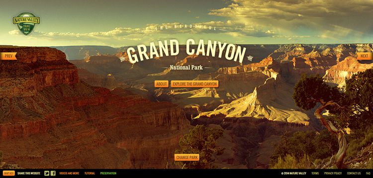
The webpage for Nature Valley Trail View includes large photos of national parks all around America. Each photo may have been taken specifically for this website, or they could all be stock photos purchased online.
Either way, it’s immediately noticeable that the photos are of a very high quality. Since the photos take up a lot of space, they really define the website’s overall look & feel. Low-quality photos would imply a low-quality website, but in this case we have just the opposite.
For a more personal example take a look at Red Dessert Dive. This is a bakery/cafe specializing in custom desserts. All throughout the page you’ll find various photos but the header is most significant.
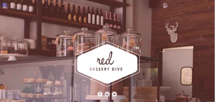
Visitors will see the header before anything else so it needs to pack a punch. This environment photo shows off the unique interior of this bakery along with some desserts and eating utensils. Powerful imagery like this example demonstrates what a company does without relying solely on text.
Consider using environment photos when you need to connect a website to a physical location.
Blending Personal Portraits
Many stock photos come as transparent renders with the background removed. These are often added to corporate sites for some extra graphics or to create new photo composites.
While it’s cool to include photos of the staff or team members, photo composites are also really popular. A shrewd designer can work personal portraits into the design with elegant compositing techniques.
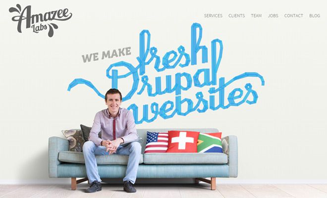
My all-time favorite example can be found on Amazee Labs. Typographic effects are worked into a fullscreen photo composite. One of the employees can be seen on a couch while the beige wall blends smoothly into the background.
I love this trend because it goes further than just a typical fullscreen photo. The header looks like one solid color until you piece everything together. It’s a truly unique effect and it’s the perfect example of stock photo compositing for the web.
Keep in mind that people like to work with & buy from real people. A faceless website can sometimes work great – look at the success of Amazon and eBay.
But a little personal touch can also make quite a difference.

Brian Regan is a stand-up comedian with a website full of photos. The homepage features a composite of himself mixed into a textured background. It’s not exactly a traditional website layout but it works for a personal site using only a few pages.
You’ll find more photos on his about page with a fullscreen header plus some other composites.
Don’t assume that all stock photos have to be put online sans-editing. A little Photoshop magic can push your website photography in a whole new direction.
Product Photography
Any good eCommerce store is going to need some product photos. They’re essential to selling both physical & digital items.
This style of photography is somewhat unique and most professional photographers classify products shots as different shoots from regular headshots. The point is to capture each product in a certain light so customers get a good look and hopefully make a purchase.
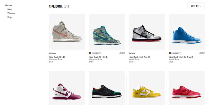
Take look at the onlike Nike store with sneakers cataloged into thumbnails. Each photo is basically the same with a sneaker facing towards the right on the same gray background.
Some sneakers offer alternate colors which you can select when hovering the thumbnail. This is more of an advanced feature but it shows the importance of quality product photos. If you run an online store and sell physical merchandise it’s a good idea to hire a professional to take product shots for your website.
A high-quality portrait or environment shot may improve a website’s design, but a high-quality product shot may actually coax a sale.
When it comes to physical products a great photo is important. Digital products can use a preview shot taken right from the computer – maybe a little Photoshop to spruce it up. But what about corporate services?
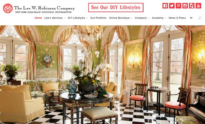
The Lee W. Robinson website is a portfolio for interior design & renovation. His photos don’t include actual things for sale, but rather samples of his work. Real tangible services go best with photos of the work.
But some difficulty arises when designing for services that can’t be showcased in photography, kinda like plumbing. In this case you might go for a personal portrait or mix it up with environment shots of the office, equipment, or customer homes (if they allow).
Fullscreen Backgrounds
Fullscreen backgrounds can include photos of people, environments, workflow, or really anything. The idea is to use photography to build an identity for the website. Blind Barber uses the fullscreen technique with an image slideshow linking to individual pages.

Each photo matches the inbound link from booking an appointment to browsing the Blind Barber online shop. And the photos are great quality so they add real value to the overall design.

Another cool example is the Book of Beards website. It uses one single fullscreen image for the background which stays fixed through each page. The site relies on JavaScript to load each page so the background photo is a consistent focal point.
The book was actually created by Justin James Muir who’s a professional photographer. The Book of Beards website proves that simplicity can go a long way and that photos really can play a large role in web design.
Adding a Personal Touch
You don’t always need stock photos to take up a majority of the page. Even a small portrait or thumbnail can offer a personal touch to your design.
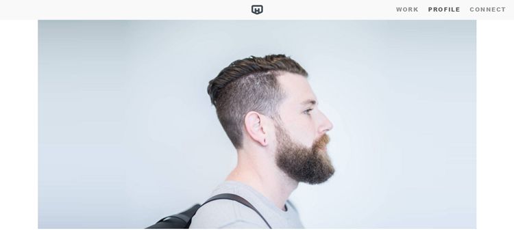
Mat Helme’s portfolio showcases a profile photo of himself. It’s definitely large but it’s also the only real photo of himself on the whole site. Mat’s personal portrait is only for people who venture that far into his website anyways.
But we can go even smaller and still get this same effect. Take a glimpse at the footer on Rogie King’s portfolio.

His photo is a grayscale 200×200 thumbnail featured in the corner of the website’s footer section. Even though it’s small and mild it still offers a quaint personal touch.
This trend of personal photography can evolve into a complete team about page with biographies and social profiles for each team member. The goal is to offer as much(or as little) personality as needed to best fit the website.
The most important factor when it comes to stock photography is quality. This really can be the difference between awesome and awful design work. High-quality photos will help to build a reputable brand for any website. By following the trends in this post you can use photos with purpose to design powerful digital identities.
Top