Whenever I browse a website or read a book, the first thing I notice is the font. If the font or typography is not proper, I’m hardly motivated enough to continue, no matter how good the content may be. Agreed that beauty lies in the eye of the beholder, and some fonts are more beautiful than others, but overall, it is an accepted fact that if the typography of your web page is not good enough, you will have a hard time impressing your readers.
To help you make the right typographic choices in your projects, we have put together some tips and concepts that you should consider when making decisions related to typography. Also, speaking of typography, do take a look at my previous article about typography in responsive design.
Step One: Legibility
What defines the purpose of good typography? Naturally, it should aid and assist, even inspire, the viewer to read the text. A font is useless if it does not foster easy legibility and help the end user in reading without painstaking efforts. Thus, in order to make your typographic ventures successful, you should concentrate on the legibility aspect before anything else.
The rules for simple legibility are not difficult: avoid funky fonts, stay away from colors that hurt your readers’ eyes, and so on. However, if your project is such that it demands the use of a funky or special font, you will obviously have to opt for one such font. Just tread cautiously, and use it sparingly!
In my opinion, perhaps the best instance of legibility on-screen is witnessed in the Open Sans font. After all, WordPress.com will not favor it for no reason, right? Here is a screenshot of WP.com’s About Us page, showing the difference in legibility (the older version, using Helvetica/Arial is towards the left, whereas the Open Sans version is on the right):

If you are using a gigantic screen, you may as well not have a grudge against Helvetica. But take the same text to either print or mobile web layouts, and Open Sans serves the legibility aspect in a way better manner than Helvetica/Arial.
Step Two: Colors
Colors are one of the most curated and carefully considered aspects of design. And they rightfully deserve the attention: after all, we define the things we see by means of colors!
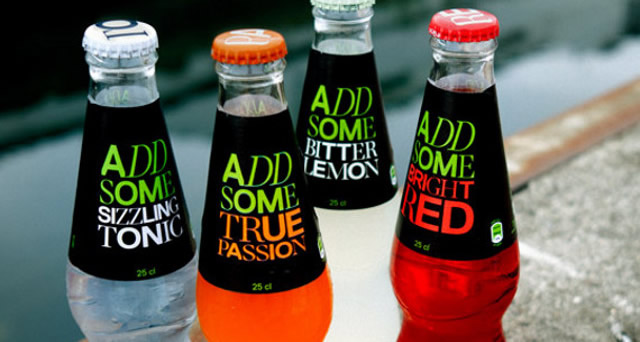
In terms of typography, you should pick the color that does not hinder the reading experience, and at the same time highlights and complements your design well.

Image Source
Now, at this point, you should exercise some precaution: your color choice should be smart enough to get noticed, but somber enough not to shout out loud for attention. In other words, a good set of colors will only enhance your typography, and let the font itself and the content do the talking. Colors are an important aspect of design, but should never be the only important aspect of it.
Step Three: Size, Spacing and Placement
Size of the text is one area where you cannot experiment much. Of course, you can have a heading that is huge, and if you are creating a personal website or a portfolio, you can employ any font as well. However, if you are creating something like a news website, your text will have to be a readable size, not big and definitely and not small.

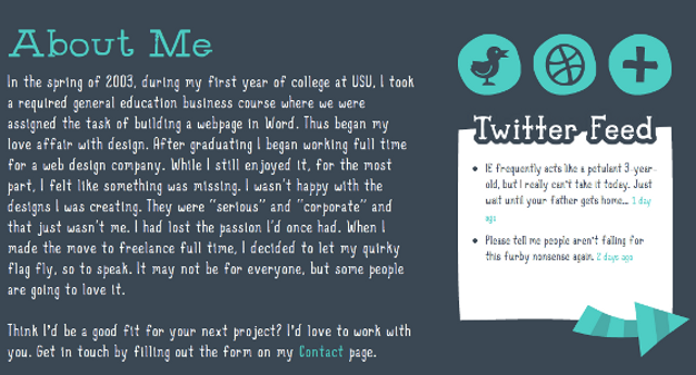
Take a look a Denise Chandler‘s website. The font choice can be funky because obviously, it is a portfolio and not a charity website. However, the placement and spacing of the text (visible once you scroll down a bit on the home page) smells of clever thinking. The lines ought to have that much of space; any bigger, and you risk it being too far; any smaller, and you risk the funky font coming in the way of legibility.
Step Four: Room For Innovation
As creative artists and designers, we need to have some room for our own innovation, right? Exactly, I agree, absolutely!
Now, obviously, I cannot “tell” you how to innovate or where to experiment, but here are some handy pointers that you can bear in mind when trying to mix your creativity with typography norms.
- Always bear in mind that the basic purpose of typography is to aid in reading. Typographic experiments should be modeled around reading experience, not the other way round.
- Keep your target niche in mind. If this is a news website, have a font that boasts of a professional look. If this is a website for a dance club, have a font that is slightly less severe than that for a news website.
- If you are indeed serious about innovation, try to get rid of stereotypes. A news website should surely have a professional font, but it should not really have an Old Text font for logo or a Roman font for main text.
- Make sure that the colors for your typography are such that they complement the main design well, and at the same time do not come in the way of easy reading. You should model your typographic colors around the main design, not the other way round.
- Needless to say, stay away from Comic Sans. Also, on a lighter note, read this.
Step Five: The Message
Anything that is associated with creativity has to convey a message. A novel conveys the views of the author to the readers, a painting expresses the painter’s feelings, and even a pamphlet or poster conveys a specific message to its viewers. Naturally, it is obvious that web design too is no exception to this norm.
Now, in order to make your typographic decisions blend well with the main message of the website, you should repeatedly ask yourself regarding the website’s chief aim and the message that the site intends to convey. Thus, if you are creating a website for a fundraiser, your typography should give that very message, not that of a sports website.
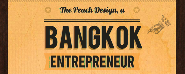
Let us consider, for example, the website of The Peach Design. Since it is the website of a creative artist who is willing to take up web design projects, the typography should convey the creative aspect as well as the design insight of the artist. In other words, using a typography that is too dull or mundane will be a bad choice here.

The huge caption portrays the creativity and design insight of the artist well; as soon as you visit the page, you know that you are dealing with a person who is willing to offer you websites and illustrations, and the font choices for the caption further compliment that impression well.
Conclusion
We have now come to the end of this article about a five-step guide to improving your typography choices. I hope this article has been helpful for you. In the end, I’d only like to say that whatever typographic choices you make, just make sure that it suits and blends well with your design project and its intended audience. The aesthetic aspects of web design are best portrayed in typography selections and therefore, you should never overlook it.
What are your thoughts regarding typography? Please share them with us in the comments below!
Related Topics
Top
