Stacked text blocks can be seen everywhere. But, the problem with them is that sometimes designers can get carried away and include a wealth of information, resulting in TL;DR-like content. No one wants to read that.
However, with two lines it is a different story. Brevity is the soul of wit. It always works. Just pick up the keywords, compose a catchy tagline and voila, you are ready to win over clients. It is so elegant, simple and effective. It’s no wonder that many designers fall for this trick.
However, artists do not just rely on smart phrases. They play with its appearance, spicing it up with interesting features and unobtrusively emphasizing it with clever tweaks. Various techniques are put into play, for example:
- Different typefaces;
- Different colors for each line;
- Color that stands in contrast to the background or other content;
- Big, almost overwhelming font sizes;
- Bold typefaces;
- Different font styles;
- Typeface-based artworks;
- Fully highlighted text;
- And even the time-proven and unexpectedly not-as-dull-as-we-may-think underline.
We are going to examine all of these options, so that you can see the potential of each one and choose the best match for your particular case.
Denton Design
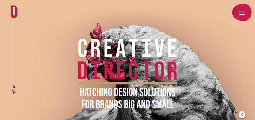
Let’s begin with one of the brightest representatives of this in the mainstream – Nathan Denton’s Denton Design. Created by Rene Hernandez and Ryan Haskell-Glatz, it is a true masterpiece that fascinates with originality and bizarreness.
“Creative Director” are the two words that meet the audience, marking the start of the dialogue. All of the letters are set in uppercase and a relatively big font size. They are painted in two primary colors: White and ruby red. Here, the two-line stacked block is not just a greeting. It is an integral part of the design that completes the ensemble and screams out Nathan’s occupation.
Multistampa
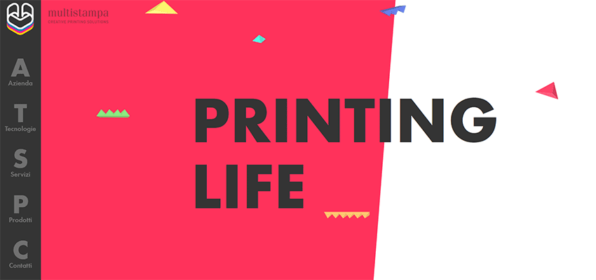
The team behind Multistampa goes for uppercase letters, large sizing and neutral colors that stand in contrast to the background. As a result, the phrase “Printing Life” is a natural focus of attention here that perfectly blends into the geometry-inspired aesthetics.
Spotify Wrapped
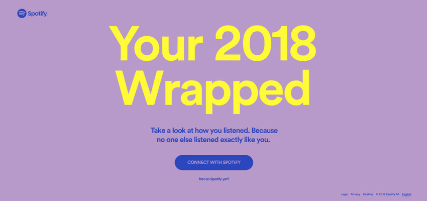
This is the big name in our collection. Spotify is famous for its pioneering solutions, proof that it is a trendsetter in the web sphere. This latest example shows that duotone and bright coloring still excite the minds of their creative department.
Once again, we can see a two-line stacked text block on their website. There are two blocks placed one above another. The first one is big and prominent, whereas the second is small. yet eye-catching. The beautiful yellow goes well with the Pantone orchid used as the background color. The tagline feels gentle and, at the same time, bold.
iFly KLM 360 degrees
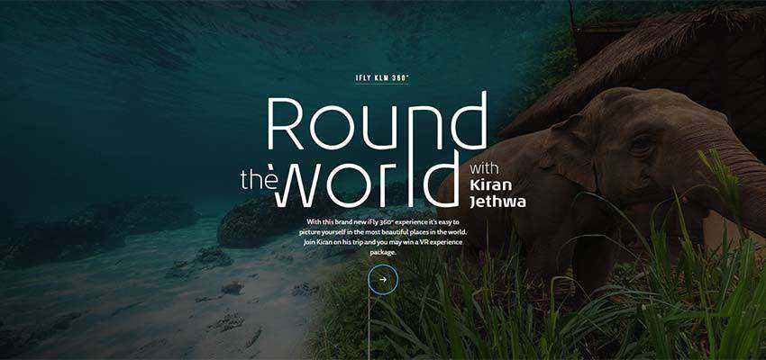
The team behind iFly KLM 360 degrees’ design employs the beauty of typographic centerpieces that are unfortunately rare these days. “Round the World with Kiran Jethwa” instantly draws our attention. This artistic take on two-line stacked text is just incredible. Thin, elegant lines of letterforms, big size and intricate play with words make the phrase an absolute winner in our eyes.
Claudia Noronha
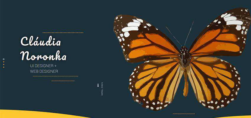
If you do not have typography artists at your disposal, Claudia Noronha offers a valid alternative – use a beautiful typeface. Her elegant, smooth and a bit fat typeface nicely interacts with the rest of the content. At the same time, it stays true to the UI’s lady-like aura – nicely contributing to the overall feminine atmosphere. Simple, beautiful and effective.
Heartbeat Labs
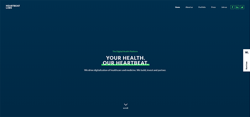
The team at Heartbeat Labs opts in favor of an old-timey solution that implies the underlining of words. It works great here. Although the size of the font is small, the bright thick line that shines out against a clean, monochrome, dark blue background puts the phrase in the spotlight.
SiR MaRy
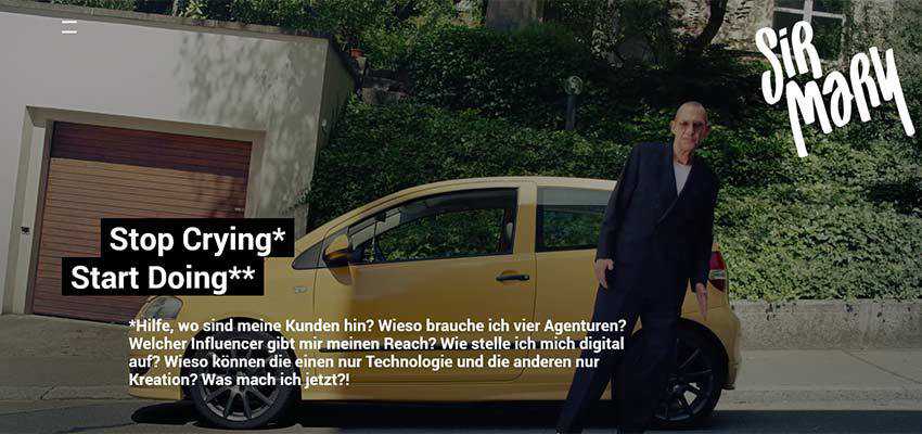
SiR MaRy presents another absolute classic in our collection. Here, the catchphrases are highlighted with bold black lines. Although it may seem a bit brutal and crude in comparison to the examples featured above, nevertheless, the trick gives the slogan a solid base, delineating it effectively.
Elastos
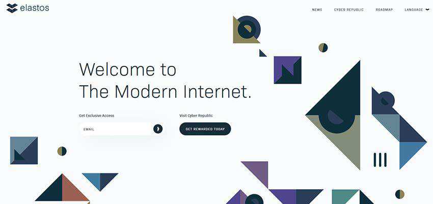
The team behind Elastos shows us how to use a two-line stacked text block when you have a fancy background. Even though the phrase is set in an ultra-narrow typeface, it still catches the eye. There are several reasons for that.
First of all, the size of the font adds to its prominence. Secondly, the clean background and white space give way to everything on the fore. Third, the phrase is placed to the left – just where we naturally start to read. Finally, the graphics themselves literally point towards the text.
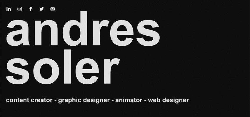
Andres Soler
Andres Soler, a multidisciplinary artist, breaks his name into two lines. The two-line concept remains on the smallest device screens as well, so that the first thing that you read on your cell phone is “Andres Soler.” Here, the phrase looks like a bold statement that does not require any visual “supports” or extra entourage.
When Two Is Better Than One
If you think that trends effect only the essential elements of design, think again. All the components of web design (whether small or large) are subject to the trends. You have to look carefully, paying attention to the most minor details.
Even a boring thing, such as a block of text, will undergo changes and improvements regarding design and user experience. Today, we witnessed a trend of using stacked two-line taglines that are beautifully emphasized.
They hit straight to-the-point and add to the general aesthetic. Most importantly, they correspond to a user’s preference of scanning text on a website rather than reading it. It is a trend that combines both pragmatism and creativity.
Top