Sketch has a plethora of companion applications to share the top table with, and there is, especially, no shortage of Prototyping applications out there to wine and dine our favourite design application. One of my favourites is Flinto (for Mac). An application that has grown in strength in recent times. Let’s put these two apps to the test shall we, as we design, and prototype an app for iOS.
Ok. Fire up Sketch! Don’t have a copy to hand? You can download the free trial here.
There are a few things that you may want to grab for this tutorial (if you haven’t already) first:
- Iconjar: I have raved about this app before. It’s perfect for storing, and referencing your icons. A must have, and one that we can put to good use with the icon set below.
- Craft Plugin by InVision LABS: The perfect plugin to enable the use of real-data in your projects, and more. One of the now, essential plugins for using with Sketch.
- Google Fonts: Download Raleway and Open Sans.
- Zeiss (Lite) Icon Set: Feel free to download the icon set.
All cool? Everything installed? Sweet! Let’s get to it!
Designing our Screens in Sketch

In the 1st part of this tutorial we’ll be creating the screens for our application. Nothing too testing. We’ll keep it simple, with 6 screens for a fictional Photo Editor iOS App called ‘Zeiss‘. Carl Zeiss invented the modern day camera lens. He deserves an iOS photo app named after him, don’t you think?
As I mentioned, we’ll be creating just 6 screens (It’s the ‘Lite’ version after all) for various parts of the app:
- Welcome Screen
- Viewfinder
- Image Gallery
- Choose Filter
- Filter Applied
- Information
Let’s make a start on the first of those screens:
Welcome Screen
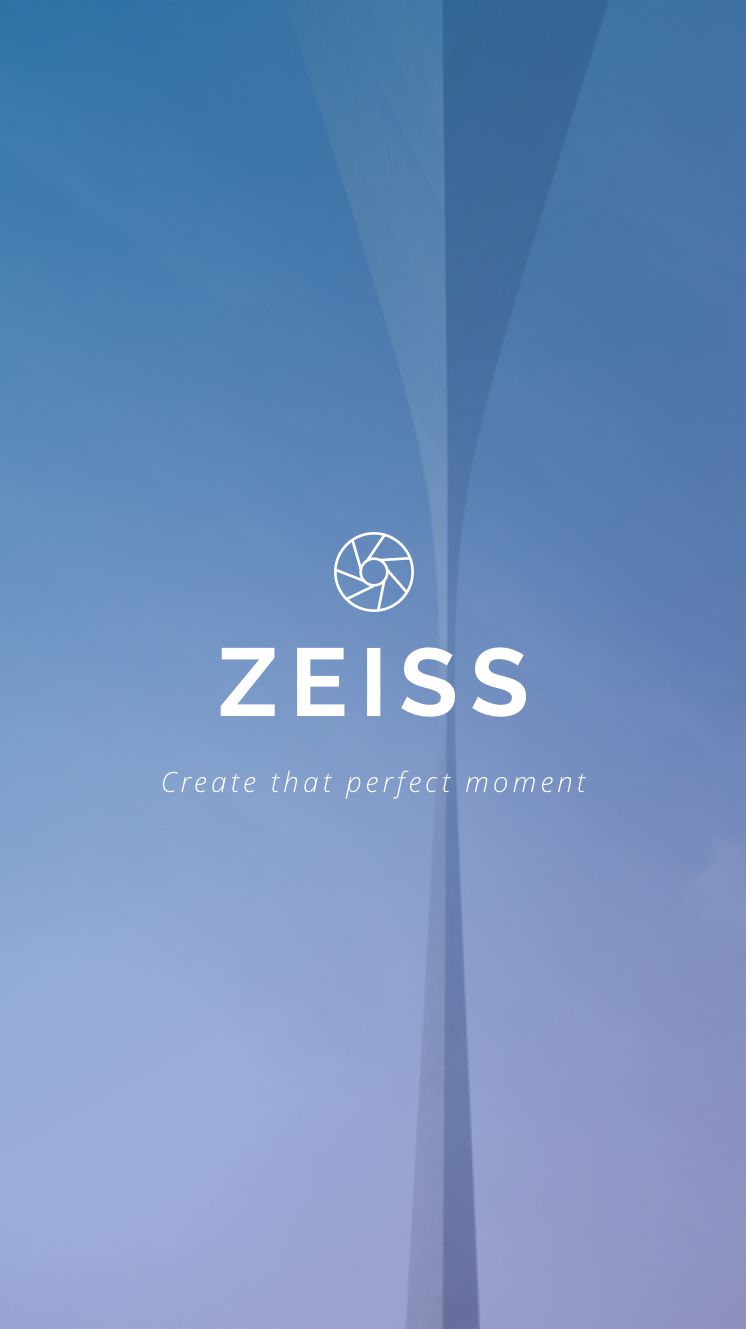
Create a new Artboard (A), and choose the iPhone 6 option from the Inspector panel on the right.
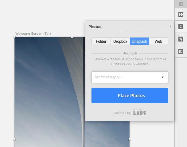
Draw out a Rectangle (R) to cover the Artboard (375×667), and then from the Craft panel on the right choose the Photos tool.
Select the Unsplash option, and click the Place Photos button.
Quick Note: You can toggle the Craft panel on/off with Cmd + P, and if you want to quickly cycle through (random) Unsplash images use Shift + Ctrl + 3.
Let’s add a gradient overlay to sit over our image. Draw out a Rectangle (R) the same dimensions as the image, and then choose a Gradient Fill from the Inspector panel.
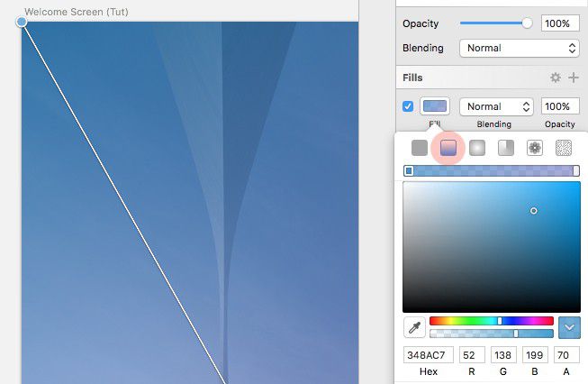
Make the Gradient go from Top Left, to Bottom Right. And add the following colour values:
- Top Left: #348AC7
- Bottom Right: #7474BF
And select Smooth Opacity in the Fills panel.
Quick Note: As we will be using this gradient again on other screens in this tutorial, it would make sense to add it to the Document Gradients in the Fills panel. So do that now. Click on the Gradient in the Inspector Panel, and then click the plus (+) icon in the Document Gradients section to add it.

Now time to drop in our shutter icon. If you haven’t downloaded the icon set yet, you can grab it here.
Open up IconJar, and click the plus (+) icon at the top of the app to add a new set. Give the set a name, and then browse to the (unzipped) folder where the icons are.

You will now see your icon set inside of IconJar, from where you can easily select an icon, and simply drag & drop it into your Sketch project. Boom!
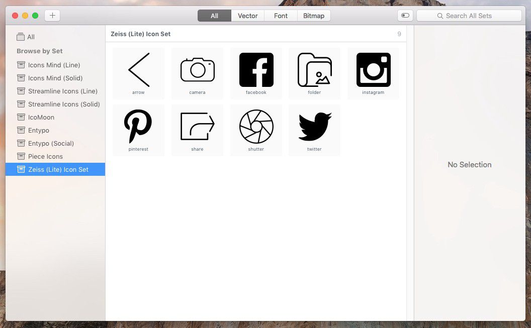
Drag the shutter icon into Sketch, keep it at the same size, but change the colour of the icon to #FFFFFF. Make sure you have the shape layers selected, and not the actual folder.
Add in a couple of Text Layers (T). One for the app title, and the other for the subtitle.
For the title, I used the following settings:
- Typeface: Raleway
- Weight: Bold
- Color: #FFFFFF
- Size: 48
- Alignment: Center
And for the subtitle:
- Typeface: Open Sans
- Weight: Light Italic
- Color: #FFFFFF
- Size: 14
- Alignment: Center
Group the icon, and text layers together (Cmd + G), and then use the Alignment Tools to center this new group on the Artboard.
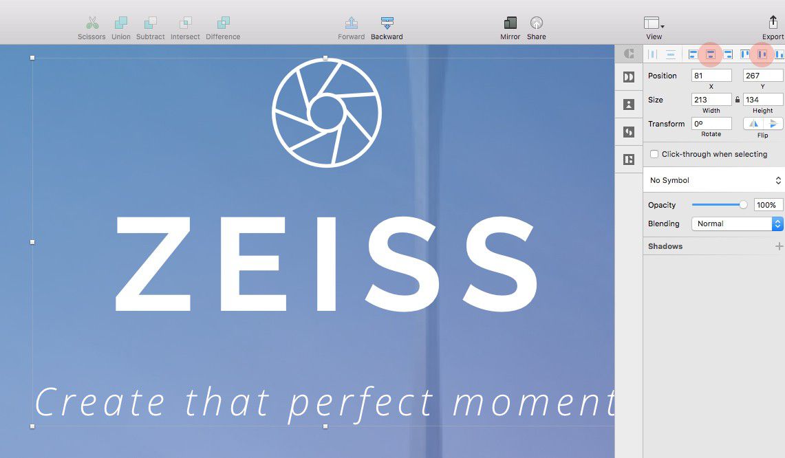
Nice work. One screen down, five to go!
Viewfinder
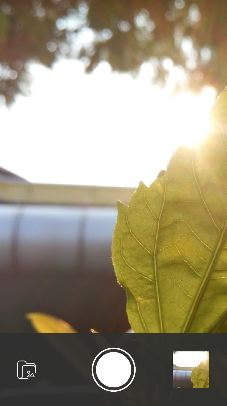
Create a new Artboard (A), and again, choose the iPhone 6 option from the Inspector panel on the right.
Like we did with the Welcome screen, draw out a Rectangle (R) to cover the Artboard, and then from the Craft panel on the right choose the Photos tool.
Select the Unsplash option, and click the Place Photos button.
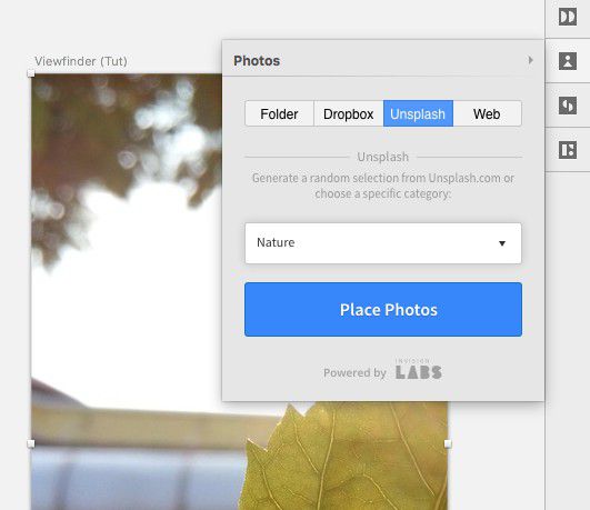
Quick Note: You can pull in any random photo from the Unsplash site, but for the next few screens, and just to keep a little uniformity, you will see I have chosen one of the categories (‘Nature’) this time.
Now onto the Control Bar for our Viewfinder screen.
Draw a Rectangle (R) 375 x 120px and place this at the bottom of the screen. Give it a Fill Color of #303030 and reduce the Opacity to 95%.
Onto the controls:
Firstly, drop in the folder icon from IconJar, and give it the colour #FFFFFF.
Then, for the shutter button, select the Oval tool (O), draw out a circle 58 x 58px, change the Fill Color to#FFFFFF, and remove the border.
Duplicate that shape by holding down Alt, and dragging it to duplicate. Then increase it’s size to 70 x 70px, add a 2px white border, and remove the Fill Color.
Quick Note: Remember to hold the Shift key when drawing out the circle, to keep proportions.
With both layers selected, use Align Horizontally, and Align Vertically to align them correctly to each other.
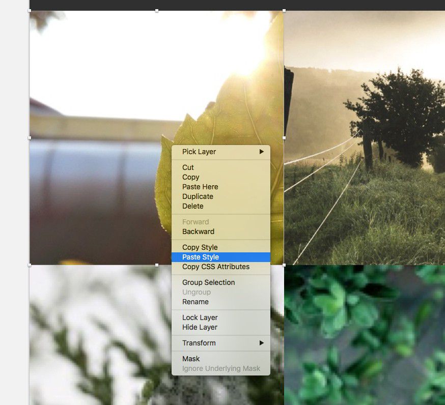
Then finally, for the small image thumbnail, select the large background image we inserted previously, right-click and choose Copy Style. Then draw out a small Rectangle (R) 60 x 60px with a Radius of 1, and right-click on this layer and choose Paste Style.
Group all 3 elements (folder icon, shutter button, and image thumbnail) together, and then use the Alignment Tools to line everything up correctly.

Image Gallery
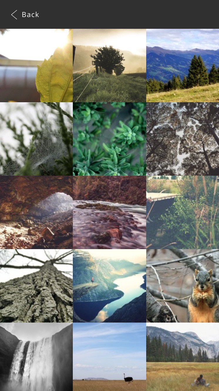
Let’s add in a Navigation Bar for our Image Gallery screen.
Draw out a Rectangle (R) 375 x 50px and give it a Fill Color of #303030, and place this at the top of the screen.
Drag in the arrow icon from IconJar, and colour this #FFFFFF.
Insert a Text Layer (T), change the wording to ‘Back‘ and then give it the following settings:
- Typeface: Open Sans
- Weight: Regular
- Color: #FFFFFF
- Size: 12
- Alignment: Left
Align the icon, and text layer together, and then group the two elements. Holding Alt (to show the measure guides) align this new group with the background layer you created before.

As we will be using this element again we’ll convert it to a Symbol. So with our Navigation Bar selected, choose Create Symbol from the Toolbar.

Now to put the Craft plugin back into action! Where, again we will be using the Photos tool (combined with the Unsplash images), and also the Duplicate tool. Good times!
Draw a Rectangle (R) 125 x 125px and place this to the left edge of your screen, and directly under the Navigation Bar.
Then, with the shape layer still selected, choose the Duplicate tool from the Craft panel, and select the Specific Count option.
Check both the Vertical, and Horizontal options, and then for the Vertical Item count, enter 7, and for the Horizontal Item count, enter 3. Leave both Gutters at 0, and then click Duplicate Content.

Then select all those shape layers (there will be 21 in total) from the Layers List, and choose the Photos tool in Craft to propagate each of the layers with images from Unsplash (please bear in mind it may take a little while to fill each layer).

Before we finish up this screen, replace the first thumbnail with the image from the previous screen, just so the flow is not broken.
Now you may be asking ‘But why are two rows of thumbnails sat outside of the screen?’. When we move onto the 2nd part of this tutorial all will be revealed! Mwah, ha ha!! (A bit too much? Less ha, more mwah, yeah?)
Choose Filter
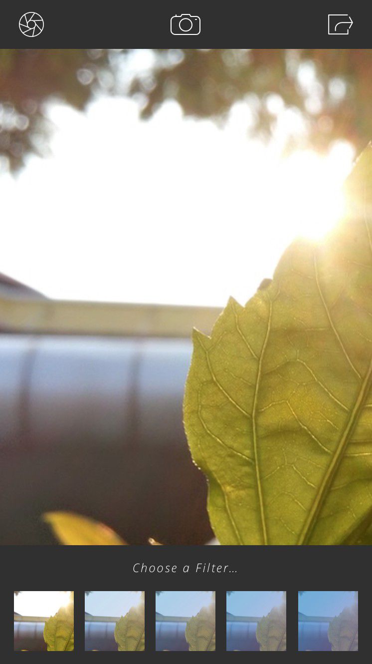
Firstly, draw out a Rectangle (R) to cover the whole screen, and then using right-click, copy/paste style (like I showed you before), paste in the image from the Viewfinder screen.
Now, let’s add in a Navigation Bar for our Choose Filter screen (a little different from the one we created previously, so don’t use that Symbol just yet).
Draw out a Rectangle (R) 375 x 50px and give it a Fill Color of #303030, and place this at the top of the screen.
Then, from IconJar, drag in the shutter, camera, and share icons.
Change their colour to #FFFFFF, and then use the Alignment Tools to space them out correctly, with the shutter, and share icons sat 20px from the Artboard edge. Group the 3 icons together, and then align them correctly against the background you created before.

As you may use this element again, go ahead and convert it to a Symbol. So with the Navigation Bar selected (icons, and background), choose Create Symbol from the Toolbar.
Now onto the Control Bar for our Choose Filter screen.
Draw a Rectangle (R) 375 x 120px, give it a Fill Color of #303030 and place this at the bottom of the screen.
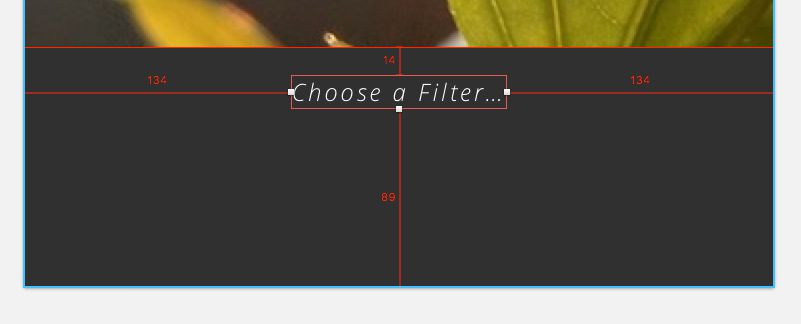
Add a Text Layer (T), change the wording to ‘Choose a Filter:’, and apply the following settings:
- Typeface: Open Sans
- Weight: Light Italic
- Color: #FFFFFF
- Size: 12
- Alignment: Center
Then align this correctly inside of the background layer.
Draw a Rectangle (R) 60 x 60px with a Radius of 1, and then copy/paste the style across from the background image you inserted at the start of this section.
Duplicate this layer 4 times, either holding Alt and then dragging to duplicate, or using the Duplicate option from the Craft panel. I’ll leave that one up to you! (You can even use the Make Grid feature inside of Sketch, but that may be a little overkill for this part of the tutorial).
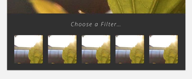
Then, and following similar steps to above, create four more squares using the Rectangle (R) tool (using the same dimensions, and radius as the image thumbnails), and place these over images 2, 3, 4, and 5.
Remember that Document Gradient that we saved before? Cool. Let’s put this to good use again (but tweak it slightly as we go along).
So, starting with the thumb 5, add the Document Gradient to our new shape layer, and then do the same for thumbs 4, 3, and 2, reducing the opacity by 20% as you move along.

Filter Applied
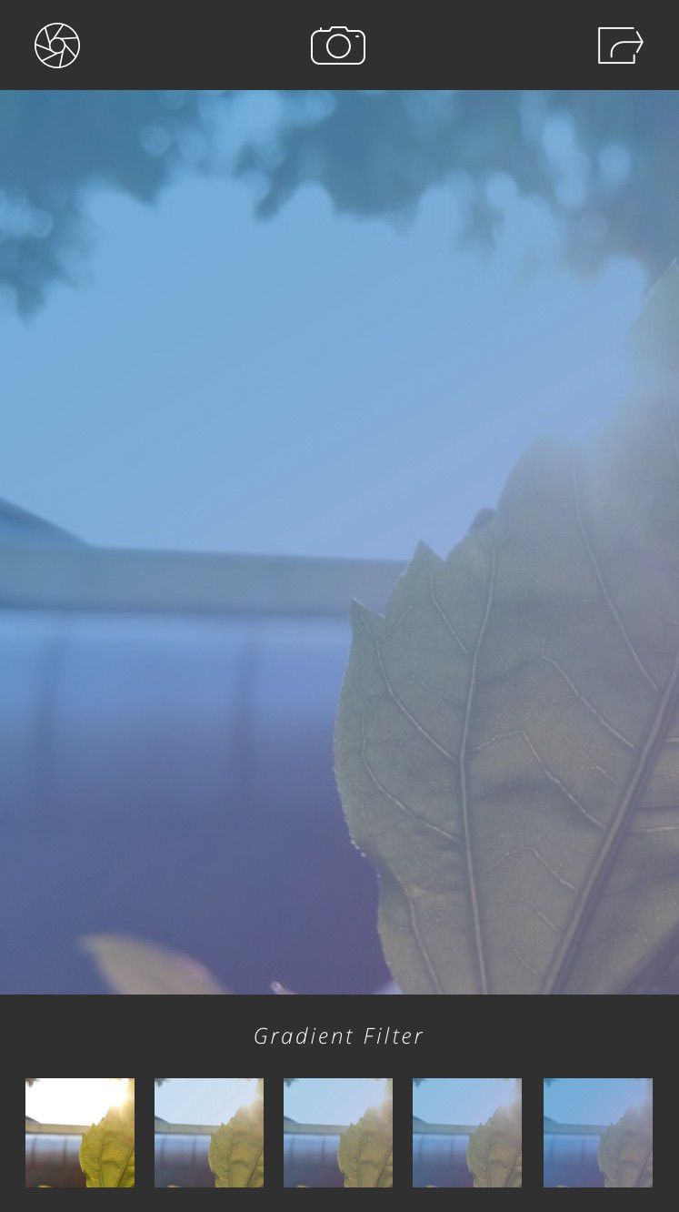
This section will not take up too much of our time I promise you. Just a quick Duplication of the previous screen, colour tweak, and name change. Yup that simple!
So, on your Canvas area, click on the name of the previous screen, ‘Choose Filter’ (or whatever you named it) to select the whole Artboard, and then holding Alt, click and drag to duplicate it.
Change the name in the Inspector Panel. Something like ‘Filter Applied’ would be tip-top.
Then, create a Rectangle (R) to cover the new Artboard, apply the Document Gradient that we saved previously, and then place the layer correctly using the following keyboard shortcuts:
- Bring Forward
Alt + Cmd + ↑ - Send Backward
Alt + Cmd + ↓
And then, to finish up, quickly change the wording of the Text Layer to something like ‘Gradient Filter’.

And that’s that screen all sown up!
Information
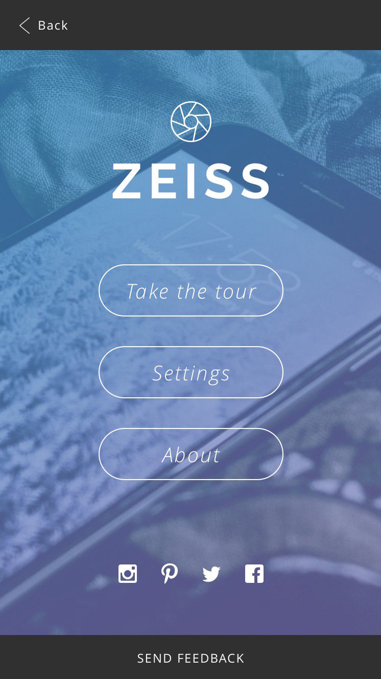
Onto our final screen.
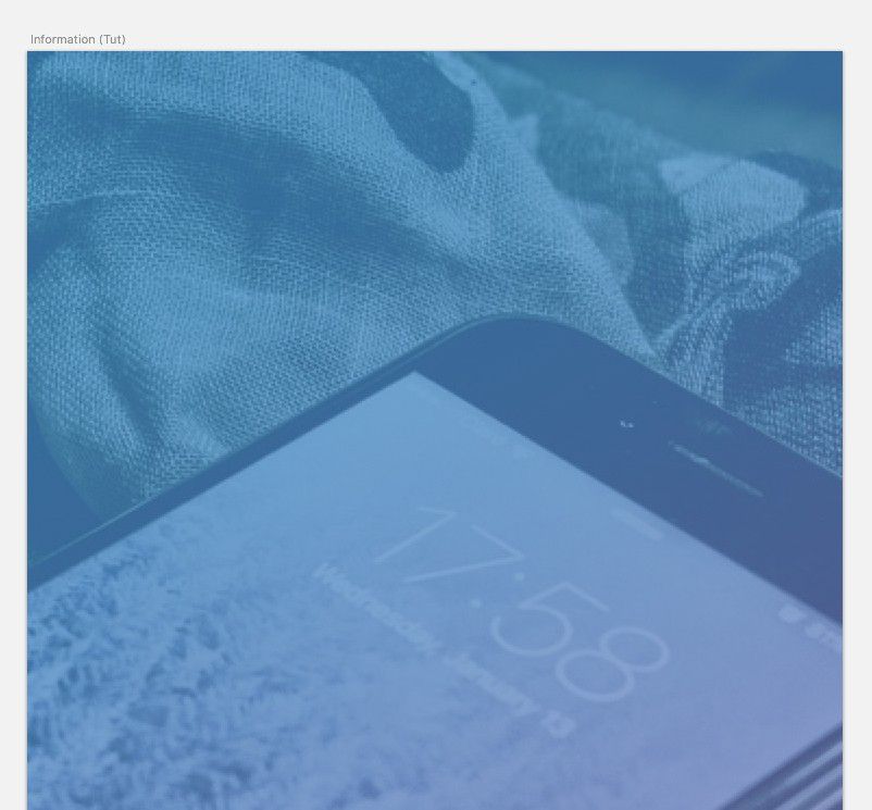
Like we did with the previous screens, draw out a Rectangle (R) to cover the Artboard, and then from the Craft panel on the right choose the Photos tool.
Select the Unsplash option, and click the Place Photos button.
Draw another Rectangle (R) to place over the image, and apply the Document Gradient that we saved previously.
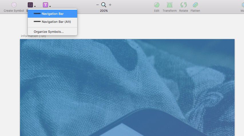
Then, from the Symbol icon in the Toolbar, choose the Navigation Bar Symbol that you created earlier, and place this at the top of the Artboard.
From the Welcome Screen Artboard, copy, and paste across the logo that you created there, and then align this correctly on the Information Artboard.
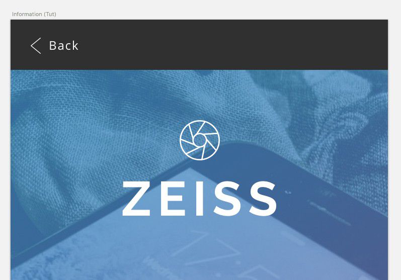
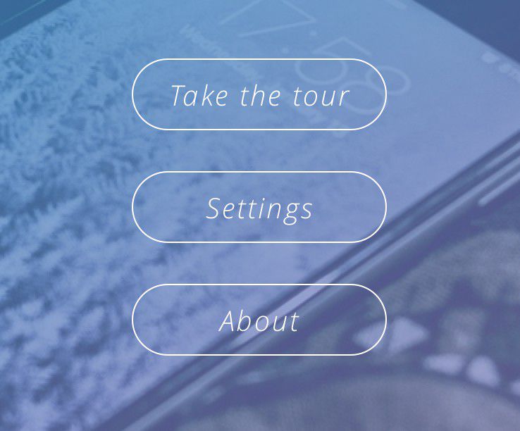
Now, let’s add 3 buttons to appear on this screen:
- Take the tour
- Settings
- About
Draw out a Rectangle (R) 180 x 50px with a Radius of 100. Remove the Fill Colour, and give it a Border of 1 with the colour #FFFFFF.
Insert a Text Layer (T), change the wording to ‘Take the tour’, and then apply the following settings to that layer:
- Typeface: Open Sans
- Weight: Light Italic
- Color: #FFFFFF
- Size: 20
- Alignment: Center
Then, with both the shape and text layer selected, use the Alignment tools to align them together.
Quick Note: Remember you can use Alt to check that everything is lining up nicely.
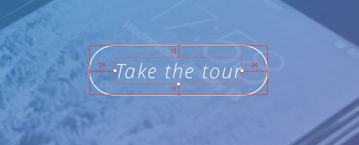
Duplicate this button twice, and change the wording accordingly.
Time for a few Social Icons to put in an appearance, yeah?
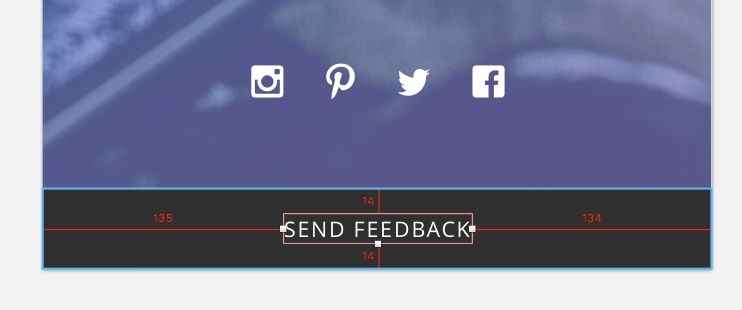
From IconJar, drag across the instagram, pinterest, twitter, and facebook icons. Change their colour to #FFFFFF, and align them correctly on the Artboard.
Quick Note: Always remember, when working with elements like this, to put those Alignment Tools to good use!

To finish up this screen, we’ll add in a Feedback bar/button to appear at the very bottom.
Draw out a Rectangle (R) 375 x 45 px with a colour of #303030. Add in a Text Layer (T), change the wording to ‘Send Feedback’, and apply the following settings:
- Typeface: Open Sans
- Weight: Regular
- Color: #FFFFFF
- Size: 12
- Alignment: Center
Then, from the Menu bar, choose Type > Uppercase.
Align the shape, and text layer:
And that’s a wrap for this screen, and the first part of this tutorial.
In the second part of this tutorial, we’ll be exporting our Artboards from Sketch (using their nifty plugin) and into Flinto to breathe a little life into them!
You may also like to take a look at my previous Sketch tutorials:
Looking for the fastest, most practical way to learn Sketch?
Sketch App Essentials is the perfect guide to help you realise the full potential of this amazing application. Take a look here.
Use the offer code MEDIUMESSENTIALS to receive 20% OFF any of the Packages.
Related Topics
Top