As web designers, we are often encouraged to utilize the latest and greatest features that CSS has to offer. And there are plenty of compelling reasons to do so. Techniques like CSS Grid and Flexbox make quick work of common layouts, while CSS animations add movement and interactivity. That’s just the tip of the iceberg.
However, implementing these features can sometimes come at the cost of browser compatibility. For websites that still have a significant number of users with older browsers, or for features that are very new, there’s a risk in leaving some people out.
Philosophically speaking, some designers are fine with this – and that’s OK. But implementing fallbacks for these features may be easier than you think. These failsafe measures offer a reasonable facsimile of a particular layout or design element and are compatible with legacy web browsers.
Today, we’ll show you how to utilize the Modernizr feature detection library for this purpose. Here we go!
What Is Modernizr?
Modernizr is one of those handy tools that web designers have been relying on for years. It’s a library that can be customized to “detect” (in reality, it’s running tests) specific features as a web page loads. From there, it adds CSS classes to the page’s <HTML> element, allowing designers to target their code based on what the library finds.
In our case, we’ll be using it to detect CSS Flexbox. However, it’s also able to look for features related to HTML and JavaScript. For instance, you can use it to determine whether a browser supports HTML5. If not, the available HTML5 shiv script can be used to bring it up to code, so-to-speak.
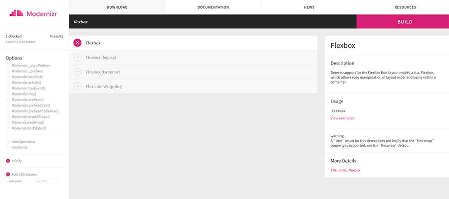
What’s really nice is that you can customize Modernizr to meet the needs of your project. Their website’s UI will let you pick and choose only the items you want detect. Once you’ve made your selections, click on the “Build” button to generate a custom downloadable package.
Our Build
For our purposes (and to keep things simple), we’re building our Modernizr package to detect Flexbox. We’ll also choose to minify the code and add CSS classes as well.
Step 1: Setting Up the Demo
To demonstrate how this all works will require a couple of files – both available on GitHub:
- flexgrid.css – This is our simple CSS Flexbox grid system. You’ll notice it has classes for different alignments and column widths. In addition, there are a special set of
.no-flexboxclasses that use old school CSS floats as well. This will help us create a similar layout style in legacy browsers. - modernizr-custom.js – The aforementioned script will detect whether or not CSS Flexbox is supported by the current browser.
Next, we’ll want to create a new HTML document that calls both of the above files in the <head> area. In addition, the document will need an example CSS Flexbox layout and some content.
You can feel free to use the demo file below for experimentation. It contains a simple 3-column layout, along with some minor visual enhancements (more on that in a bit).
Step 2: View the HTML Document in a Modern Browser
Now it’s time to see how our demo looks in a browser. To start, let’s use a modern web browser that supports Flexbox.
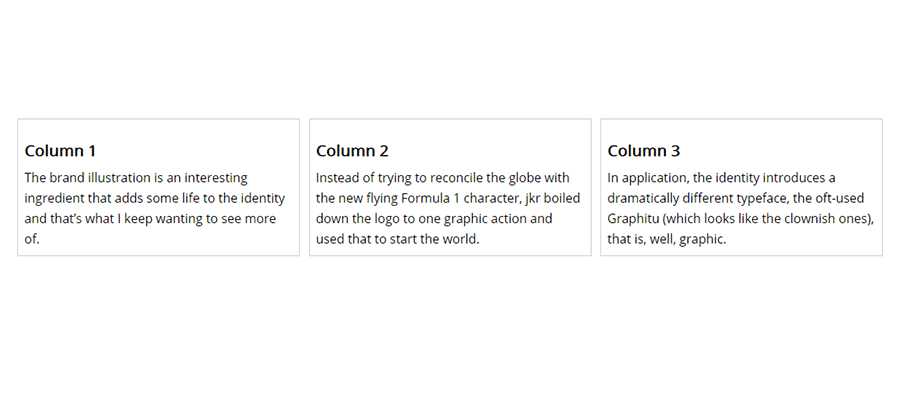
At least, we suspect that it supports Flexbox. How can we tell for sure? That’s what Modernizr is here to do.
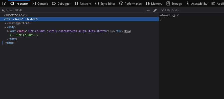
In our case, we’ll want to look at our demo page’s source, specifically the <HTML> element. If there is a class of flexbox added to the element, we know our browser supports the feature. Go ahead and view the page source in your browser – we’ll wait.
Where’s the Class?
If you tried to view the full source of the page, you may have noticed that the <HTML> element doesn’t contain a class. Don’t worry – this is normal.
That’s because the class is added at runtime, after Modernizr tests for the selected feature. Therefore, it won’t show up in the full source code.
Use Your Browser’s Developer Tools
Instead, open up your web browser’s developer tools (hit the F12 button on your keyboard). That will provide an accurate look at the <HTML> element.
Here, we’re using the latest version of Firefox Developer Edition. According to Modernizr, it supports CSS Flexbox. Yay!
Step 3: Test the CSS Fallback in a Legacy Browser
Everything’s looking pretty great in our modern browser. But how about legacy software?
Our styles are set to use CSS floats in browsers that don’t support Flexbox. That fallback should allow us to create a multicolumn layout, even on ancient setups.
According to Can I use, Flexbox has partial support as far back as Internet Explorer 10, Firefox 2, Chrome 4 and Safari 3.1. Many years have gone by since these browsers were in wide use. However, IE in particular is still hanging on here and there.
Modernizr can be configured to test for partial support – but it gets messy. It leads to writing more CSS fallbacks that take a number of different situations into account. It’s not very efficient. Therefore, we’re looking for all-or-nothing support in our tests.
Let’s take a look at our demo in IE 10 (via a browser testing service) and see what happens.
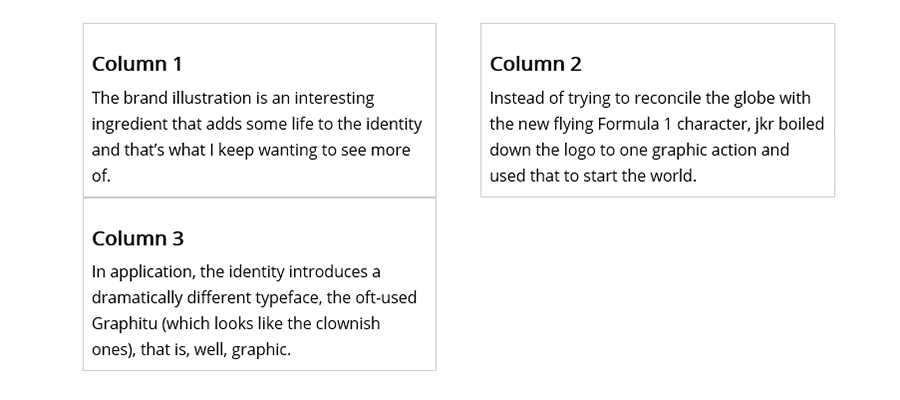
Not too shabby. Our third column gets pushed down to the next row, which can be tweaked. But what about Flexbox support?
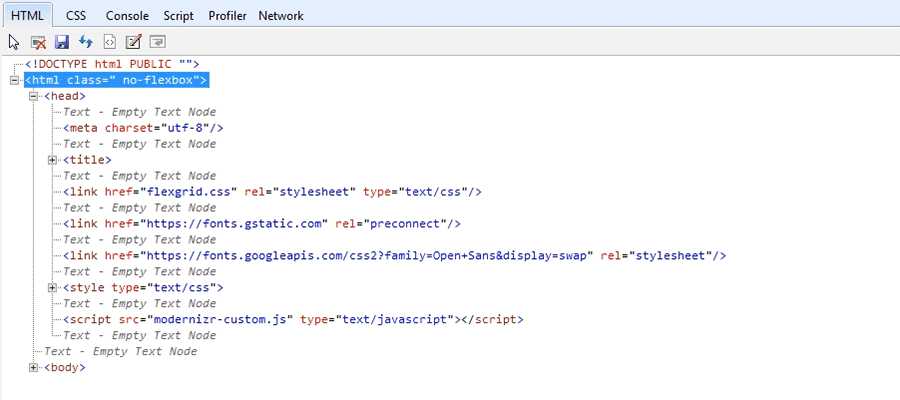
A quick view of IE’s developer tools shows that our <HTML> element displays a class of no-flexbox. That means Flexbox is not supported here, and the CSS fallback is being utilized.
Fixing the Layout for CSS Floats
Our fallback CSS floats will not cooperate with the visual enhancements we made. The third column is pushed down to a second row, which doesn’t look very nice.
That’s because floats add padding and borders to the column width that we previously set in the stylesheet. Flexbox, on the other hand, can adjust to these items without adding to the overall column width. Hence the difference in the results.
There are a few different things we could do to rectify the situation. We might cut the width of the columns or even shrink the margin between columns. Let’s try cutting the column width from 30.66% to 28.66%.
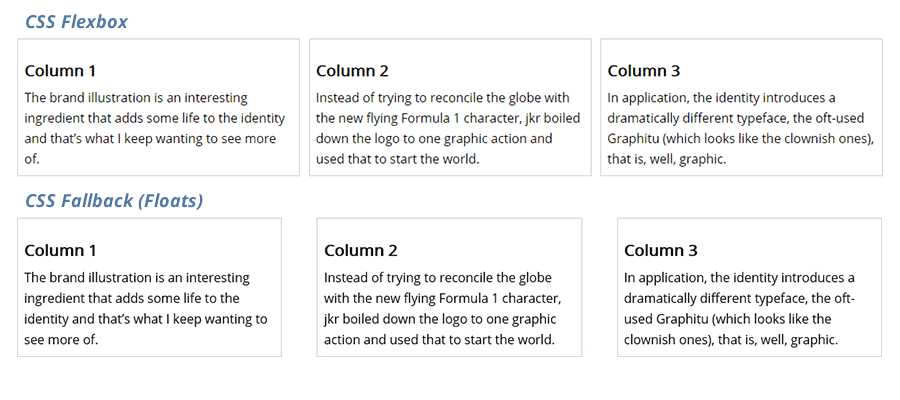
It worked! Our columns are now happily displayed and reasonably similar to the Flexbox versions. Some spacing differences aside, this is at least usable within an old browser. We could go in and make further changes to get even closer to the original.
Detect Browser Features and Adjust Accordingly
While our demonstration focused on detecting CSS Flexbox, Modernizr can do so much more. It can look for other common features such as HTML Canvas, SVG support, CSS Grid and an array of other useful tidbits.
The idea is that, once you know what a user’s browser is capable of, you can adjust your code to follow suit. This makes adopting newer CSS specifications, for example, a much less worrisome process.
Perhaps you won’t need to use fallbacks in every instance. But it’s nice to know that implementing them is easy to do, with the help of Modernizr.
Related Topics
Top